Health and wellness have become more than a trend — it’s a lifestyle. And people are turning to personal trainers in droves to help them achieve their goals.
In fact, to keep up with demand, the Bureau of Labor Statistics predicts that the personal trainer industry will grow by 15% from 2019 to 2029, adding 57,600 more trainers in a decade.
Where do most people find personal trainers? Online, of course. So if you’re a personal trainer, or working for a fitness company, your website needs to be top-notch.
We’ve compiled this list of 10 amazing personal training websites along with key lessons you can apply to your own site.
Editor’s note: Are you a personal trainer looking to build your first website? Then, you’ll want to check out the GetResponse AI Website Builder. It comes with website templates, an intuitive user interface, and even an AI-creator that’ll build a custom website tailored to your needs. Just answer a few simple questions, choose a design style, and you’ve got at least three personalized templates to choose from.
You can watch it in action here:
Here are 10 of the best personal trainer websites we’ve seen:
There are lots of different ways to showcase your skills as a personal trainer and attract customers. Check out these ten sites to find some inspiration.
1. Girls Gone Strong

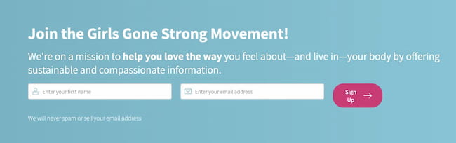
Girls Gone Strong is a personal training website dedicated to women’s health, strength, and empowerment. As you can see above, their website does a great job of identifying with women right off the bat using both imagery and website’s header.
Then the website tells you exactly what they do (women-specific health and fitness coaching and certifications), followed by some serious social proof (recommended by Yale, Johns Hopkins, Time, ABC, Today, Women’s Health, and more). Thanks to these, website visitors know exactly that they’re in the right place and that they can trust this brand.
After that, the GSS website offers users a clear path to finding information specific to their goals with three call-to-action (CTA) buttons. Thanks to these descriptive CTAs, clients can select the offer that matches the stage on their fitness journey.

As you keep scrolling further, you see articles and a newsletter signup form aimed at those that’d like to follow the brand, and maybe not necessarily sign up for their services just yet. By offering these, GSS can start building relationships with their audience (even after visitors leave the website) and show off their expertise, which will help to bring them more clients in the long run.
At the bottom of this website, you’ll also find various kinds of free courses. These lead magnets, as we call them, are great for attracting new clients who may feel hesitant to sign up for the full program. By offering them a free resource, personal trainer gathers their potential client’s contact details and can upsell them with their paid program via email later.

Key lessons from the Girls Gone Strong website:
- Use visuals that are relatable to your target market. For example, GSS focuses on serving women, so they used an image of a strong woman in their hero header.
- Feature social proof prominently on your website — 63% of consumers say they’re more likely to purchase from a website with reviews. If you have well-known clients, you can just use their name or logo. If you work with individuals, you can use testimonials.
- If you offer multiple services, make it easy for users to navigate quickly to what they need.
- Provide a newsletter signup form to build long-term relationships with your audience and eventually turn them into customers.
- Offer free resources to obtain your potential customer’s details and upsell them with your paid services via email later.
2. Big Dawgs

Big Dawgs is a personal training website dedicated to athletes. They do a good job of speaking to their target audience in a motivational tone — especially at the top of the site, saying in bold letters: IT’S TIME TO WIN.
They also identify who would be a good fit for their coaching services by saying that they work with athletes of all ages and stages of fitness, from “weekend warriors to athletes training for small to large competitions.”
The Big Dawgs site also includes a CTA button above the fold, encouraging users to take immediate action using specific language (book a call). This is good because CTA’s are proven to drive conversions and generate leads — even more than AdWords.
The average click-through rate (CTR) for AdWords is 2%, compared to 3.5% for a CTA on a landing page. Plus, CTA’s have become so common that they’re just expected. In fact, people are so conditioned to look for a CTA that they may not know how to navigate your site if they don’t find one.
Key lessons from the Big Dawg’s website
- Know your audience and speak to them in the right tone. For example, athletes are known for being competitive. So Big Dawg’s “IT’S TIME TO WIN” text is going to resonate with the intended audience.
- Use clear CTA buttons above the fold to drive conversion on your site.
3. Forge Fitness and Nutrition Coaching

The fitness and nutrition coaching Forge offers is intended for beginners or anyone without access to a gym or fancy equipment. And they identify with this audience right away using an image of a woman working out with just an exercise mat, phone, and water bottle.
That’s quite different from the image of a trainer spotting someone lifting weights at a gym on the Big Dawgs site. But it works because Big Dawgs is targeting serious athletes while Forge is targeting everyday people.
Below the image, the Forge site immediately explains what they offer, using an accessible and non-intimidating tone. “All fitness and nutrition plans are based on your current condition and ultimate goal while considering your access to workout equipment, experience, and food preferences.”
Forge also does a good job of explaining how the training is delivered — which is via their mobile app. Users can track stats, earn badges, and communicate with their personal trainer using the in-app messenger. And the image above shows a screenshot of the app on a phone, giving users a visual understanding before it’s even explained.
The Forge website also uses social proof by featuring a scrolling feed of testimonials on the first page.
Key lessons from the Forge Fitness website:
- Understand your target audience and use appropriate imagery and tone to show them what you do.
- The more social proof, the better. Gather testimonials from happy customers and feature them prominently on your website.
Read more:
1. Top 19 Fitness Websites and How to Make Yours
2. Why do I need a website? 5 key reasons
4. Trainiac

Trainiac offers individualized weekly workouts and 1-on-1 coaching from a certified personal trainer. Their website sends a clear message at the top in bold text, “Get a coach. Get consistent. Get results.”
One of the best parts about Traniac’s website is the video embedded above the fold. It shows a male and a female using the Traniac program, with one of them working out at a gym and the other at home. The video features each user’s specific training plan and shows them communicating with a coach.
The Trainiac site also does a good job of outlining the onboarding process so potential customers know what to expect.
Key lessons from the Trainiac website:
- Use video to demonstrate what your training program will be like and keep people on your website. According to a 2020 survey by Wyzowl, 83% of respondents say video increases the average time their website visitors spend on the page.
- Explain the onboarding process to potential customers in a visual, easy-to-digest format. Trainiac’s site uses icons with brief titles and descriptions to get the point across quickly.
5. Trainerize

Trainerize is a bit different because it isn’t a personal training business itself but a third-party marketplace that many individual trainers pay to use.
When users click through the clear and prominent CTA on the landing page to “Find A Trainer,” the site automatically loads with popular personal trainers near the user’s location. Users can then easily change filters with two simple drop-down menus at the top of the page.
Once users find trainers or services in their area, they can click through to each person’s individual page for specific programs and pricing. The Trainerize site also has an active, up-to-date blog. They feature several new articles on the landing page with a button to click through for more.
Key lessons from the Trainerize website
- Make your website easy to navigate. After all, 94% of consumers say easy navigation is the most useful website feature. Trainerize does this through clear CTA buttons, automatic loading, and simple drop-down menus.
- Use a blog to demonstrate your expertise and authority within the personal trainer industry. Blogs are also good for driving organic traffic to your site. Websites that prioritize blogging are 13 times more likely to see a positive return on investment (ROI).
6. Transform HQ

Transform HQ was created by TV personalities and extreme transformation duo Chris and Heidi Powell. Their programs offer cost-effective solutions for those interested in personal training.
The Transform HQ website does a good job of explaining the benefit to customers right off the bat. For example, the hero header says, “The Transform App Makes Weight Loss Simple. Start Your Transformation Today.” And it’s followed by a clear CTA button to “Get the App.”
Their site also does a good job of using social proof, featuring before/after images of users who have lost weight with their program — a very effective strategy in the fitness industry.
Key lessons from Transform HQ’s website
- Be clear about your services from the start so users aren’t surprised or disappointed as they go further into your website.
- Use before/after photos and testimonials as social proof for your services.
7. Fitness Blender

Fitness Blender is another personal training business created by a husband/wife duo. And like Transform HQ, Fitness Blender doesn’t offer much in the way of personal coaching, focusing instead on fitness videos, workout programs, and meal plans.
The Fitness Blender website makes great use of the above-the-fold section, featuring a photo of the founders Kelli and Daniel along with a detailed menu. What’s interesting is they also show a bit of the next section at the very bottom.
By cutting off the section like that, it indicates to users that there’s more to see, encouraging them to keep scrolling. Whereas when the above-the-fold section seems complete in and of itself, users will sometimes bounce.
Fitness Blender also includes a bar at the top of the page promoting a new challenge — a good way to draw attention and hook new users. Plus, the Fitness Blender website is ecommerce ready with a well-designed product page and user-optimized checkout process.
Key lessons from the Fitness Blender website:
- Optimize your above-the-fold space. The most recent research from Nielsen/Norman Group shows users spend about 57% of their page-viewing time above the fold and 74% of viewing time in the first two screen fulls.
- Use photos of real people. Eye-tracking studies by Nielsen show that users pay more attention to photos of real people compared to generic and stock photos.
- If you have an online store, make sure the checkout process is easy. 56% of shoppers abandon their carts due to long and confusing checkouts.
8. Built Phoenix Strong

Built Phoenix Strong is a personal training business that targets former athletes and their website does several things right. For starters, it makes signing up risk free by offering the first 7 days for only $1.
Second, it uses social proof in a big way — name dropping high-profile clients like the Miami Dolphins, Atlanta Braves, and Arizona Cardinals. Plus, it includes a bright red icon saying they’re the “highest-rated and most reviewed personal trainer in Roswell.”
Below the social proof, the BPS website has a CTA button with clear action language telling the user what will happen when they click the button. And it’s just an exploratory action that contributes further to the “risk-free” feeling of trying this service.
Last but not least, their website includes a video explaining their personal training method and philosophy right at the top so users can tell if it’s a good fit before putting in any more effort.
Key lessons from the Built Phoenix Strong website:
- Increase conversion rates by offering a free (or very low cost) trial. This is especially important with personal training services because people often harbor a slew of self-doubts about their ability to stick with the program. They also tend to be skeptical of results and hesitant to spend money on themselves. Free trials help overcome all of that.
- As with other websites, use CTA’s with clear action language like “schedule a fitness assessment” as opposed to vague wording like “learn more” or “let’s do this.”
9. Upside Aerial Arts & Fitness

On a mission to provide adults with an outlet for creative body movements, Upside Aerial Arts & Fitness is a unique and highly specialized personal training business. And they use their website to immediately communicate what they do — with a full video background showing a woman swinging from aerial silks.
The full menu along the top is another good feature on Upside Aerial’s website, especially since their services are so unique. It allows users to easily explore the site using customer-centric choices like an FAQ, Classes, Pricing, Schedule, and Events.
Plus, Upside Aerial’s website includes a chat feature above the fold, giving users an immediate way to get answers if they can’t find them on the website. This is important because 92% of customers feel satisfied when they use live chat — better than any other communication tool. And 44% say that having questions answered by a live person is one of the most important features a website can offer.
Key lessons from the Upside Aerial Arts & Fitness website:
- Add interest to your site and boost conversion using video backgrounds — it can increase conversion rates by a whopping 80%.
- Consider adding a chat feature to satisfy customers who won’t go to the trouble of picking up the phone or sending an email. Live chat can increase conversion rates, increase subscription rates, and create a more personalized experience for customers.
10. Armoury Coaching Studio

Many of the previous examples focused on remote or online coaching. But many personal trainers focus on local, in-person customers.
The Armoury Coaching Studio website is a good example for local trainers to follow because it’s SEO optimized for local searches. Local search is when someone adds a location to their search parameters on Google —“best personal trainers in Houston” as opposed to just “best personal trainers.”
This personal trainer website uses target keywords in the headings, meta description, and body text, helping them rank on the first page for the keyword phrase “personal training in Milton Keynes”.
Key lessons from the Armoury website:
- If you offer in-person services, make sure to optimize your site for local keywords.
Time to build your own personal trainer website
One thing’s for sure — It’s a good time to be in the health and wellness industry.
If you’re about to build your own personal trainer website, here’s what you can take away from the websites we’ve just gone over:
- Use visuals to connect with your target audience
- Use social proof, especially before/after photos
- Prioritize important information above the fold
- Include clear CTA buttons with specific action language
- Offer free resources to convert more clients long-term.
- Add a newsletter signup form to build relationships with your audience outside of your website.
- Add features like video, blogs, and live chat
- Offer customers a free or low-cost trial
And if you’re in need of a tool that’ll help you get your personal trainer website off the ground in a little amount of time, consider GetResponse’s Website Builder.
Just take a look at these beautiful templates:

And if you’d rather build your website from scratch, you can use our no-code drag-and-drop editor as well. To learn what it looks like, just watch the video below and when you’re ready hit that big button below to sign up.
