Health and wellness have become more important than ever, especially in the wake of the pandemic.
But because of worldwide stay-at-home orders, many fitness enthusiasts haven’t been engaging in their favorite outdoor activities.
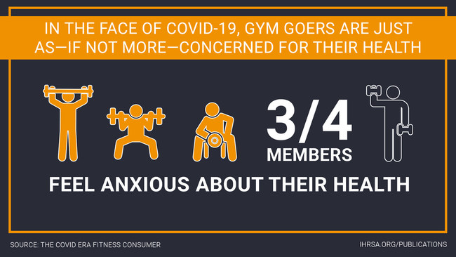
Yet, wellness still remains top of mind for most people.
Three in four gym goers admit they are anxious about their health and are eager to return outdoors and to physical gyms.
But even as things return to normal, people will continue to turn to the Internet for their fitness needs and to keep tabs on their favorite gyms. According to a Mindbody survey, 46% of survey participants stated that they intend to make virtual fitness classes a regular part of their routine.
With more consumers looking for health and wellness options online, your fitness business needs to have a well-established online presence and be positioned to serve customers both online and offline.
And it all starts with having a well-designed and functioning website.
In this article, we’ll cover 19 fitness web design examples and how to create your own website using GetResponse’s AI-powered website builder.
Not sure what the tool’s about? Then watch this quick video overview to learn more.
Here are 19 of the best fitness website designs we’ve seen
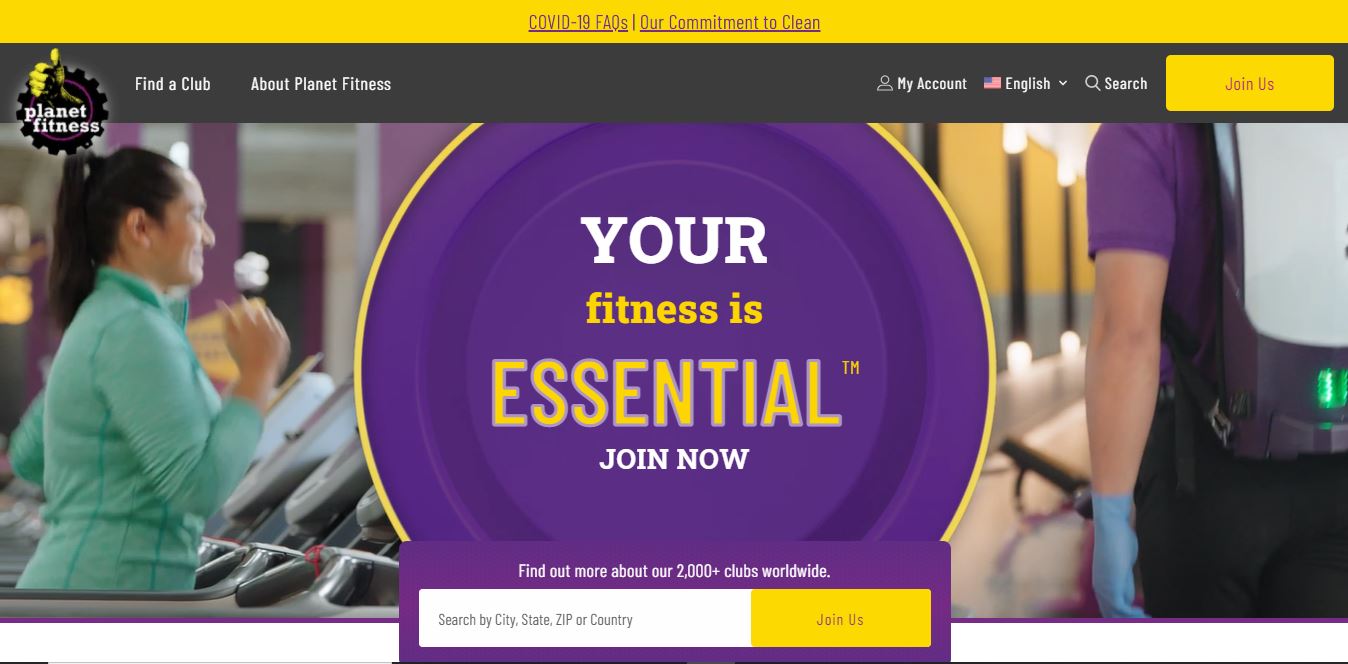
1. Planet Fitness
Why’s this a good example to follow?
Planet Fitness is a well-known brand in the fitness industry. And their website lives up to expectations.
A short autoplay video on the homepage gives users a sneak-peek into Planet Fitness’s facilities. Their website is organized in neat sections that highlight their distinct offerings — from apps to virtual tours to membership card perks — without overwhelming the site visitor.
Key lessons from this example
- Present your website content in a consistent, easy-to-follow layout.
- Use video to give prospective customers a peek into your gym activities. Research has shown that the average user spends 88% more time on a website with a video than one without.
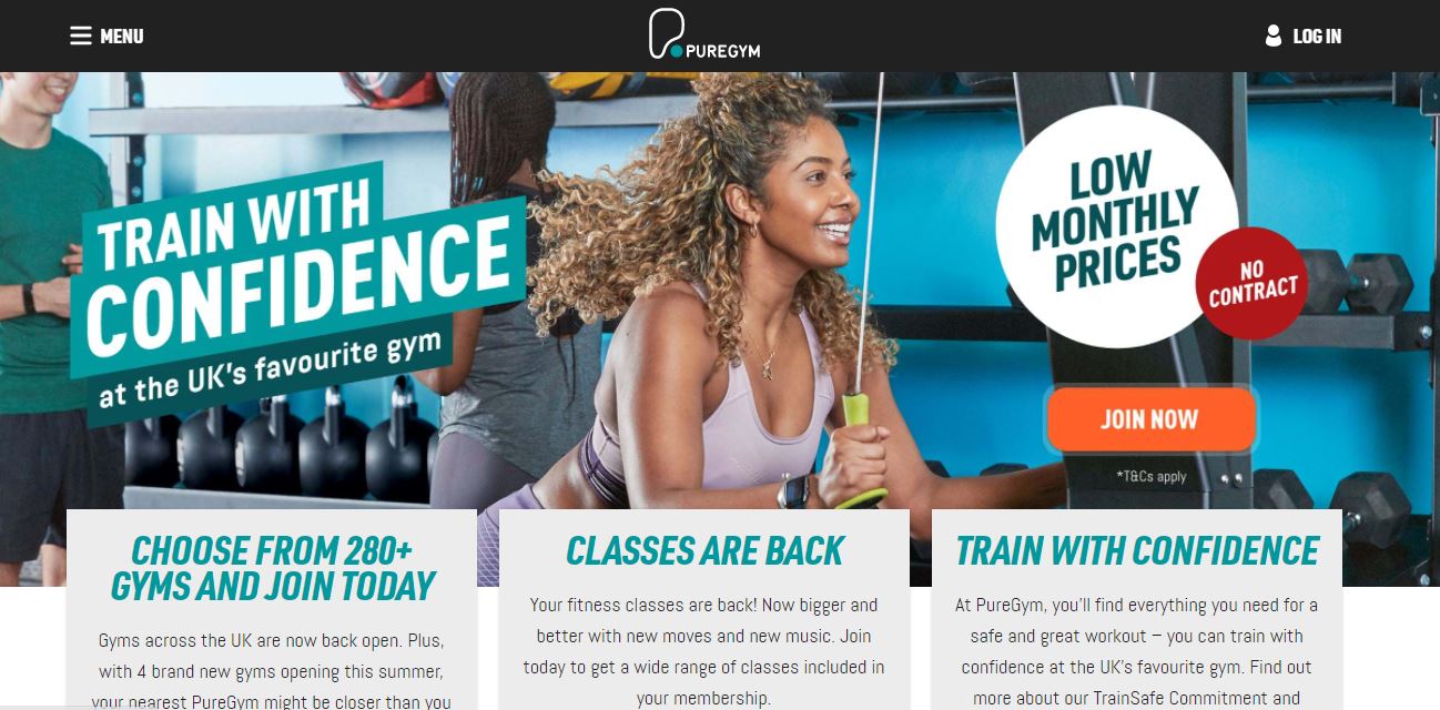
2. PureGym
Why’s this a good example to follow?
PureGym’s website features great copy and an aesthetically pleasing design.
The website copy speaks directly to fitness enthusiasts, highlights key benefits of a PureGym membership, and paints a clear picture of what their fitness journey would look like.
PureGym makes effective use of their above-the-fold section — the part of the website viewers see first before scrolling down — by highlighting their most important activities and including a clear call-to-action button.
Key lessons from this example
- Your website copy matters. Use customer-focused copy to grab visitors’ attention and keep them engaged.
- Present the most important information above-the-fold, because it receives the most eyeballs. User scroll behavior studies show that the area above the fold, at about 550 pixels, is the most viewed area of any web page, with over 80% viewership.
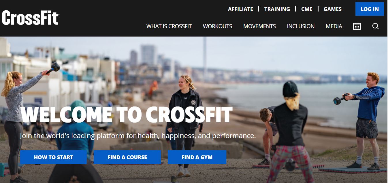
3. CrossFit
Why’s this a good example to follow?
CrossFit’s website is a good example of how to present a large amount of content on your website without overwhelming your visitor.
The website’s hero section provides links to the most important paths a site visitor might be interested in: how to start, finding a course, and finding a gym. The sections that follow give more details about these three paths.
CrossFit also makes judicious use of their website footer and includes links to several important website pages.
Key lessons from this example
- Tailor your website content to meet the distinct needs of your target customers.
- Link to important pages in your website footer. A study by Chartbeat found that users scroll down thousands of pixels and many scroll before a page loads. While above-the-fold content gets the most attention, placing content strategically in your footer is a great idea so you can capture this group of users.
Improve your website with these resources:
1. Best coaching websites and how to create yours
4. UFC Gym

Why’s this a good example to follow?
UFC Gym’s website features smooth scrolling and subtle web animations.
And according to Viget, web animations can help users understand your website content better. Their site also has well-laid out sections highlighting their workout programs and training sessions.
Even more, the website header has a clear call-to-action that is repeated at strategic sections along with a sticky menu.
Key lessons from this example
- Use web animations to boost interactivity and engagement.
- Include a sticky menu to help users navigate your website quickly and find information at any point in their scroll. If you’re wondering why, research by Smashing Magazine shows that sticky menus are 22% quicker to navigate and users prefer them.
5. Fitness Blender
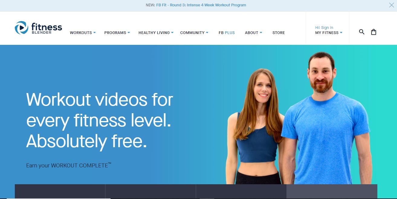
Why’s this a good example to follow?
Fitness Blender makes great use of their above-the-fold section, which includes a detailed menu and links to their workout videos, workout programs, meal plans, and Fitness Blender membership.
The entire website features photos of the husband and wife team behind Fitness Blender. This is great because eye-tracking studies by Nielsen Group show that users pay attention to photos of real people compared to generic and stock photos which are completely ignored.
The website is ecommerce-ready with a clean product page and user-optimized checkout process — a good thing — since 56% of shoppers abandon their carts due to long and confusing checkouts.
Key lessons from this example
- Optimize the checkout process to increase order completion.
- If you’re a personal trainer, include your photos on your website.
6. 24 Hour Fitness
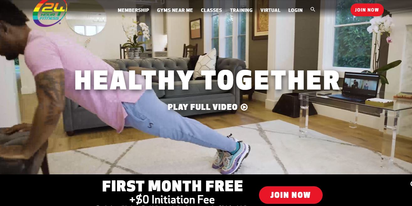
Why’s this a good example to follow?
24 Hour Fitness’s website gets several things right. It has clear calls to action that are repeated consistently throughout the website. And research shows that using multiple calls to action can increase conversions by 20%.
Sections of the website are properly laid out to highlight their studio classes, virtual and personal training sessions, meal plans, and healthy recipes.
They also include an autoplay homepage video showing behind-the-scenes activities at the gym to create an immersive user experience.
Key lessons from this example
- Use clear consistent calls-to-action buttons to drive users to action
- Think through your website design and use an attractive layout. According to a study by Adobe, 38% of your website visitors will stop engaging with your website if the layout is unattractive.
7. Ludlow Fitness
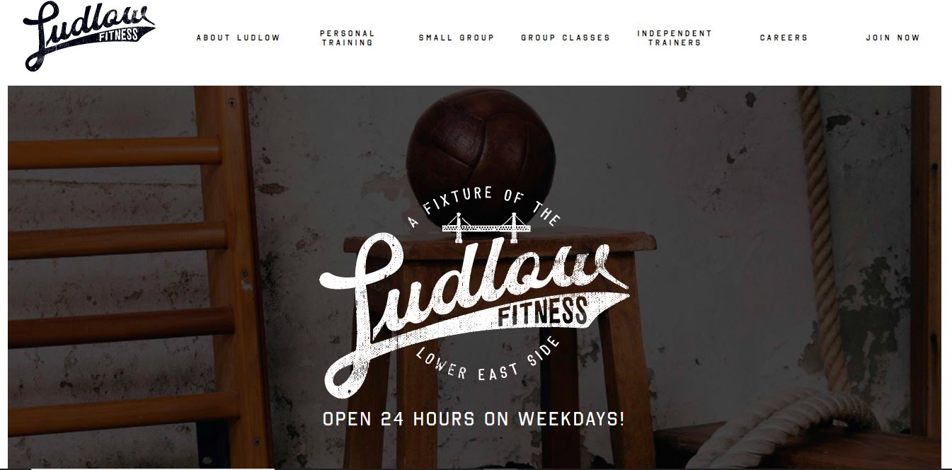
Why’s this a good example to follow?
Ludlow’s website is simple, functional, and does a great job of showcasing their products and services. The homepage features a pricing table that spells out their membership plans, making it easy for potential customers to see if the services offered are within or above their budget.
They also include their contact information, business hours, and important COVID-19 notices. This is an excellent practice because 44% of website visitors will leave a website if it has no contact information or phone number.
Key lessons from this example
- Consider including a pricing table that clarifies your gym membership structure because it can help boost your search engine rankings.
Fiberpool, a swimming pool company, saw a huge bump in search engine rankings which resulted in roughly $1 million in sales after publishing a detailed post about their pricing on their website.
- Display important contact information and business hours on your website.
8. Built Phoenix Strong
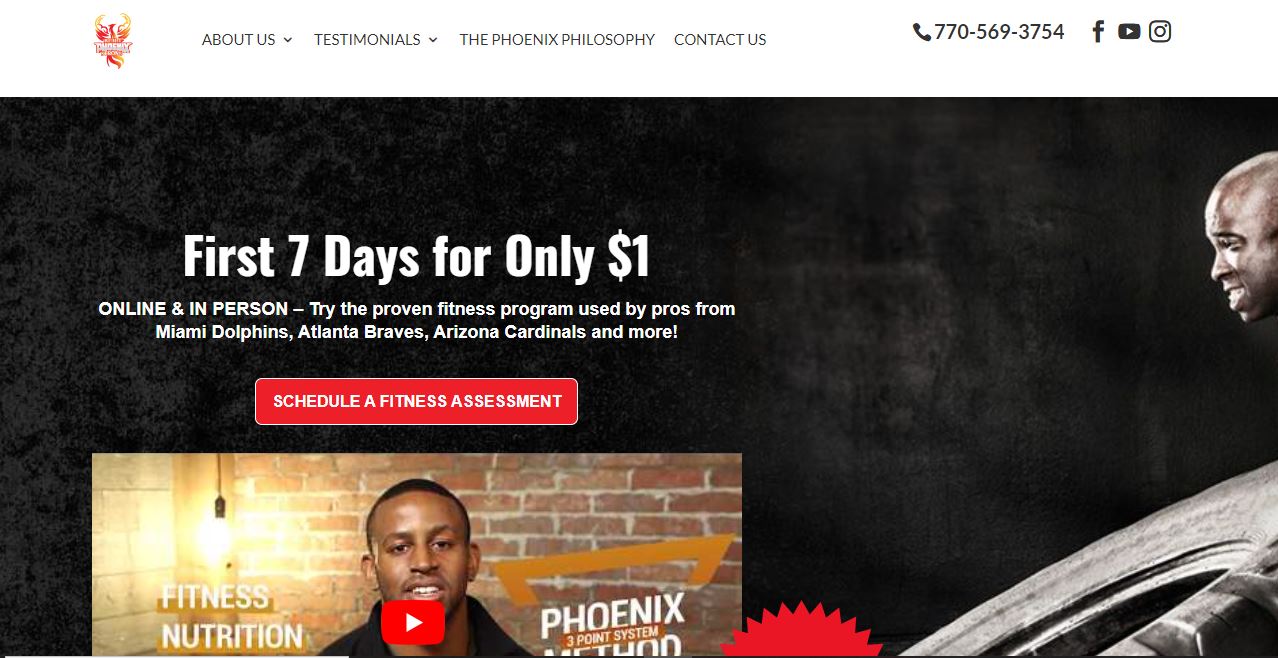
Why’s this a good example to follow?
Placid Ajoku, a personal trainer and the founder of Built Phoenix Strong, uses social proof to his advantage on his fitness website.
He makes a clear offer, then proves his credibility to website visitors by adding before and after photos of previous clients and has a testimonials page that lists several testimonial videos from clients.
And research proves that this is a great idea because majority of consumers trust online reviews, and 4 in 5 consumers believe a video that shows how a product or service works is important.
Key lessons from this example
- Make a clear offer that your target audience cannot resist.
- Use video testimonials, certifications, and any other details that boost your credibility.
9. The Rack
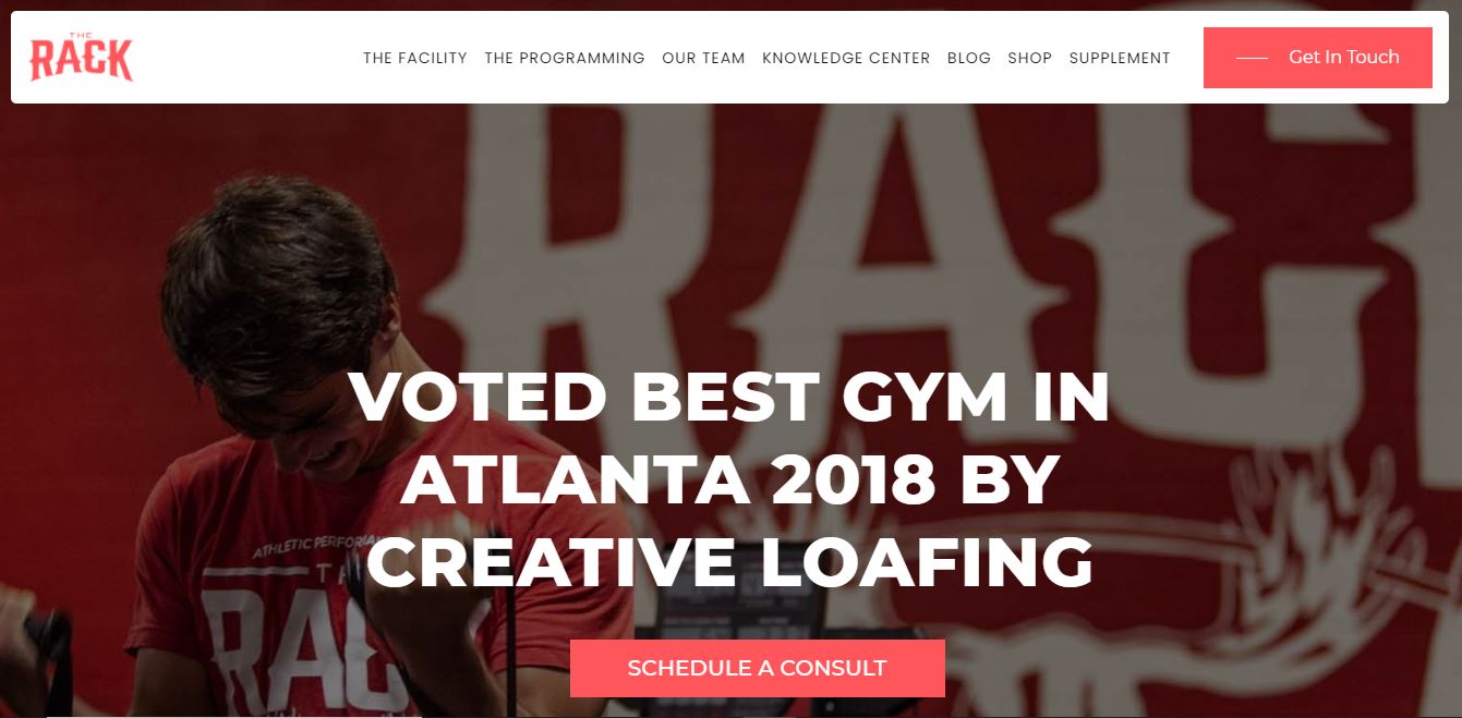
Why’s this a good example to follow?
This beautiful template-based website from The Rack boasts of a consistent color scheme, bold typography, and smooth animations.
It includes a team section, lists the facility’s business hours, and features a blog where they share fitness tips.
It also includes a gallery that contains high-quality images of the facility which is a plus because 67% of consumers consider the quality of product images to be very important when selecting and making a purchase.
Key lessons from this example
- If you can’t invest in video, then use the next best thing — high-quality photos that showcase your facility.
- When choosing a template, choose one that helps you display important information for your customers.
For example, GetResponse’s AI-powered website builder automatically generates a personalized template with important website features, such as contact forms, cookie notices, etc. that you should include on your website.
10. New Jersey Fitness Factory
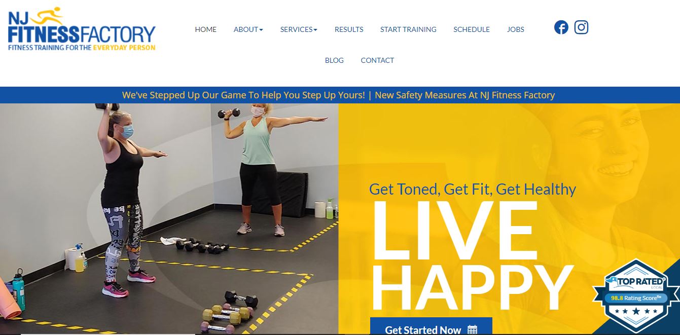
Why’s this a good example to follow?
A key highlight of the NJ Fitness website is the top-rated badge which shows the facility’s overall ratings from five different review websites, including Google My Business and Yelp. This is important because only 48% of consumers would consider using a business with fewer than four stars.
NJ Fitness Factory also has a results page where they share heartwarming customer success stories.
Key lessons from this example
- If your business has great reviews, use them to your advantage.
- Emphasize results when you share customer testimonials.
11. Armoury Coaching Studio

Why’s this a good example to follow?
This personal training studio website from Armoury Coaching Studio is fully optimized for local SEO (i.e.optimized for local searches). The target keywords are used in the headings, meta description, and body text, helping the website rank on page one for the keyword “personal training in Milton Keynes”.
Optimizing for search engines is super important when building a gym website. This is because 70 – 80% of users will research a small business online before their first visit.
Armoury Coaching Studio also uses detailed website copy to explain their products and services. Before and after photos of their current clients serve as proof for prospective customers who want to see how the facility can help them achieve their fitness goals.
Key lessons from this example
- Use before and after photos to establish credibility.
- Optimize your website for local searches. Not sure how? Here’s a quick SEO guide to get you started.
12. Train With Danny
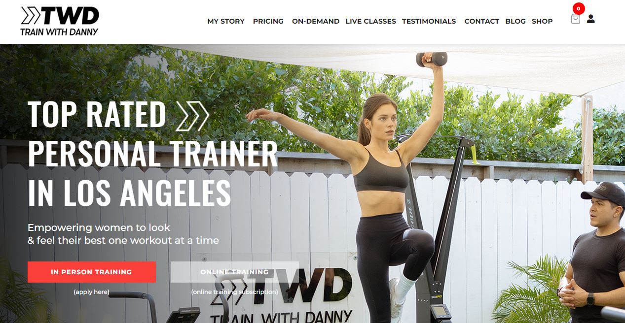
Why’s this a good example to follow?
This is another great example of a fitness site for a personal trainer from Train With Danny.
This SEO-optimized website has all the right features — videos, high-quality images, testimonials, reviews, and an online store where customers can shop for customized workout wear.
Danny’s About Page introduces users to the trainer and helps to establish a connection. In addition, the website’s footer contains links to important social media pages and a newsletter sign-up form.
Key lessons from this example
- If you’re a personal trainer, building your website around your personal brand can help to establish trust and boost credibility.
- Include fitness resources that will be useful to prospective customers — it’s a great way to nurture leads and grow your email list.
Read more: Top 10 Personal Trainer Websites Worth Copying
13. Strength Coach
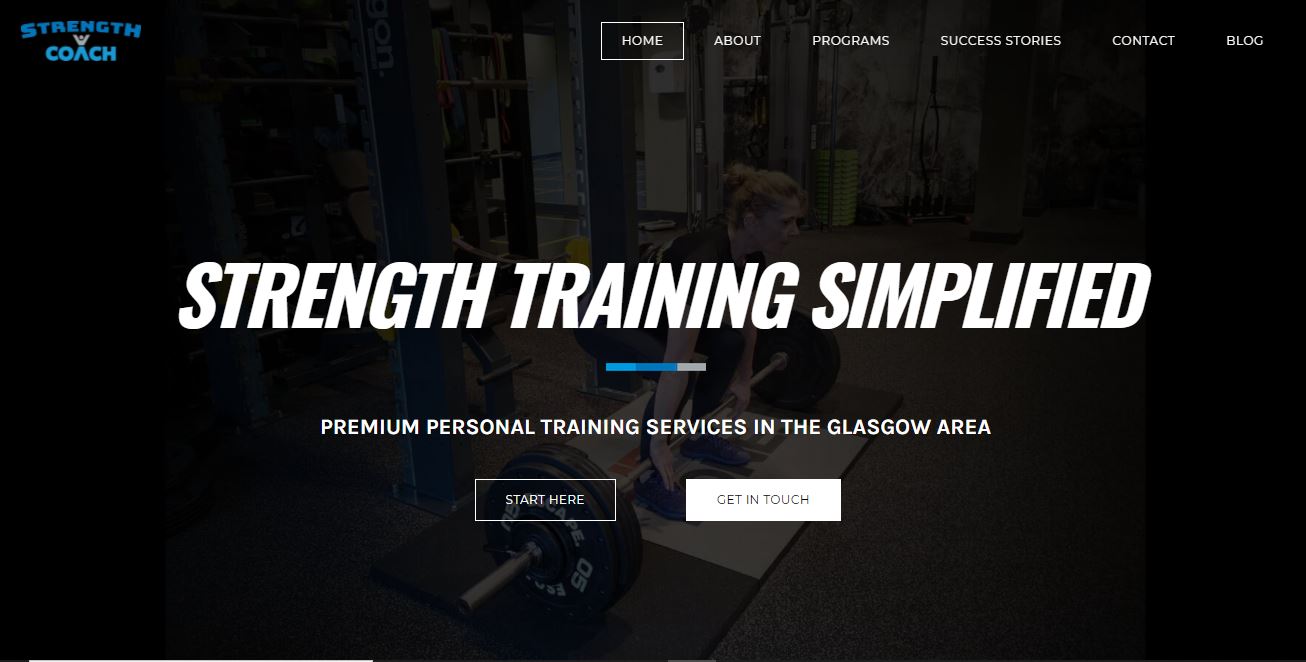
Why’s this a good example to follow?
The fitness industry is extremely competitive and this business carves a niche by focusing on a specific area — strength training. The Strength Training Simplified website highlights their specialization, with certifications and success stories included for social proof.
Key lessons from this example
- Consider focusing on a specific niche. This could help you position yourself better as an expert.
- Include links to your social media handles so website visitors can follow your business pages.
14. Tracy Anderson
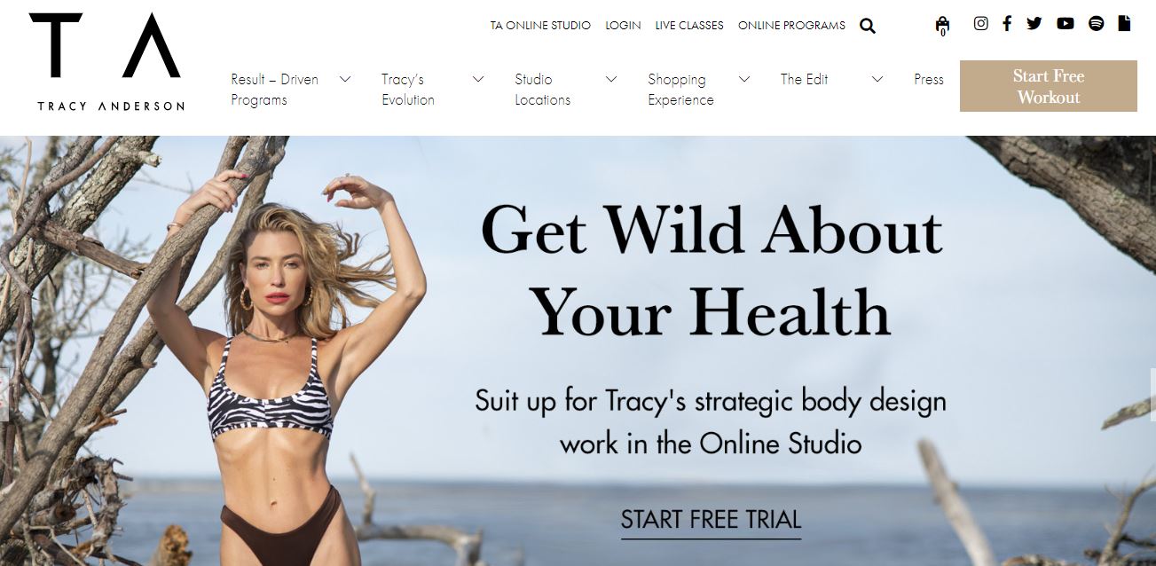
Why’s this a good example to follow?
Fitness trainer Tracy Anderson’s website is a great example of a personal website. Her fitness website is fully focused on her personal brand, highlighting her unique perspective about fitness.
The homepage features a slideshow that highlights important sections of her website, from her workout plans to skincare routines. She also shares several customer success stories, with before and after photos to back them up.
Key lessons from this example
- Leverage your personal brand when creating your fitness website.
- Use your website as a base for all your online activities. If you have a lot of interests or offer a lot of services, make sure to present that information in a way that’s easy to follow and doesn’t overwhelm your visitor.
15. Iron Tribe Fitness
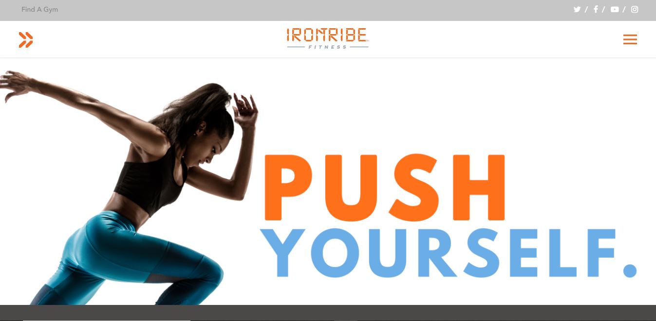
Why’s this a good example to follow?
This Iron Tribe Fitness website uses strong copy and power words. “Push Yourself” in bold font with an accompanying photo on the homepage immediately sets the tone for the entire website.
Research has shown that power words can help to increase conversions. For example, Spring (a print-on-demand ecommerce platform) increased conversions by 12.7% when they changed the language on their homepage by including the power word “you”.
Besides power words, their site also includes an “In the Media” section listing major publications where the brand has been mentioned — for social proof. Their Twitter feed is also neatly integrated into the website.
Key lessons from this example
- Use power words to keep website visitors engaged and boost conversions.
- Highlight your social media activity on your website. Recent activity on social media shows site visitors that your business is a legitimate thriving business with real followers.
16. On The Regimen
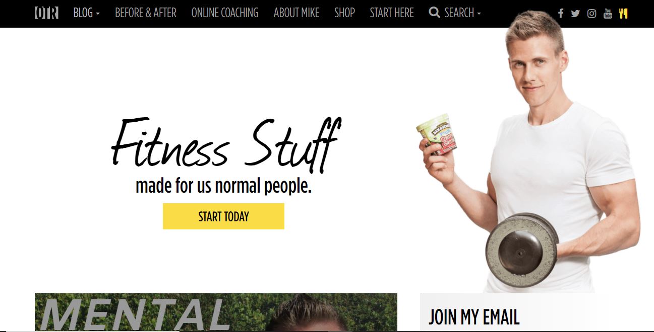
Why’s this a good example to follow?
The On The Regimen website makes great use of white space and focuses on the trainer.
The email newsletter CTA is clearly emphasized on the homepage to encourage new sign-ups. A “first time here” section also helps users find their way around the website.
Besides that, the trainer uses first-person pronouns in his website copy to connect with his audience, making him instantly human and approachable.
The first-person point of view personalizes his story and makes the reader feel like they are reading from a friend rather than a corporate third person.
Key lessons from this example
- If you have lots of content, include a “Start here” section to help new users discover your most important content.
- Let your personality shine through in your website copy because it makes you more authentic and sets you apart from other trainers.
17. Livestrong
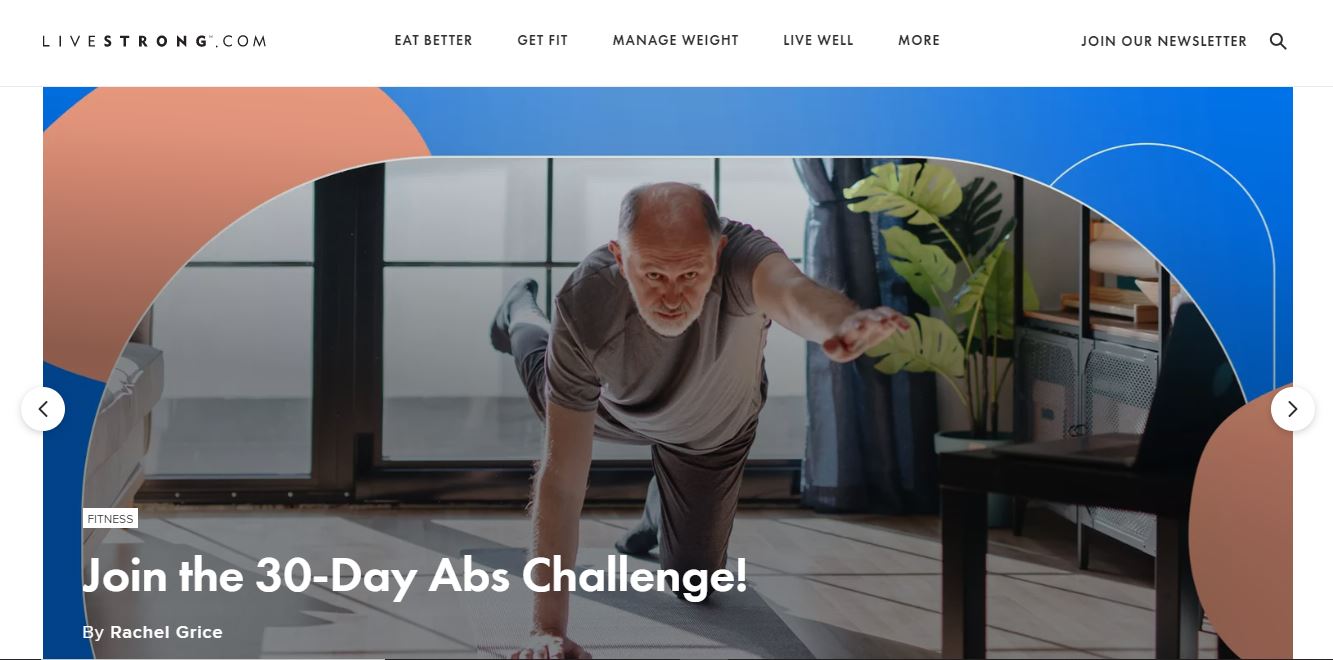
Why’s this a good example to follow?
Livestrong is a content-based health and wellness website that shares helpful fitness tips.
Their website is a masterpiece on how to share large amounts of content in an aesthetically pleasing layout.
Descriptive menu items such as “Get Fit” and “Manage Weight” help website visitors find information quickly.
A pop-up also offers visitors high-protein recipes when they sign up for the Livestrong newsletter — a great idea proven by a study we did that shows that video and text-based lead magnets are the best performers when it comes to lead magnets.
Key lessons from this example
- Use video and text-based lead magnets to boost conversions on your website.
- Use descriptive menus that help users navigate your content easily.
18. Box N Burn
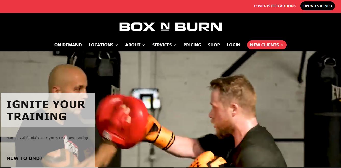
Why’s this a good example to follow?
Box n Burn’s website features in-training videos and photos. The website uses a dark theme to create a rich immersive experience that emphasizes boxing training activities.
A well-designed pop-up also presents a couple of exciting offers to website visitors which is great since research has shown that exit pop-ups can increase conversions by up to 17%.
Key lessons from this example
- Choose a theme and color scheme that matches your brand.
- Use well-designed pop-ups to boost conversions and get more subscribers. GetResponse’s website builder comes with built-in pop-ups to help you win those conversions.
19. Bodyfit
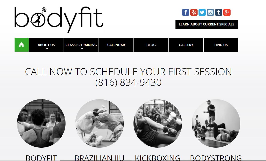
Why’s this a good example to follow?
Bodyfit’s website steps away from the norm by using a boxed layout and presenting information in a compact way. But the design is well-executed.
The website makes great use of white space and the content is presented in an easily digestible layout.
Key lessons from this example
- A compact design can help to present a large amount of information.
- When stepping away from conventional design, keep users in mind and use a consistent layout.
How to make your fitness website with GetResponse AI Website Builder
GetResponse’s AI website builder makes it super easy to create your own fitness website.
You can pick a website template, then customize your website using the drag-and-drop editor. Or you can use the AI-wizard to generate a fully personalized website in a few minutes by following the steps below.
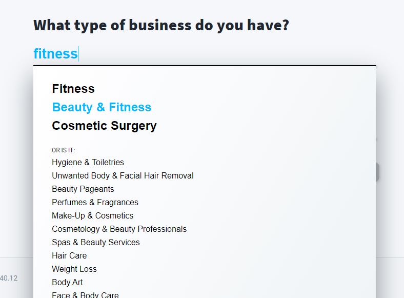
Step 1: Choose your business category
When you launch the AI website creator, you’ll be prompted to choose your business type and the type of website you want to build.
Once you type your business category, the AI intelligently suggests a full list of options in the category. Simply select the option that best describes your business.
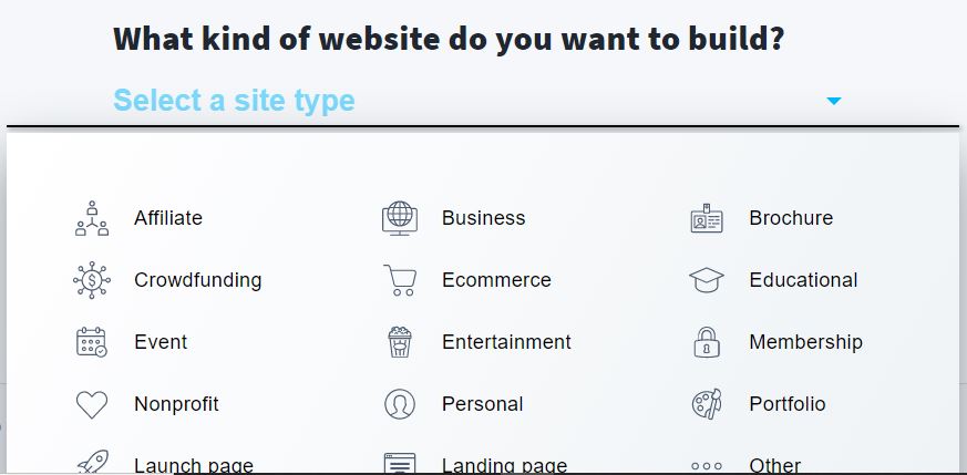
Step 2: Select the type of website you want to create
You can build several types of websites — business, membership, portfolio, personal, etc. As a fitness trainer, you’d likely want to select the business, membership, personal, or educational option; your business model will determine what you choose. Just select the option that best fits your use case.
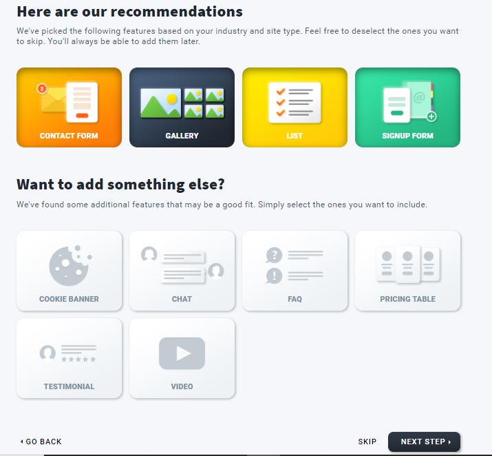
Step 3: Choose the features you want on your website
Next, the builder will make tailored recommendations of features to include on your website based on the choices you’ve made.
For example, you can include a gallery, FAQ, contact form, sign-up forms, cookie banners, pricing table, and more.
Step 4: Choose your preferred colors and font styles
Here, you can upload your logo so the builder will automatically detect the colors or import styles from an existing website.
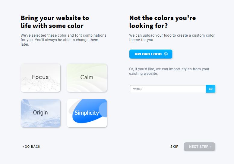
Let the AI do the magic and provide you with a template that reflects all your choices so far.

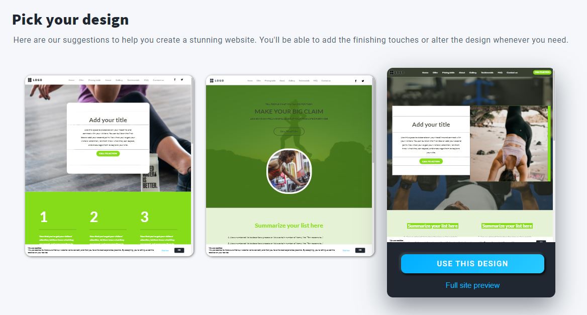
Step 5: Choose your preferred template
Once the builder has made recommendations, select the template that best meets your design taste. The template speeds up the website creation process but you can tweak it as much as you like.
Step 6: Save your progress
All set, pop in your email address and details so you can save your progress and continue to customize your website.
And once you start collecting more customers and you’d like to access more features, you can upgrade to one of the paid plans that include tools like automation, chats, paid ads, webinars, and more.
Summing it up
If you’re in the fitness industry, it’s important to share your skills, services, and know-how online, so prospective customers can find your business.
Whatever your fitness niche, whether it’s bodybuilding, cardio, or weight loss training, a well-built website helps to establish your credibility and helps you build an impressive online presence.
