A picture may be worth 1,000 words, but a top-of-the-line portfolio is worth thousands of gigs.
Research shows that 94% of a website user’s first impressions of a business are design-related, which means that you should be spending just as much time on your web design as you do creating your best work as a photographer.
So if you’re looking to build a photography brand that attracts people you want to work with, you’ve come to the right article.
Let’s dive into 17 examples of the best photography portfolio websites out there, so you can bring your “portfolio dream” to life.
Did you know? With GetResponse’s Website Builder you can make a website of your own in minutes. It comes packed with a variety of ready-made templates, intuitive UI, and uses artificial intelligence to help you build a website from scratch, automatically. Watch the video below to learn what you can achieve with this new website creator and start building a website for your photography portfolio today.
Here are 17 of the best photography portfolio websites we’ve seen
1. thelocals

Why’s this a good example to follow?
From the rapid load time to the single, full-screen image above the fold, thelocals website design is striking. As you scroll, you find collections and recent features, such as British Vogue.
Even more, the rest of the site is littered with classy animations and delightful elements like a grid layout with dynamic movements, informative GIFs, and clever load screens.
Key lessons from this example:
- Your above-the-fold image will have the most impact — make it good and make sure it loads quickly. 51% of consumers said they would stop viewing content if it takes too long to load.
- Use scrolling animations to help your images come to life and keep your audience engaged.
2. Yumpic

Why’s this a good example to follow?
The site features case studies that not only display the creative photography work they’ve done but also how their clients used it on social media. Bringing a project from start to finish like this helps your audience envision the impact your services will have on their goals.
Yumpic’s lead photographer, Helen, also leverages blogging to build trust with potential clients and drive organic traffic from search engines (like Google and Bing). And that’s a better use of a portfolio than just using it to showcase previous work.
Key lessons from this example:
- Include impactful results upfront. This helps to build trust with new clients (which helps later with justifying your rates).
- Include a blog to write about your particular methods or tips — from styling to editing techniques. You could even include some tutorials in your blog — this shows you know your stuff.
3. Liam + Bee

Why’s this a good example to follow?
There’s no doubt that wedding photography is a competitive market, so you’ve got to stand out. Using a mix of standalone images and photo gallery-style blogging, The Liam and Bee’ site helps couples visiting their site understand what they’ll be getting by working with them.
Another important feature on their portfolio site is that their pricing is placed up-front — this is a decision you’ll have to make for your own portfolio, but 56% of wedding photographers do list their prices visibly.
Key lessons from this example:
- Complement your work with graphic design and snappy copywriting to help clients get a feel of who you are and how you’re the best photographer for the job. Don’t consider yourself much of a writer? You can find examples of great copywriting pretty much anywhere.
- Don’t be afraid to list your pricing. Depending on what your rates are, displaying them may limit the number of people reaching out to you, but it will help to weed out people who aren’t in your range and save you some time.
4. Paolo Pettigiani

Why’s this a good example to follow?
From his trademark infrared photography to unique web design functionalities such as hovering over project titles to reveal a signature photo, Paolo Pettigiani takes his potential clients on a journey.
His home page prominently displays reputable work he’s done with clients such as Adobe and Affinity Photo. He also adds an entire section of his portfolio dedicated to his passion projects to showcase his personality.
Key lessons from this example:
- Big headlines grab attention. If there’s something you need a client to know about you, make it the main event.
- Keep your load times short. Not only is this crucial for SEO, but long load times mean your clients will bail. 47% of users expect fewer than 2 seconds of loading time. Optimize for load time — no matter how many photos you feature.
5. Las Coleccionistas

Why’s this a good example to follow?
Las Coleccionistas is a pair of professional photographers that have a niche in stop motion photography. By combining moving images with still ones, the dynamic grid layout of this site is the perfect blend of pop and delight.
After all, it takes only 50 milliseconds for visitors to judge your site and decide if they’ll stay or leave. That means whatever loads first is often your only shot to impress a client. So what they see first should make them want more.
Key lessons from this example:
- Your portfolio is just as much about the experience as it is about your amazing photography. Use delightful functionalities such as interactive elements and animations for a competitive edge.
- Not ready to book yet? Las Coleccionistas also has an unconventional newsletter to collect and maintain warm leads. That’s thinking ahead!
6. Ashok Sinha Photography
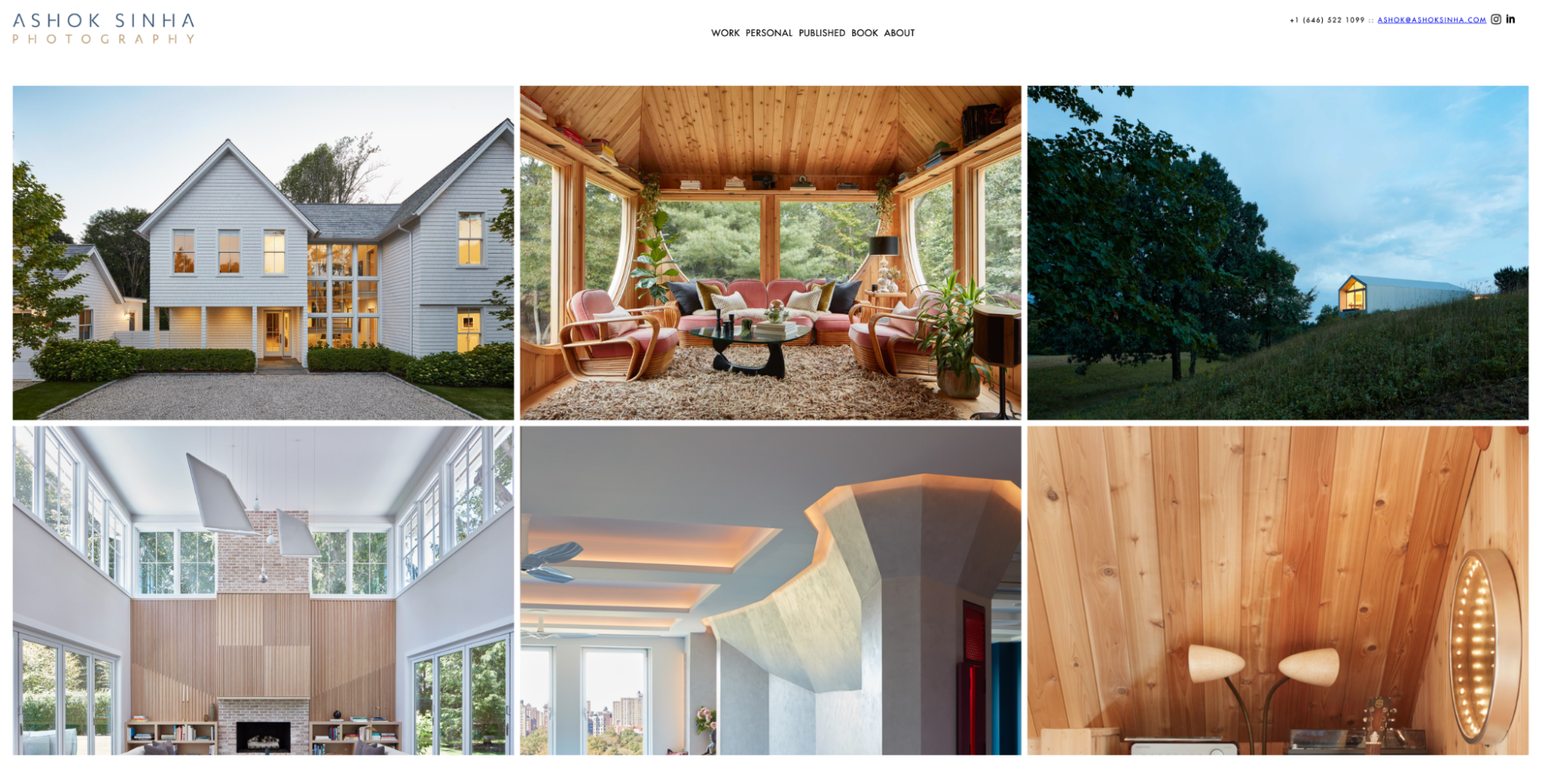
Why’s this a good example to follow?
Using a clean, grid layout, this New York photographer’s site is slick. It has a minimalist layout for all pages making it easy to navigate. Any visitor could spend quite a bit of time browsing through different projects and photos on any device.
Key lessons from this example:
- One of the major advantages of a simple design approach is mobile responsiveness. Sloppy portfolio site on mobile? 57% of web users say they won’t recommend your business if that’s the case.
- Your most important information should be above the fold — whether that’s a way to get in touch or navigation to projects worth noting.
7. Matt Porteous

Why’s this a good example to follow?
Like many website templates, Matt’s contains a mix of content blocks. It also includes a variety of actions you could take, including joining a mentorship program.
Matt also adds several videos on his website which help to increase his site’s organic traffic. After simply adding videos to existing pages, Lemonlight, a video production company, reported their organic site traffic rising from 10% to 250% in volume. Video clearly has a lot of impact on SEO, which is probably why Matt includes some on his homepage and throughout his website!
Key lessons from this example:
- Include videos on your pages to rank higher on Google and convert more potential clients. Statistics show that viewers spend 2.6x more time on a webpage that has a video than one without.
- If you have different packages, provide clear Call-To-Actions (CTAs) to the next steps for each option.
8. Mijoo Kim

Why’s this a good example to follow?
Another New York-based photographer, Mijoo Kim shows how online photography portfolios are more than just pretty pictures. Each case study on his site includes written context, even though it’s often short.
Mijoo’s “About” page also includes a full CV — ideal if you’re looking to be hired for a full-time gig or want to build credibility using your work history. So this is a great blend between a portfolio and a personal website.
Key lessons from this example:
- Take advantage of human viewing patterns. We know that most visitors will read what’s on the top left first and read in an “F” shape from left to right and then down. Use your real estate wisely!
- Some art needs no explanation… but most art does. Including a caption or blogging about your work can provide needed context for your work.
9. Xavier Portela

Why’s this a good example to follow?
Xavier Portela combines flashy neon photography with a scrolling effect that makes you feel like you’re traveling through his projects. The site also includes a non-obtrusive banner to let visitors know that his photography can be purchased.
Key lessons from this example:
- Use banners to attract attention to certain parts of your website or campaigns that you’re running. For instance, including a countdown timer if you’re offering a special deal motivates clients to make faster decisions or get in touch.
- Scrolling is more than just getting to the next content block. It’s an opportunity to interact with your work and feel immersed in your art.
10. Joee Wong

Why’s this a good example to follow?
Choosing a wedding photographer is more than just about beautiful photos.
It’s about the experience you’ll create and the trust you’ll build with the couple. Joee’s photography business rests on creating magical moments for couples around the world — and his site reflects that.
He even includes a blurb on each couple in his case studies showing off just how much he gets to know his clients.
Key lessons from this example:
- Testimonials play a huge role in finding the right fit for your client’s big day. 72% of consumers will take action only after reading a positive review.
- When you work intimately with individuals, families, and couples, it requires a human touch. So show your empathetic side through your content and case studies.
11. K.63 Studio

Why’s this a good example to follow?
You may not know it at first glance, but each mini item on this portfolio has an entire project behind it. Click and you’ll reveal dozens of photos like it. Despite the volume of works displayed on this site, it doesn’t feel overwhelming. Rather, it comes off as a bit of an adventure.
Key lessons from this example:
- Leave a bit to the imagination. With a little hover animation, encourage your viewer to click and reveal something great to reward the exploration!
- Where there’s a lot of text, make it easy to scan. Studies show that visitors will only read about 20% of the text on the average page.
12. Cori Corinne

Why’s this a good example to follow?
Can you tell that this photographer has a passion for typography? You probably don’t need to click through to her “About” page to find out. And this echoes the old grade school phrase “show, don’t tell.”
Key lessons from this example:
- Complement your work with bold typography. Cori’s web design looks like a magazine or newspaper aesthetic, which aligns perfectly with the photography style.
- Language matters. Even the menu items sound straight out of a journal or paper. Studies show that readers only consume about 20% of the content on a page, which means you need to make every word count!
13. Alena Saz

Why’s this a good example to follow?
The pressure for a stunning portfolio is on when your niche is fashion photography. This photography template is similar to some other portfolios we’ve seen, but it’s effective for a photographer whose work is typically displayed in magazines. The layout flatters her work, just as it should!
Key lessons from this example:
- Pick a design that works for your industry. Grid layouts are great for fashion photographers, while feature image style may be more appropriate for landscape photographers.
- Do you work with celebrities or public figures? If that’s part of your mix, it’s worth highlighting in a section.
14. Atelier Karasinski

Why’s this a good example to follow?
Adding a bit of texture to the site with a sticker draws attention to the main call to get in touch. Scroll down and you’ll also see layers of accolades, services provided, and more. This comes together to make it clear that this crew knows what they are doing.
Key lessons from this example:
- Choose your main image carefully. Visitors spend nearly 6 seconds looking at a website’s hero image.
- Never underestimate the power of a CTA. 70% of small business websites don’t have one on their homepage! Whether it leads deeper into your work or to a contact form, include a CTA (ideally above the fold).
15. Caitlin Fullam

Why’s this a good example to follow?
This fine art photographer doesn’t shy away from a bold image.
Not only that, she knows how to drive sales too; almost immediately as you scroll, there’s also a quick prompt to get in touch. This includes a short bio to help prospective clients get to know the photographer and what she values in collaborations with them.
Instagram is a platform that Caitlin prioritizes and with over 34,000 followers, most prospects would be quite confident in her skills should they visit her profile.
Key lessons from this example:
- Use features like a progress bar that indicate your progress on the web page to help visitors understand there’s more to see and scroll to (check out Caitlin’s on the left-hand side of her homepage).
- Social media integration makes it easier for folks to follow you and your work. Include it in your footer to add a little meat to your site.
16. Aditya Patkar

Why’s this a good example to follow?
This portfolio boasts some great sections — including an entire page of recognizable brand logos. This is a lean way to stand out and build credibility with your website visitors. Each page has a footer with Aditya’s other accounts and spaces to follow. This helps you stay on a potential client’s radar even before they’re ready to book your services.
Key lessons from this example:
- Try out a slideshow on your homepage to keep the focus in one space but still allow for variety.
- Provide an option to download your portfolio as a PDF, making it easier for prospects to keep your work and pass it along to others.
17. Mitch Rouse Aerials

Why’s this a good example to follow?
The major upside to working in aerial photography is that you end up with quite an arsenal of sweeping, beautiful photography. It also means that you can get into a fairly lucrative niche — stock photography. The eye candy throughout Mitch’s site makes it a no-brainer to hit that “purchase” button.
Key lessons from this example:
- Offer more than just photography? Mitch Rouse includes direct links to where you can buy his photos on his online store.
- Understanding what your clients value inspires sections like Mitch’s “Zoom” page – this is where you can Zoom in to extreme levels and see just how crisp his images are.
Related posts:
10 Mistakes to Avoid When Creating a Photography Website.
17 Graphic Design Portfolio Examples and How to Create Yours
39 Profitable Website Ideas to Build an Online Business
11 Tips on How to Create a Photographer About Me Page
Other questions you may have on photographer portfolios
What should you include in your professional photography portfolio?
It’s often your first impression, so put your best work forward! There’s no single template for exactly what to include in your portfolio, but here are some things to consider:
- Your best photos – This could be photos of celebrities or public figures, projects that were particularly impressive, or work with established brands in your niche.
- Credibility boosts – This includes accolades and awards, or recent features in well-known publications or ads.
- Testimonials – Social proof is powerful. Most consumers trust user reviews as much as personal recommendations.
- Videos – Having a video on your homepage boosts your SEO ranking, which attracts even more traffic.
- Contact information – 44% of website visitors will leave a company’s website if there’s no contact information. You may even consider adding a live chat function for an integrated means of getting in touch.
- Pricing – If you have a flat rate, package deal, or hourly fee, don’t be afraid to put it on your website. This helps weed out people who aren’t in your price range.
Pro tip: No matter what you include, there are two things that you must have — a fast loading portfolio, and a mobile-responsive site. If either of these isn’t optimal, you’ll lose your visitors!
How many photos should you include in your own portfolio?
Include as many photos as possible, as long as they’re showing excellence in your work. Always choose quality over quantity, but if you have a nice, full body of work that meets your quality standards, don’t hesitate to strut your stuff.
Where should you host your photography portfolio?
There are free and paid platforms you can use to host your portfolio.
Social media pages are an example of a free hosting platform. Websites are good examples of paid platforms and oftentimes, they help you position your photography brand in a place of authority. While platforms like Instagram are excellent at attracting potential clients who love your style, there are plenty of reasons to have a website, as it’s a more professional platform.
If you’re going the website route, GetResponse website builder can help you build a beautiful photography portfolio website. Whether your style is minimalist or loud, intuitive platforms like GetResponse can help you bring your body of work to life. This makes a difference because judgments on a company’s credibility are 75% based on the web design.
So, what’s next?
If you want to attract new and exciting clients, you need to have an online presence — whether that’s a rocking website or a simple social media account (or both).
When executed the right way, your website can be your strongest advocate and your mightiest marketer for your photography business — no matter the competition.
With powerful tools such as GetResponse photography website builder, you no longer need a web designer. You can build a bespoke website that speaks to who you are and what work you want to represent you so that clients who align with your values will come pouring through the door.
