How to use Basic blocks to create a message? Video
Basic blocks are the most important part of every message creation process. They hold your entire message content and allow you to build your message the way you want it to look. With Basic blocks you can add images, text, buttons, video and more.
Use Basic blocks to create engaging messages in no time. Setting up your monthly newsletter or a special promo offer is quick and intuitive.
Mix and match the blocks however you like in your sections to achieve the desired effect.
How to add a basic block to a message?
In order to add a basic block to a message:
- Navigate to Layout in the message editor.
- Expand the Basic blocks section.

- Select your basic block and drag and drop it to your message. Once you drag the block into your message, the properties of the block will open on the right-hand side menu.
How to move, save, duplicate or delete a block?
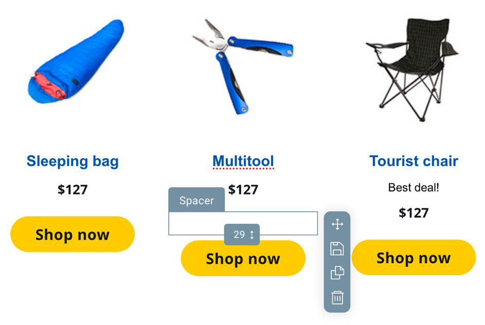
If you want to move, save, duplicate or delete a block, click on or hover over it and then use the menu on the side.
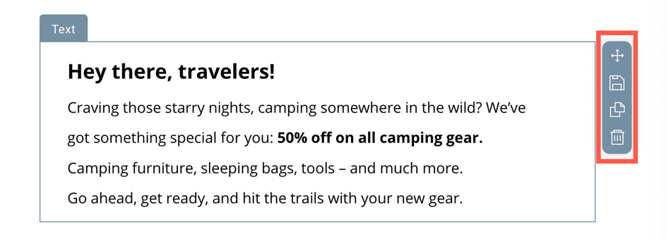
1. Move – hold the first icon and drag your block into the desired location.
2. Save – use the floppy disc icon to save your block into your reusable blocks. A pop up will open up with the preview of the block and a place to type in the block name. Then just click Save.
3. Duplicate – the third icon allows you to duplicate the block. The copy will be placed beneath the original block.
4. Delete – click the trash can icon to remove the block
What types of blocks are available?
We offer a variety of blocks to help you create the exact content you need. Below you can find the list of all the blocks and their options.
Image
An image block is one of the most useful blocks. Use it to add a photo or a graphic file to your message. After editing and styling the image, you can save it to My blocks and reuse it in different messages.
Drag and drop the image block from Layout >> Basic blocks into position. Then add your image either by uploading it from Files and images or from a URL.
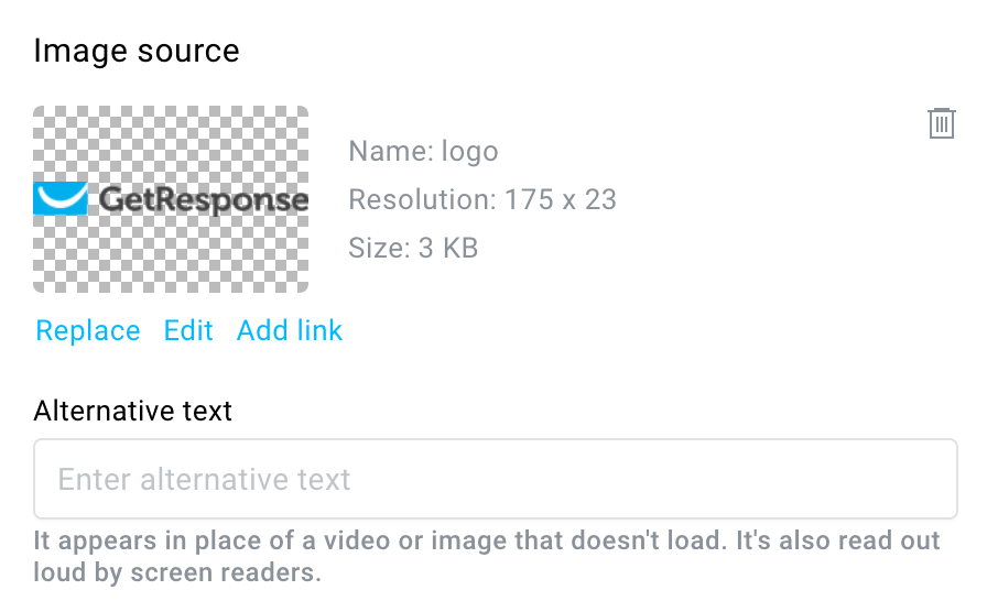
Once your image is added, click on it to open properties on the right side.
You can do the following:
– Replace the image.
– Edit it in a photo editor by cropping it, setting filters, adjusting colors, setting focus, adding text and stickers, using brush, adding frames and overlays. Learn more about the photo editor.
– Add link to the image. You can link it to a website, landing page, webinar, dynamic content, email address, phone number. You will be able to edit or remove the link after adding it.
– Delete it.
– Add alt text.
When you edit the image in the photo editor, you’re making changes to the image copy added to your message. The original image will stay intact. The image will stay in the message even if you remove it from Files and images.
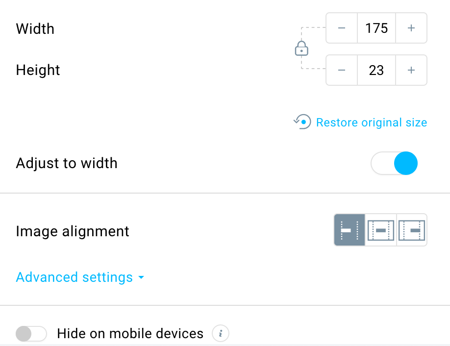
You also have additional editing options such as:
– Changing the width and height of the image.
– Restoring the original size of the image.
– Changing image alignment to left, centre or right.
– Hiding the image on the mobile version.
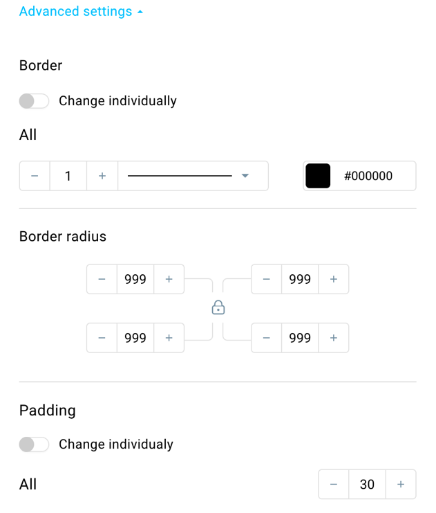
Apart from that, there are expendable Advanced settings which include:
– Setting image border,
– Adding border radius (you can use it to make your image rounded),
– Adding image padding (setting the space between the image itself and the block border).
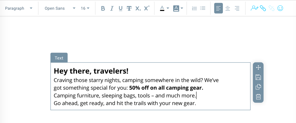
Text
The text block is another crucial and most used block. It allows you to add text to your message and style it according to your needs. You can choose paragraph styles, link part of your text, use different fonts in one text element and more.
As with images, after styling your text block, you can save it to My blocks and reuse it later.
Use the text field to add news, describe your products or create an engaging narration to promote your business.
Drag and drop your text block into position from Layout >> Basic blocks and you can start editing it.
Click on the text block to add some text and style it from the menu at the top.
Your styling options include:
– Selecting a paragraph style.
– Selecting a font and font size for a part of the text or all of it. You can also choose webfonts as your font. Learn more here.
– Choosing your font styling.
– Adding font color and font background color.
– Creating a numbered or bulleted list.
– Aligning the text to the left, centre, or right.
– Adding personalization.
– Linking text or a part of it and removing the link.
– Adding emojis to the text.
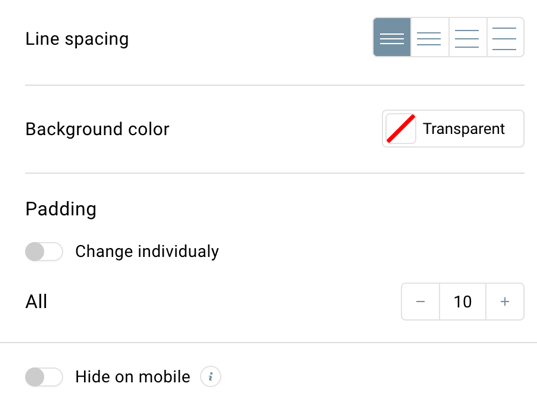
Apart from that. From the side menu you can set up properties for the entire block, such as:
– Line spacing,
– Background color,
– Padding (setting the space between text and the border of the text block),
– Hiding the block on the mobile version.
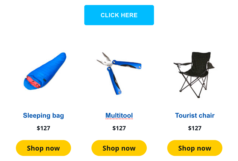
Button
The button block is a way to add a link going to a specific website, filed to download and more. Buttons are a way to create a Call to Action and attract the attention of your readers to that particular element.
You can place as many buttons as you need, but in order to place them next to each other horizontally, you need to use a multiple-column section first. Otherwise, you can place one button per line.
Drag and drop the block element from Layout >> Basic blocks to your workspace.
The properties of the block will open on the right-side menu.
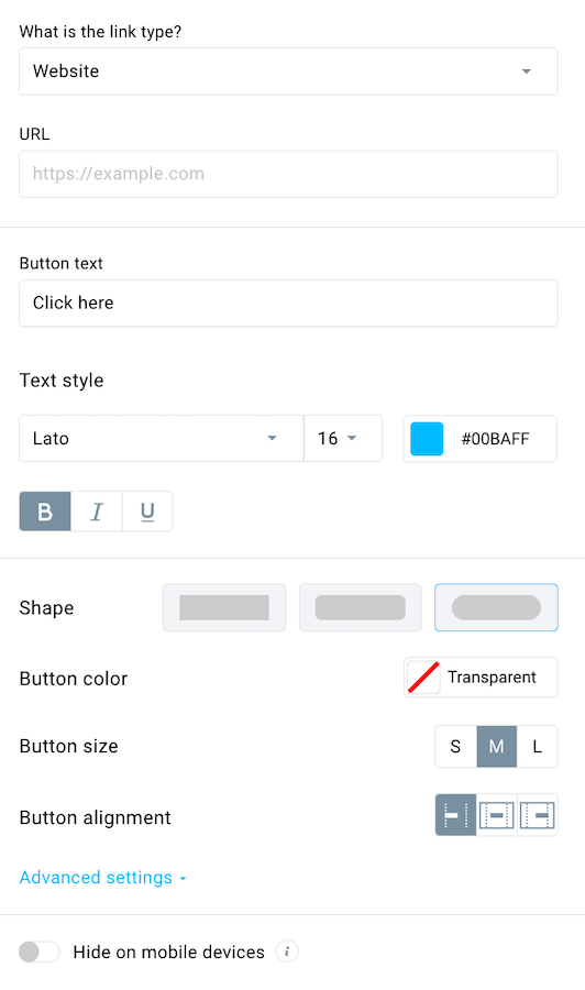
You can set up the button using the following option:
– Select a link type. These include linking to a website, landing page, webinar, dynamic content, email address or phone number. Depending on the link type either provide the URL/email/phone number or select your option from the dropdown.
– Change your button text. This is the text that will display directly on your button.
– Choose the font, font size, color and styling.
– Select the button shape.
– Change the button color.
– Set your button size.
– Decide on the button position.
– Hide the block on the mobile version.
If you expand Advanced settings, you can also:
– Set the background color for the entire block behind the button.
– Add and change the border of the button.
– Set up border radius.
– Change button size.
– Change padding (space from the border of the button block to the button itself).
Video
Adding the video block to your message will greatly increase your contacts’ engagement with the message. Video is a great way to promote your content and attract the attention of your readers. You can use this block to redirect people to your video. The best practice is to add a video after your message text content, in order to not distract your readers from the main points of your message or drive them away from your email.
Since most email clients don’t support playing a video in the message directly, we pull the default thumbnail from your video and overlay it with a play button. The whole block is linked to the video of your choice. When someone clicks it, they are automatically transferred to a tab in your browser where the video will play.
We support videos hosted on YouTube and Vimeo.
Drag and drop the video element from Layout >> Basic blocks.
Once the block is placed, the properties will open up on the side menu.
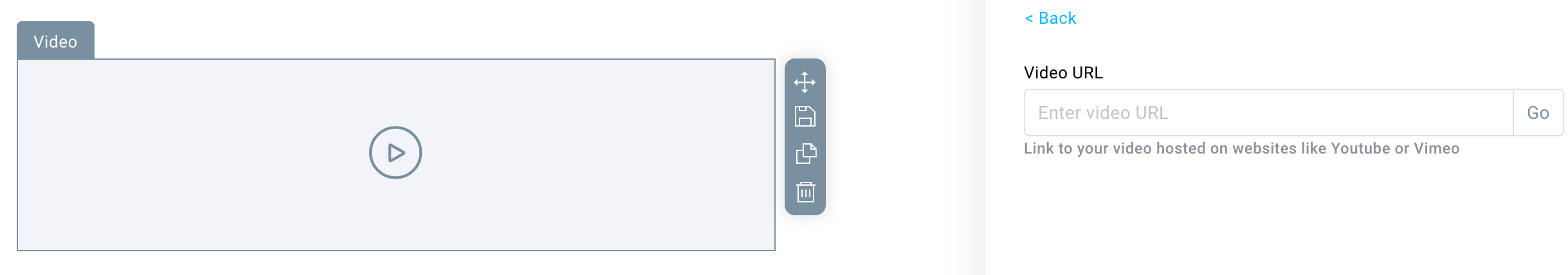
Provide your video URL and press Go to display full properties.
Once your video is loaded, you will have access to the following settings:
– Add alternate text for cases when the video doesn’t load, or someone uses a screen reader.
– Decide on the play button shape.
– Select the play button color.
– Set up the width and height of the video inside the block.
– Enable adjusting the video to the full width of the message.
– Change the video alignment.
– Hide the block on the mobile version.
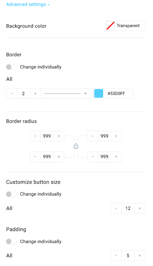
Apart from that, you can expand Advanced settings, to adjust:
– the video border,
– border radius to make your video rounded,
– padding (the space from the video to the video block border).
Spacer
The spacer block is a tool to add some whitespace to your messages in order for the content to not appear “crowded”. It can also be used to level out length differences, for example in columns that showcase your products. Adding spacer simply means adding space in your message. Spacer should replace using “Enter” when looking for additional empty area. It can also be a great way to add some whitespace between your sections if you’re looking to create a clear and lean looking message.
To add spacer, drag and drop it from Layout>> Basic blocks to your message wherever you’re looking to add some whitespace.
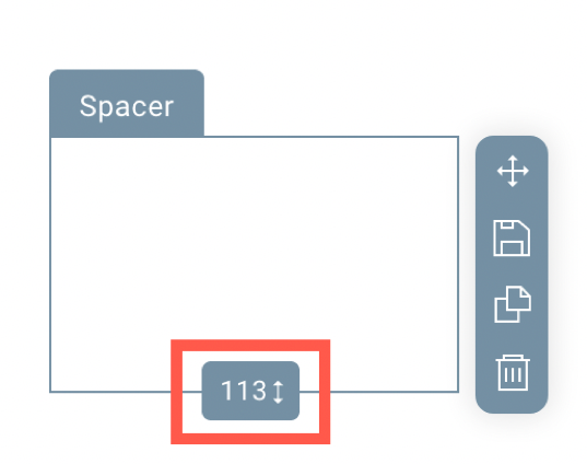
To change the height of the spacer, click on it and drag the bottom handle down or up.
Additionally, in the properties in the side menu, you can:
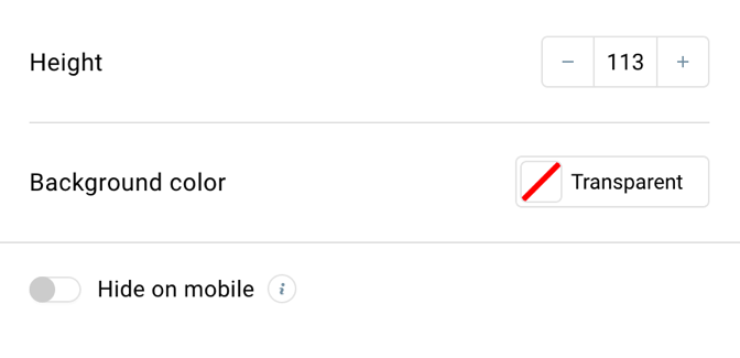
– type in the spacer height,
– change the background color,
– hide the block on the mobile version.
Divider
The divider block allows you to visually distinguish different sections of your message. Use it to create more clarity or breaks between your content. Dividers can only be horizontal. It is a supported block in email clients, so that element will display the same way on different devices and clients.
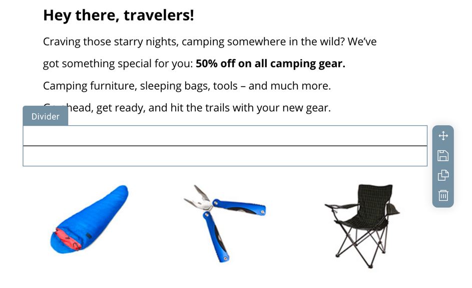
Drag and drop the divider element from Layout>>Basic blocks and the properties on the side will open.
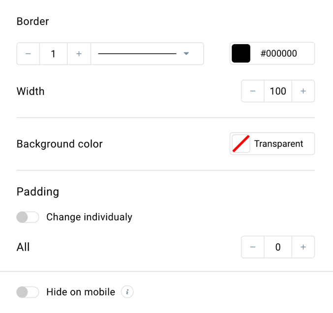
From there you can set up:
– The divider border size.
– The line type.
– The divider width.
– Background color for the entire block.
– Padding (the space from the divider to the block borders). Please note that increasing the padding will make your divider shorter. You can change padding individually to avoid that.
– Hide the block on the mobile version.
Webinar
The Webinar element allows you to create and send invitations to webinars directly from the GetResponse email editor. It integrates seamlessly with webinars hosted on GetResponse, enabling recipients to register with a single click.
Once the block is placed, the properties will open up in the side menu.
- Choose which webinar you want to promote in your email. Note: You can only select from upcoming live webinars that have not yet taken place.

- In the Fields section, you will be able to edit:
- Webinar title

- Date and time section

- Button

- Webinar title
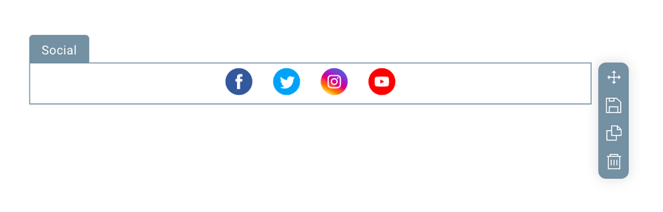
Social
The social block allows you to add icons of your chosen social media to the message. Using them people can either start following your social profiles after clicking on the icon or share your newsletters on social media platforms. These are great to increase the reach of your message and grow your social media following.
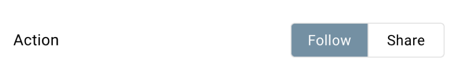
To add social media icons, simply drag and drop the Social block to the message. By default, we will display the Follow settings for the blocks. To switch it to Share settings, just click Share at the top of the properties.
Note: one social media block can either have follow or share settings. If you wish to include both options, you will have to add two social blocks, one for following, one for sharing.
Once you drag and drop the social element from Layout >> Basic blocks to the message, the properties for your social media platforms will display. Initially, we display four social media platforms you can share with your readers.
In the Follow option these are:
– Facebook,
– X,
– Instagram,
– YouTube.
In the Share option these include:
– Facebook,
– X,
– LinkedIn,
– Pinterest.
You can also add more social media platforms.
To the Follow option you can add:
– LinkedIn,
– Pinterest,
– VK.
To the Share option you can add:
– VK.
You can manage the order of the social media icons by dragging and dropping the specific platform to a different place using this icon:
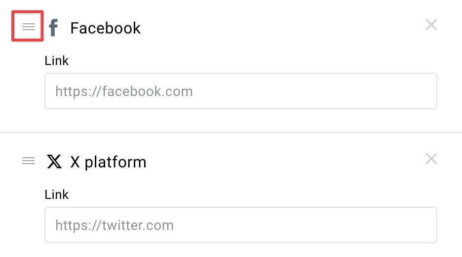
To remove a social media icon from your message, just click the X icon.
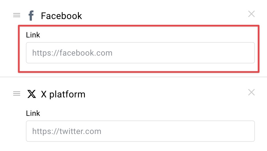
In the Follow option, configure your social media icons by providing a link to your social media page. When someone clicks on the icon, they will be transferred to that page. The clicks on the icons in the email are tracked.
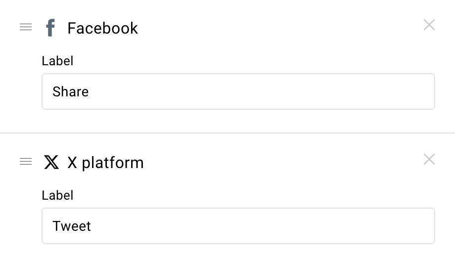
In the Share option, the links are generated automatically to allows sharing of your content. They will publish the online preview of the message. All you need to configure is the label. The clicks on the icons in the email are tracked.
Below the social media settings, you can change the properties of the block.
The options include:
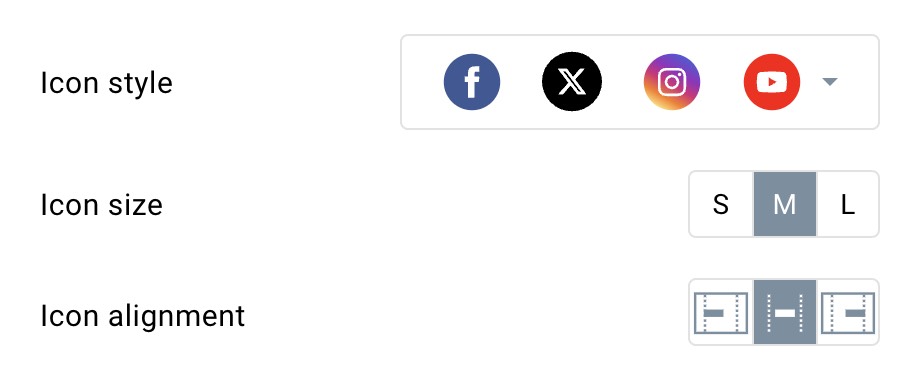
– Changing the icon style (the set of icons there doesn’t reflect your selected social media).
– Setting up the icon size.
– Deciding on the position of your icons (left, centre, right).
– (For share mode) setting up the label text style (font, font size, color and styling).
– Hide the block on the mobile version.
If you expand Advanced settings you get to:
– Change the background color.
– Change icon spacing.
– Add padding to the element (the space from your icons to the social block borders).
Note: The social media block has a transparent background. To change the background behind them you need to change the color of the column or section it’s placed on.
Custom HTML
Custom HTML is a block that allows you to add custom elements or styling to your message, by providing HTML or CSS code.
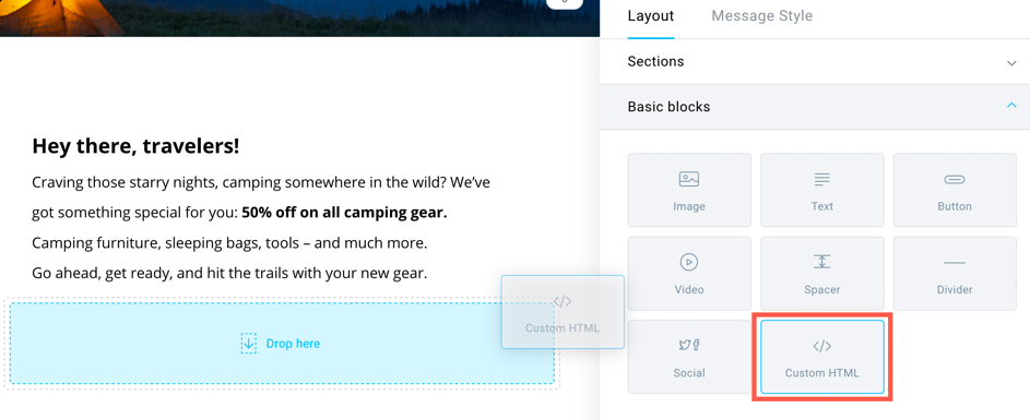
Drag and drop it from Layout>>Basic blocks and type in your code or paste it. When pasting, make sure you’re using a plain text editor, such as notepad. Pasting from Microsoft Word or similar word editing software can add unwanted formatting to your code.
Learn more on the Custom HTML block here.


