Launching a product online can be daunting, especially if your business is bootstrapped.
You have several other parts of your launch to take care of.
And it takes time to put together a successful landing page that has the right copy, layout, and call to action to drive signups.
But you can eliminate the stress of launching new product landing pages by using landing page templates. They are an easy way to build effective, single product landing pages that boost lead generation.
So here are 10 landing page examples from our product landing page templates that’ll help you drive more signups.
Before you begin:
New to landing pages? Read our guide on how to create a landing page from scratch. And if you’re looking for optimization tips, consider this post on landing page best practices.
1. A simple product landing page

Driving signups using simple, straight-to-the-point landing pages is the oldest trick in the book for lead generation, and there’s a reason for that — they work.
This template has all the essential features of a digital product landing page:
- A bold headline: The main goal of any product landing page design should be to reassure your visitor that they’ve been redirected to the right page.
After all, it’s likely they’ve arrived there by clicking on a link from social media or a Google advertisement, so you need to be clear that they’re in the right place.
This headline should also reaffirm the offer you had in your social media post/advertisement, which in this case, is the product’s value proposition.
- Striking images: There are two high-quality images on this landing page — one to catch the visitors’ attention, and one further down that will relate back to your product.
They not only make the page more aesthetically pleasing, but research says 80% of users are more likely to read content that’s paired with bold, attention-grabbing imagery.
- CTAs: You’ll also notice that while there are two calls to actions, they both have the same message — “Sign Up Now.” Wishpond’s Claire Grayston agrees that incorporating multiple CTAs on a landing page works if they’re working towards the same conversion goal.
“For example, a long landing page may have a CTA button on the right above the fold stating “Download my ebook now” as well as a picture of the ebook at the bottom of the page with a button stating “Get it now!”…the key is that they have the same call-to-action,” she says.
“Asking visitors to complete multiple actions can lead to a decrease in conversions. Always have one goal for your landing page, and one goal only.”
Related: Lead magnet examples that’ll grow your email list
2. A mobile app landing page

Your landing pages should always be mobile-friendly.
The best product landing page templates, like the one above, are multipurpose. The page layout will convert to mobile effortlessly while keeping the same form if it’s viewed on a desktop.
With this template, you can replace the image on the right-hand side of the landing page to complement your product launch while keeping the focus to the left-hand side of the screen — the product itself.
Another plus is that while the image adds aesthetics to the page, it’s not clickable. Research by Marketing Experiments found that 42% of offer-related graphics on landing pages are not clickable, which is important for keeping your visitors focused on your product offer.
If you have too many clickable graphics or links, it increases the chances of your visitors leaving the landing page and looking at other parts of your website. And you definitely don’t want that.
With this page layout, your leads will be focused on filling out the contact form instead of scrolling.
Finally, the landing page has a simple set of social links where visitors can find out more and stay in touch with you, which is a good way to boost followers!
Read more: Best ebook landing page templates
3. A landing page with video

This landing page has a secret weapon — a video.
Just below the fold of the contact form, this landing page template lets you insert a video to boost signups. This is important because research has found that including videos in landing pages can increase conversions, on average, by 86%.
However, where you place the video on the landing page can impact user experience too. This landing page template keeps the contact form and call to action at the top of the page. And if a visitor needs a little more convincing and keeps scrolling, that’s when they’ll come across the video.
Notice that there’s another CTA next to the video? That’s important to remind the visitor of what you want them to do — sign up.
This landing page ticks a lot of other boxes, like contrasting color schemes between backgrounds and CTAs as well as a space to add customer testimonials. But it’s the video that makes this template one that will definitely drive signups!
Read more: Inspiring thank you page examples
4. A “one ask” landing page

A big mistake some marketers make when they’re launching a product is that they make their landing pages too complicated.
Perhaps it’s writing too much copy or asking visitors to fill in a contact form with way too many fields. But when you’re trying to drive signups, sometimes it’s best to stick to the basics, which is what this template does.
Now, it’s important to point out that this landing page has one single ask: an email address. The main aim of stripping back a landing page this far is to reduce friction and make it easier for your visitor to sign up.
What you can’t see is that this landing page opens up possibilities of collecting more information once you cross the first hurdle and get that email address.
The simple ask gets the company’s foot in the door with their new visitor. Once they’ve entered their address, they’ll be redirected to another page that asks for more information.
That’s what makes this template perfect for complex product launches that might need more details from a visitor or if you need to give them more information.
Once you entice them to enter the funnel with a simple ask, it’s easier to keep them interested!
5. A landing page without navigation links

While typically the entire point of a landing page is to drive signups with forms, this landing page template does it with one single element — a call to action.
It’s simple and effective. A bold heading tells your lead what they’re getting and explains your product, and the call to action encourages them to continue.
The reason this type of landing page is so effective is that it cuts down the number of decisions your visitors have to make. Instead of thinking about what field they need to fill out, they are given a single mission — click the CTA.
What’s also significant about this landing page template is that it doesn’t have any navigation bars at the top or bottom.
This might seem like a small touch, but for prospects in the middle of the sales funnel, removing navigation bars from landing pages can have a significant impact on conversion rates. The takeaway here is this: if you’re launching a product, ditch the navigation.
6. Appeal to emotions

Sometimes the most effective ecommerce landing page templates appeal to a visitor’s emotions.
There are a few boxes this product landing page ticks, like having a simple contact form and a bold CTA button. But the way this template stands out is with its persuasive landing page copy, like these rhetorical questions:
- Are you in?
- Won’t you join us?
The use of emotional language can be persuasive for people on your landing page, especially if it continues the paragraph next to the form. Here are the parts that stand out most:
- Help preserve the natural resources you value most.
- Help preserve nature, as we grew up with it, for future generations.
This language is a direct appeal to the reader’s emotions. And while other parts of a landing page like modern design and structure are important, persuasive language can be a powerful tool to drive product signups.
7. Use the power of social proof

Convincing customers to sign up for a product, especially one of higher value, takes some persuasion.
Nothing is more powerful for convincing people that your product is worth it than testimonials from others. Research suggests that using social proof on product landing pages can boost conversion rates by almost 1%.

When you remember that the average conversion rate for landing pages is 2.35%, adding social proof can make a big difference in your signup numbers.
Where you place social testimonials also matters. On this template, they’re at the bottom of the copy, underneath the value offer and the contact form itself.
Putting social proof at the end of these details is the ideal way to convince visitors that your product is worth it.
8. When less = more
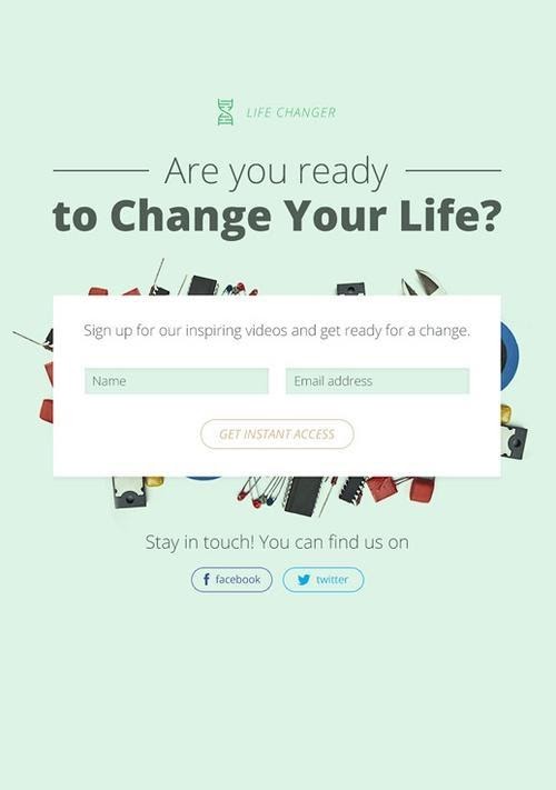
A good product landing page gets straight to the point.
You’ll notice that the “ask” on this landing page template is very simple: a name and an email address.
Research shows that cutting the number of form fields to fill down from 11 to 4 can boost conversions by up to 120%. Imagine how much more that will be when it’s cut down to two.
This template also has a single, compelling CTA: Get Instant Access. Research also proves that landing pages with a single CTA convert better (13.5%) than those with two to four CTAs (11.9%).
One final thing you’ll notice about this landing page template is that, apart from the headline, there isn’t much copy.
Instead of a lengthy pitch trying to convince a visitor why they should signup to the product, there is just a direct ask, which makes this template perfect for middle to bottom-of-funnel leads.
9. Lure them with a Webinar

It isn’t unusual for potential customers to want to see what you’re all about before they decide to buy your product.
So instead of hosting 1-on-1 demos or meetings, webinars give you a great opportunity to talk directly to a group of people at the same time. From there, you can make a direct pitch about your product.
This landing page template works because it addresses all the issues people tend to have with attending webinars:
- There’s a set date and time: Visitors can check immediately to see if they have space on their busy schedules to attend.
- It introduces the instructor: Who can be researched beforehand.
- There is a set schedule: Sometimes, the value of a webinar can be vague. This template has bullet points of what a person will learn if they attend.
Like some other templates on our list, this one also leaves out a contact form. After a visitor clicks the CTA, they’re redirected to another page that asks them for more details.
Read more: 8 Great Webinar Landing Page Examples & What They Did Right.
10. A simple, bold signup page

The last landing page template on our list follows the tried and true formula of successful landing pages:
- A headline that’s personalized to your customer’s problem
- A bullet point break down of the value they’ll receive
- An image of your product
- A simple contact form with two fields and a clear CTA
It also follows some other key tactics that we’ve already touched base on. The language is also persuasive. A short, sweet, and simple landing page can be more powerful than one that tries to do too much.
As long as you’ve got the basics covered, sometimes it’s best to leave the rest of the focus on your product.
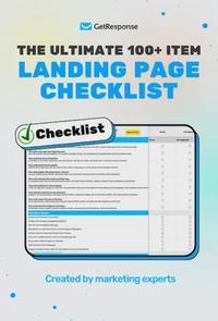
The ultimate 100+ item landing page checklist
If you’re a marketer, designer, or business owner, this 100-point audit will help you identify the hidden “leaks” in your funnel and turn your landing page into a high-efficiency revenue driver.
Wrapping up
Building a landing page that drives signups isn’t rocket science.
Thanks to our tried and tested templates, it’s now easier than ever to create landing pages that combine optimization and aesthetics.
And the data backs up these templates: the number of forms, CTAs, and images you put on a landing page can make the difference between a conversion and a bounce.
The best part?
Once you know the elements that work best for your signups, you can tweak and test templates until you build one that’s just right!
If you’re ready to take the next step, I highly recommend you check our review of the best landing page builders, or better yet – try the GetResponse Landing Page Creator, which comes with 200+ prebuilt templates and AI-generative features that’ll help you build a custom page just for you!
