Splash pages and landing pages are often treated as the same thing because they both tend to focus on just one goal. Also, they can both be the first page web visitors see when they come to your site from other sources.
However, as you will fully understand by the end of this article, splash pages and landing pages are very different.
This article will dive deep into the splash page vs landing page discussion. We will define each one, discuss the key differences to clear up any confusion, and provide great real-life examples so you understand how and when to use them effectively.
What is a splash page?
A splash page or splash screen is an introductory screen displayed as an overlay or a pop-up that appears when a visitor lands on your website. Most splash pages appear on your homepage, though you can include them on other specific web pages within your site.
Splash pages can either be a fixed screen that hovers above the website or a giant pop-up that disappears once the web visitor has completed a specific instruction.
You can use the page to deliver valuable information, request input, give a disclaimer, or display a promotion before letting users proceed to the main site. Here’s a great age verification splash page example by Spritz Society.

Although a splash page is seen as a simple website “accessory,” it can make or break the user experience. When used effectively, it can offer clarity, lead to a better user experience (thanks to the location or language filters), and leave a great first impression.
However, when misused, it will be a nuisance that leads to high bounce rates and negatively impacts your ranking.
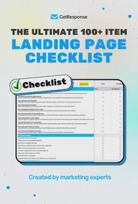
The ultimate 100+ item landing page checklist
If you’re a marketer, designer, or business owner, this 100-point audit will help you identify the hidden “leaks” in your funnel and turn your landing page into a high-efficiency revenue driver.
What is a landing page?
A landing page is a web page created for a specific marketing campaign or purpose. It’s where someone “lands” after clicking on a Google Ad or a link in a promotional email or a social media post.
Landing pages are built with one primary goal: to convert page visitors into customers or subscribers.
Here’s a great landing page example by Adobe.

Since landing pages are designed for specific campaigns, their content aligns closely with visitor intent, from the headline to the copy and even the call-to-action (CTA).
They also have very few or no distractions, like detailed navigation menus, to ensure the target audience remains focused on taking a specific action. The action could be making a purchase, signing up for a premium newsletter, or registering for a free trial.
Build high-converting landing pages with GetResponse
Boost your conversion rates with GetResponse’s powerful landing page builder. Create pages that integrate seamlessly with your email marketing and CRM.
How does a splash page differ from a landing page?
So, when do you use the splash page vs landing page? To make the best choice for your goal, you must understand how they differ in key areas like purpose, design, content, and SEO.
Let’s explore this with an in-depth landing page vs splash page breakdown.
TL;DR: Splash page vs landing page overview
| Feature | Splash Page | Landing page |
| Purpose & frequency of use | Used to deliver a quick message or request (age verification or location and language selection)Appears once per session or on specific entry points | Used to drive conversions for marketing campaigns extensively and repeatedly |
| Design complexity and architecture | Simple and minimalistic design. Often, a static full-screen page with simple visuals or messaging | More complex layout with multiple sections, visuals, and embedded forms or videos |
| Content length | Minimal copy | Longer content explaining the offer’s value and benefits |
| Visit duration | Extremely short; meant to be quickly bypassed. | Longer. Users engage with the information before taking action |
| Navigation | Limited or nonexistent | May have strategic navigation to keep visitors focused and to guide them toward conversion |
| User interaction | Limited; usually one choice or input | High interaction. Elements like forms and CTA buttons encourage engagement |
| Mode of access | Appears automatically before the main website content | Accessed through specific links from marketing campaigns |
| SEO impact | No or negative impact | High SEO impact |
1. Purpose and frequency of use
The purpose of a typical splash page is to deliver a brief, immediate message to the site visitor before they access the main website content. As such, you can use a splash landing page to:
- Ask users to confirm their age (especially on alcohol or adult sites).
- Let visitors select a language or region.
- Display a short product announcement, active promotions, or upcoming event details.
- Collect contact information (email addresses and phone numbers) or zip codes for shipping purposes.
- Ask users to sign up for memberships for premium sites.
- Warn about cookies or privacy policies, especially in GDPR-compliant countries.
Splash pages are mostly temporary and not frequently used today, since most users expect immediate access to information. Therefore, a majority can easily perceive the extra step as an obstacle, and 88% of online users won’t return to a site if they had a negative experience on it.
This is why a well-executed splash page will only appear once per session for first-time visitors. It will only appear on the web visitor’s subsequent page loads or sessions if they return after clearing their cookies.
In contrast, a landing page is built with the primary purpose of converting visitors in mind. Whether that’s getting someone to sign up for a newsletter, download a guide, register for a webinar, or make a purchase.
Also, unlike splash pages, landing pages are used regularly and at scale. Marketers often create multiple landing pages for different campaigns, audiences, or offers. It’s not unusual for a company to have dozens of active landing pages, each customized for a particular product, campaign, or customer intent.
2. Design complexity and architecture
A splash page is designed to be visually striking but structurally simple. It typically consists of a single screen with minimal elements like a logo, high-quality visual, brief message, and a button or dropdown for language, age, or location confirmation.
See the Disney example below.

A splash page’s architecture is also quite straightforward, since the page typically sits as a single layer on top of the homepage. There’s no need for multiple sections, detailed layouts, or complex interactive elements.
The backend only requires basic HTML/CSS, and you can integrate a simple script to set a cookie for the splash page. The script ensures that once a user has seen the page, they won’t see it again for a set period of time.
In comparison, a landing page design and architecture is a bit more complex because it’s designed to hold visitors’ attention and encourage action.
Unlike a splash page, which only exists as a static page, landing pages are scrollable and have a strategic layout to guide the visitor towards the specific conversion goal. Some of the most common landing page components include:
- A compelling headline that captures visitors’ attention and communicates the main value or offer.
- A clear CTA that directs visitors toward the desired action, such as signing up, purchasing, or downloading something.
- Stunning visuals (images/videos/graphics/icons) that reinforce the message and drive engagement.
- Concise and persuasive copy that highlights the key benefits or unique selling points.
- Social proof (testimonials, reviews, trust badges) to build credibility and encourage conversions.
- A lead capture form to collect necessary information, like names, emails, and phone numbers, for future engagement or follow-ups.
- Minimal distractions, like a navigation menu, to keep the focus on the main goal
On the backend, landing pages can be integrated with form handlers, marketing automation tools, analytics platforms, A/B testing frameworks, and CRM systems.
3. Content length
Splash pages stick to very short, concise text. It’s often just a short sentence or headline and a clear call-to-action button. In fact, most great splash pages are designed to prioritize visuals (graphics, videos, or animations) over text to quickly grab visitors’ attention.
Landing pages, on the other hand, are built around content depth. Their goal is to inform, persuade, and convert, so they naturally require substantial content. A landing page will have a headline and subheadline, a detailed product or offer description (discussing key features and unique benefits), testimonials, CTAs, and FAQs.
The copy may be long or short based on the campaign, but even the most minimalist landing page will have more content than a splash landing page. However, you must keep the content concise and avoid continuous text blocks by using high-quality images, white spaces, headings, and bullet points.
4. Visit duration
Considering it’s meant to be a temporary entry point, a splash page is designed to be one of the shortest interactions on a website. Therefore, the visit duration of a splash page is very short, typically just a few seconds.
Long visit durations on a website splash page actually indicate that there’s a problem. Maybe the message isn’t as clear as it should be, the site’s loading speed is too slow, or the user is confused about what to do next, which could suggest ineffective action buttons or links.
In contrast, landing pages are designed to keep the visitors’ attention long enough to communicate the value of the offer and guide them towards conversion. Depending on the complexity, effectiveness, and the length of the page, users may spend 30 seconds to several minutes.
- A good time on page for a landing page is over 1.5 minutes (90 seconds). This visit duration indicates that visitors are taking the time to read and engage with your content.
- A high bounce rate, or time on page less than 30 seconds, often indicates that the landing page content is not meeting user expectations.
- Longer visit durations on a landing page can be a positive sign. It shows users are engaging with the content and seriously considering the offer.
However, excessively long durations with low conversion rates might suggest that users find the information confusing or unpersuasive. They might also be encountering issues in the conversion process, like overly lengthy forms, slow load times, broken buttons, or too many competing elements and unnecessary links.
5. Navigation
Navigation on a splash page is minimal or entirely absent. Users typically encounter a single action, such as clicking a button or selecting an option, before they proceed to the main website. You will find very few elements like selection buttons, drop-down menus, or links for language or location selection, and “Yes/No” buttons for age verification.

Other than that, there are no menus, links to other pages, footer links, or other distractions. In some cases, the splash page automatically redirects visitors to the homepage after a brief delay.
When asking for sensitive or private information like an email address or phone numbers on your splash page, ensure you offer a skip, continue to site, or exit (X) option in the upper right corner. Users reserve the right to withhold such information, and taking away that choice will frustrate web visitors, which will boost bounce rates.
Check out the splash page example below.

On the flip side, landing pages often feature intentional navigation. You won’t find full website menus here either, especially on campaign-specific or standalone landing pages, but you might see some strategic navigation elements.
For instance, longer pages can use internal links (anchor tags), like Apple has in the landing page below, to allow users to jump to specific sections, like pricing or features.

Some landing pages also include minimal header or footer links that contain essential details like privacy policy, terms of service, and contact information. Such links will help build trust with visitors and improve crawlability, which can lead to higher search engine rankings.
6. User interaction
Splash pages involve very limited and straightforward user interaction.
Users typically interact with a splash page in one of two ways:
- Make a quick selection (language, region, and yes or no for age verification)
- Read a short message or alert
Once that interaction is complete, the user is either automatically redirected to the main website or manually clicks a button that leads them to the site.
On the other hand, landing pages thrive on active and meaningful user interaction. In fact, the more engaging the landing page, the higher the chances of conversion. This is why effective landing pages are designed with interactive elements like CTA buttons, image sliders and carousels, video content, hover effect, countdown timers, and expandable FAQs.
7. Mode of access
Users don’t choose to seek out a splash page. It’s just a part of their journey. It will load automatically when someone visits a website’s homepage or a specific entry URL for the first time.
In contrast, landing pages are typically accessed intentionally through specific links from targeted marketing campaigns.
Visitors just don’t stumble on a landing page. Instead, they will get on a landing page by clicking on a specific link in an email marketing campaign, social media post, or Google Ad, as shown below.

Each landing page has a unique URL, often tied to a campaign or target audience, as shown above. Therefore, users land on a specific page because they clicked a link with a certain intent.
For instance, if an Instagram user sees an online course ad and clicks on the CTA to learn more, they will land on a page customized for that campaign, complete with testimonials and pricing details.
Landing pages are not always accessible via a website’s main navigation, and in some cases, they are isolated from the rest of the site to maintain focus.
It is also important to note that while splash pages must exist within a larger website, landing pages can exist as a standalone page outside of a main site’s navigation. You can host a landing page on custom domains or subdirectories.
8. SEO impact
Splash pages have little to no benefit for SEO, and in some cases, they will hurt your search rankings. Why? Because splash pages:
- Can block search engine crawlers from reaching valuable content deeper within the site if not implemented correctly.
- Don’t typically include keyword-optimized content, meta information, or internal linking, which are all important elements for SEO.
- Contain very little valuable text or indexable content. Search engines prioritize pages with valuable, informative content.
It is generally advisable to use splash pages sparingly due to their potential negative SEO implications. However, when you have a compelling reason to use one, say, you sell alcohol or are an international brand with multiple locations, follow Google’s guidelines on interstitials and dialogs.
Examples of splash pages
Here are some great examples of splash pages
White Claw splash page
White Claw is an alcoholic seltzer beverage manufacturer. The brand uses a splash page to ensure legal compliance. However, the page still reflects the classic features of a great splash page. The first thing you notice is that White Claw reinforces its brand identity by prominently displaying its logo at the top.

The page is clean, focused, and free of distractions. There are no external links, flashy banners, or cluttered visuals. This ensures the user completes the required action (entering date of birth) as quickly as possible before proceeding.
The splash page design is intuitive. The date of birth input fields are clearly labeled, and the “confirm” button is easy to notice. The button’s placement directly below the input fields also reinforces that it is the primary action to take after entering the date of birth.
The country selection option is a particularly great addition to this page, since the brand serves multiple countries. Different countries have different legal drinking ages and verification requirements. Selecting the correct country early ensures the user is subjected to the appropriate age gate.
Nike splash page
The first time you get on the official Nike website, you will see this simple, functional, and user-friendly splash page.

Nike lets users select their country/region and preferred language before they browse, ensuring that content, currency, and availability are relevant to the visitor. For instance, you’ll notice people in Canada can choose either the English or French option.
After you’ve selected your preferred location, you are automatically redirected to the main website.
The uncluttered interface and clean typography keep the focus on the location selection. The clearly grouped regions (Africa and the Americas) help users scan the page and find their country with ease.
Nike also gives web visitors the choice to dismiss the page by adding a clear exit link in the upper right corner of the page.
Examples of landing pages
Check out these great examples of landing pages
Monday.com landing page
The Monday.com project management landing page is a great example of an effective landing page. The page opens with a compelling headline and subheadline that immediately conveys the platform’s value proposition.

Monday.com sticks to a consistent and prominent CTA button “Get Started,” which appears throughout the page, encouraging website visitors to take immediate action.
The key features and benefits are presented in digestible sections that use scroll-triggered animations. Each section has relevant visuals that reinforce the messaging.

The video testimonial, client logos, and impact statistics boost visitors’ trust and credibility.

Finally, the page only has two clickable buttons in the header: the main CTA and a contact sales button that leads to a lead capture form. The footer links are also very minimal compared to those on other Monday.com web pages.
Xero landing page
This Xero landing page for the keyword “QuickBooks alternative” is another strong example of an effective landing page.
The headline and subheadline immediately communicate Xero’s value proposition, making it clear to users why Xero is a better alternative to QuickBooks.

The page design is clean and simple. The ample white space, expandable content sections, headings, and relevant images boost readability and engagement.

Like Monday.com, Xero’s landing page only has two clickable buttons on the header and sticks to the same CTA, “Try Xero for free,” throughout. This keeps visitors focused on the desired action.
Optimize your web presence with GetResponse
Ready to maximize conversions? GetResponse offers everything you need to create effective splash pages and high-converting landing pages. No coding knowledge required!
Conclusion
Splash pages and landing pages serve different purposes on a website.
If you want to capture attention briefly, display a temporary message, or gate content (to verify a visitor’s age, language, or location), a splash page is your go-to. An effective splash page is designed to automatically pop up when someone visits a site and quickly get out of the way. It will have a simple design with minimal content, visit durations, navigation options, user interaction, and SEO impact.
But if you want to engage visitors and drive conversions, then you need a landing page. Every element of a great landing page, from the compelling headline to the call-to-action, is designed to persuade visitors to take the desired action. Landing pages feature longer and more detailed content, have strategic design layouts, encourage user interaction, and are optimized for SEO.
Understanding these splash page vs landing page differences should help you choose the right one for your goals. As you’ve seen in this article, their roles, architecture, and goals couldn’t be more different.
