There are two key reasons you want to create an ebook landing page:
- To convert qualified leads
- To grow your email list audience, making it a hub for potential customers
Yet, choosing the right landing page design for your ebook can become a painstaking task.
Questions that may plague your mind include:
- Should you use a long copy or a short one?
- Which landing page creation tool is best for your goals?
- What color combinations should you use?
No need to sweat it though; the five design examples (along with 15 templates) below show you how your ebook landing pages should look.
And if you need to cover the basics first, consider this post exploring what landing pages are and how to design them effectively.
GetResponse Landing Page Creator comes with 100+ ready-made and mobile-optimized templates you can use to get your campaigns off the ground in less than 15 minutes. Try it free for 14-days and start building your email list today.
1. The short and precise ebook landing page

Sometimes you need a longer ebook landing page to provide your audience with enough information for them to convert.
But there are also times you need to make it shorter, especially when your visitors:
- are already well-informed about your offer from a referring site or email
- know and trust you because they’ve been engaging with your content
- aren’t required to pay to get your ebook
So if you’re looking for short ebook landing page examples, here are templates you can use now:


Now that you know what a simple, short design looks like and why you may want to use it, let’s see why sometimes you might need a longer copy.
2. The long and detailed ebook landing page
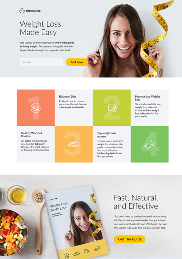


Note: you can use any of the designs featured in this article for a short or long ebook landing page; all the templates are fully customizable.
There are three specific cases where you’d need a long landing for your ebook:
- When your audience is professionals or people who just naturally want extensive information before signing up for anything.
- When you’re asking them to buy the ebook, or fill a complex form.
Advertising legend, David Ogilvy, put it this way: “Long copy sells more than short copy, particularly when you are asking the reader to spend a lot of money.“ - When you’re looking to make your landing page visible in search results (more on this in the bonus section below)
In these three cases, you’re better off with longer copy.
Next, you need to properly use colors on your landing pages.
You may also enjoy:
- Free Ebook Templates: 9 Best Sites to Find Them Now
- Ebook Marketing Strategies for 2023
- Webinar Landing Page Examples That Inspire
- White Paper Landing Pages—All You Need to Know
3. The ebook landing page in one color scheme

Ever landed on a page and wondered why the colors seem to fight with your eyes?
The reason is usually that the landing page designer didn’t have a good eye for selecting colors.
Either that or they wrongly thought the color combinations they used would play well with their audience’s eyes – when in fact they looked awful.
The point here is simple: you need to combine colors well on your landing pages so they look appealing to your potential ebook readers. The last thing you want is to deter them.
Here are three landing page templates with nice color schemes to use for your ebook landing page:

4. The season-relevant ebook landing page

If you’re thinking of theming your ebook around a particular season, say Thanksgiving, Christmas, or New Year, this kind of design works.
The best part about season-relevant landing pages is the way they meet people where they are when a certain holiday is around the corner. As visitors land on your site, they can see the connection your ebook makes with the season.
Relevance is the same as pertinence.
You’re telling people that buying your ebook in that season makes sense, and this is key when it comes to conversions (i.e., ebook downloads).
The more relevant (contextual) your page is to visitors, the better your chances for conversions.
But of course, the copy and images being relevant to a season isn’t the only important factor here; what your readers want to see – above anything else – is the value in your ebook. So make that explicitly clear.
Here are a few season-related landing page examples you can use for your ebook:


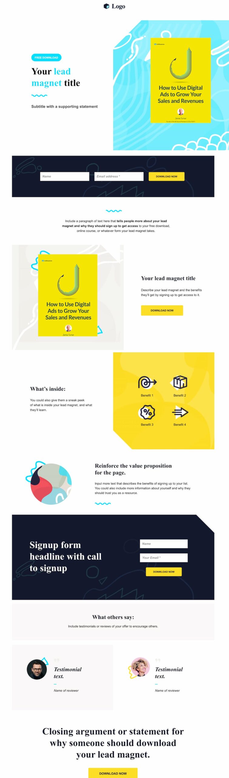
5. The how-to ebook landing page
If your ebook is teaching people how to perform a specific task, a how-to themed landing page design will work great for you.
There are two key elements you need on a how-to ebook landing page:
- A brief history of your experience with your ebook’s topic
- A breakdown of the main beneficial points you’re covering in the ebook
First, sharing your experience is a great way to help your readers understand how well you know your ebook’s topic.
Imagine you have an ebook on “How to start an event planning business” and your ebook landing page has a brief story of how you make $50,000 a month from the business.
You will gain their trust and prove you’re qualified enough to teach them. Once they can see your expertise, they’ll be convinced it’s a great idea to download your content.
Second, sharing a breakdown of the main points of your ebook gives readers something tangible to look forward to.
This one template, in particular, works great for a how-to ebook:


Bonus: 4 costly landing page design mistakes to avoid
As you build your ebook landing page, you will be tempted to try different elements on the page to see if they’ll improve your downloads.
It’s not a bad idea; you can try things as long as they’ll improve the UX and conversions. But here are four major mistakes to avoid as you build your landing page:
1. Navigation links
Should a landing page have navigation?
The short answer is: not really.
Your ebook landing page has one goal: generate leads and conversions.
The primary objective is to convince your audience to read your copy and submit their emails to download your ebook.
Since you have this one goal for the page, you want to remove navigation links (or any elements) that might distract visitors from reading your copy and signing up for the ebook.
Think of navigation links on your landing page this way:
One link = 1 distraction
Two links = 2 distractions
And so on.
You get the idea; the more navigation links you have, the more distractions your future leads face on the page.
The example below has over seven navigation links – each one creating a diversion that might distract visitors from signing up. The page may not be fulfilling its full potential since visitors might want to click any of those links while they’re on the page.
We’re not saying it’s a bad example – it’s actually pretty common for companies with extensive resource centers to host them on their website just like this, so they’re more accessible for their users and customers.
(One cool thing to mention here is the social proof element – SEMrush shows that 4.4k people have already downloaded their report)

But, for single ebooks, this navigation overload is easily avoidable with landing pages.
You don’t need a website (and such a complex one, for that matter) to have a landing page.
Landing pages can have no navigation links – like the one below – so your visitors have to focus their attention on your downloadable book. They won’t be distracted by any other link that leads somewhere else:

What should be on a landing page?
So, if there should be as little distraction as possible, what should you put on your ebook landing pages?
Well, the most crucial thing is a CTA button (a call-to-action button) . A single, short, specific, and visible button that leads to downloading the ebook.
But before you place the CTA button, show your leads a quick snippet of what they’ll be signing up for – the ebook’s cover and a short copy (the headline, the ebook’s title, a summary, etc.). That’s it – any other information is optional!
2. No white space
One major mistake to avoid on your page is the absence of white space.
In design, white space doesn’t literally mean spaces that are white (as in color). Instead, it means unused or unmarked spaces, like this one in the Sales Hacker example:

Simply put, white space helps you declutter the visuals and copy.
It dissuades your reader’s eyes from moving all over the page and guides them to focus on one thing: deciding whether or not to sign up.
3. Messaging everyone
Define who exactly you’re talking to – because messaging everyone on your page is talking to no one.
Here’s what messaging everyone looks like:
Get our free ebook on event management
But here’s what targeting a specific audience looks like:
Get our free ebook on event management for beginners
See the difference? The first one speaks to all event managers while the second is more specific, speaking directly to newbies.
If you have to connect with multiple, different segments of your audience, have separate landing pages for each of them.
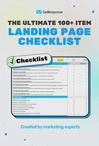
The ultimate 100+ item landing page checklist
If you’re a marketer, designer, or business owner, this 100-point audit will help you identify the hidden “leaks” in your funnel and turn your landing page into a high-efficiency revenue driver.
4. A complicated form
Do landing pages work as a lead generation tool? In short, yes.
But, what the page needs is a clear form your leads can fill with their information before they download your lead magnet (in this case, the ebook).
The data from our Email Marketing Benchmarks report found that landing pages with forms containing three fields (as opposed to two) get over 60% fewer conversions.
If you make the form too complex, adding a long list of fields, your lead will become sceptic of your intentions and flee.
You wouldn’t want that. So, make sure the form is restricted to crucial details only – like ‘First name’ & ‘Email address’. You can see a short form like this in almost all of the landing page examples above.
Also, place the form in a way that makes it easy to see & fill all the fields before the download.
5. No on-page SEO
It’s easy to get all creative and technical with your landing page, optimizing the headline, copy, and overall design for conversions. But that’s not all you should optimize for.
You need on-page SEO; if you’re not familiar with the term, SEO stands for Search Engine Optimization.
And on-page SEO is the process of structuring elements (titles, words, images) on your page to make it show up on search engines when your audience searches for topics relating to your ebook.
So, not optimizing your ebook landing pages for conversions will mean you’re leaving potential signups on the table and the page is no longer the lead generation tool it could have been.
How do you optimize your page for search engines?
Here’s a simple seven-step plan to make your page rank on Google:
- Pick a focus keyword: look for a relevant keyword that your audience searches for, relevant to your ebook’s topic.
For example, how to start an event planning business is a keyword that gets searched 1,600 times a month. So if new event managers are your target audience, you can make this the focus keyword to optimize your landing page with.
- Focus keyword in title: put your focus keyword in headers and subheaders on your page

- Mention focus keyword across your page: where they’re relevant, mention your focus keyword across your ebook landing page copy.
- Focus keyword in URL: edit your URL slug and include your focus keyword in it

- Use the keyword and its variants when linking to your page: whenever you’re linking to your landing page – whether internally or from outside of your website – make sure to provide a meaningful anchor link, ideally containing your keyword (as opposed to ‘click here’).
- Word count: most pages that rank on Google have at least 1,000 words in them. Search engines tend to rank these pages higher because they have more in-depth content.
- Page speed: make sure you’re using a solid landing page builder or a hosting solution that’ll keep your page running smoothly. Remember, users don’t wait too long for pages to load, they click back and move away. And search engines favor fast pages, too.
- Build links: links are trust-signals and there’s a correlation between pages that rank highly in search engines and have a lot of links. So if possible (and it makes sense for the user), add links to your landing page to pass on that link juice from other reputable pages.
All this tells search engines – especially Google – that your landing page has content that people are looking for.
In the end, convince visitors to download your ebook
The crux of the matter here is that you design your landing page so that it’s easy to use or read by your visitors and it convinces them to convert and become leads.
That means, make sure you:
- Don’t sacrifice usability for a “nice-looking design”
- Prioritize the clarity of your ebook’s message over everything else
- Speak to one audience at a time
- Have a clear and visible CTA button
- Have a simple form
- Don’t have navigation links distracting visitors from focusing and converting
- Use white space to declutter and guide their eyes to your offer
The better the visitors’ experience with your pages’ content, the more leads and downloads you’ll get.
And while we’re on the topic of ebooks, here’s a handy list of websites that offer free ebook templates that’ll speed up your design process.
