While physical events and conferences still hold their place, webinars have become a new favorite in the market.
By blending the dynamic aspects of live presentations with the accessibility of the internet, webinars have enhanced how businesses share information and collaborate with their audiences. All while maintaining a sense of authenticity and trust that is missing on online platforms.
However, the challenge lies in convincing your target audience of your value enough to boost registration numbers and attendance. This is where webinar landing pages come into play.
This article will discuss the value of a great webinar landing page and what defines a quality landing page. We’ll also leave you with 15 great examples to pick inspiration from. Let’s get started!
The #1 challenge when doing webinars
You’ve spent the past few weeks preparing for your upcoming webinar. You’ve tested your webinar equipment and slides, got your background all set up, and practiced your heart out with your presentation.
You’re all pumped up and ready to go.
You click on that button to start the webinar and…
…no one’s there!
Zero. Nada. Zilch!
If that scenario brings back nightmares, welcome to the club!
Hosting a webinar isn’t enough to get people to sign up. You’ve also got to have a landing page – a webinar registration landing page, to be precise – that’ll reel them in and boost signups.
If you’d like to cover the basics first, consider our guide to landing pages, where we explore what landing pages are, what their business value is, and the different types of landing pages you may encounter.
What makes a webinar landing page irresistible?
Your webinar landing page design will give people the first impression of your webinar’s quality, from the content to the visuals. The goal is to sell your webinar idea and boost attendance by making your webinar landing page irresistible. But how do you achieve this? And what exactly makes a webinar landing page irresistible?
It promises to give something extremely valuable
Even though you’re not asking your audience to pay to watch your webinar, you’re still asking them to give you an hour or so of their time and contact details. Therefore, your landing page must reflect the value of your webinar.
One of the most effective ways to do this is by creating copy that clearly outlines the key takeaways and insights, or the skills attendees will acquire by participating. Use bullet points to list the key benefits to make it easy for visitors to grasp the value quickly.
Finally, your prospects’ decisions are based on one of two desires: avoid pain or experience pleasure. Of the two, it’s the first that’s more compelling because humans are more aggressive in preventing a loss than earning something. Psychologists call this behavior loss aversion.For example, say, you’re planning to host a webinar on conversion rate optimization. Sharing information that’ll teach your prospects how to stop scaring potential customers away may be more appealing than just sharing insights on how to boost conversion rates.
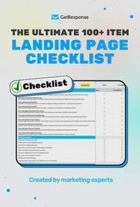
The ultimate 100+ item landing page checklist
If you’re a marketer, designer, or business owner, this 100-point audit will help you identify the hidden “leaks” in your funnel and turn your landing page into a high-efficiency revenue driver.
It includes a video message
Studies show that webinar landing pages with an embedded video convert 80% better than those without.
Here’s why:
Adding a short video message on your landing page gives your visitors and leads a sneak peek into your upcoming webinar. They’ll also get to see you and your guest speakers (if you’ve invited any), making the invitation more personal.
It offers a Unique Value Proposition
Chances are, you’re not the only one hosting a webinar about a particular topic, especially if it’s a trending topic.
The best way to hook your visitors and get them to sign up (and actually show up) for your webinar is to give them your Unique Value Proposition.
This tells them what they’ll get in return for signing up and why they should sign up for your upcoming webinar and not someone else’s.
It’s mobile-friendly
The majority of people today browse the internet on their mobile devices.

So it’s best to create a webinar landing page that’s easy for your visitors and leads to sign up on their mobile phones and tablets.
Read more:
- Dogfooding: How GetResponse Marketing Team Use Webinars
- How to build a compelling startup landing page
It evokes scarcity
Your potential webinar attendees make decisions based on their emotions.
When they see there’s a limited number of seats remaining, coupled with a countdown timer, they’ll be prompted to take action right away. That’s because they don’t want to feel they’ve missed out on something valuable.
You can also evoke scarcity by notifying your landing page visitors that there won’t be a recording after the live webinar.
One of the reasons the number of people that show up at your live webinars is smaller than those that sign up is because some assume there will be a recording later on.
When you remove the recording from the equation, interested attendees who sign up will actually try to show up.
15 great webinar landing page examples
That’s the basic recipe for how to create a high-converting landing page. Let’s now take a look at 15 webinar landing page examples to help you get started:
1. Search Engine Journal

What worked:
- The company’s logo is prominent, reminding you of who’s hosting the webinar.
- The use of the word “how” in the title tells visitors that it’ll be a webinar where they can learn the steps and strategies they can use in their marketing campaigns.
- Photos of the speakers are clearly seen on the webinar landing page.
- The red “Register Now” CTA button immediately draws your attention, and the choice of text tells you what to do next.
- The webinar description is very detailed, but doesn’t give away too much.
What could be improved:
- Applicants are required to fill in too many details. Most people are not comfortable to give away information regarding their budget.
- Having a long form with all the fields required is already daunting enough for visitors. Adding a Captcha right before the CTA button will scare them even further.
- While the Home Page link at the top left is small, it still gives their visitors an easy way to opt out from the webinar landing page
2. Microsoft

What worked:
- Here we also have the word “How” which promises solutions for contemporary topics.
- Using subheadings for different sections and bullet points makes the landing page’s copy easy to read on both desktop and mobile.
- An image used at the top of the page clearly shows that the topic will cover education with young students.
What could be improved:
- Adding a takeaway in the webinar’s title would make this more concise and able to get people excited about signing up.
- Lots of offline, personal information required in the registration form may make visitors wary about signing up.
- The CTA button is almost invisible underneath the form, making it easy for visitors to miss.
3. Content Marketing Institute

What worked:
- The title is straightforward – you instantly know what the webinar will cover.
- Using a striking color for the CTA button and its unique value proposition quickly catches your attention.
- Using a bullet list for the takeaway points makes these easier to skim and read.
- The guest speaker’s images and informative bios give the webinar page a personal touch.
- The landing page’s copy uses words that are easy for visitors to understand.
- The webinar details are clear.
What could be improved:
- Again, another long and daunting registration form.
- The image in the title is confusing.
- The repeated title is unnecessary and looks weird, especially since they’re placed too close together.
4. Forrester

What worked:
- The video in the title box explains what the webinar is about. This is a great example of the placement and value that visual material brings – a chance to get a quick glance at the webinar host, their tone, and their ability to bring value.
- The page is simple and elegant, and it features all guest speakers.
What could be improved:
- The title doesn’t specify the topic at first glance. We don’t know what the predictions are about.
- Writing the landing page’s copy in bullet points instead of long paragraph blocks makes it easier to read, especially on mobile devices. However in this case, we have a very short description of the topics that the webinar will cover but no takeaways.
- Asking for too many details appears to be disproportionate to what information will be shared in the webinar.
5. GetResponse

What worked:
- The pain point that’ll be addressed in the webinar is the first thing that’ll catch the visitors’ attention and get them to sign up.
- A short and sweet sign-up form makes it convenient for visitors to sign up.
- The CTAs’ contrasting color helps them stand out from the rest of the text.
- Takeaways from the webinar are listed in bullet points, which is great for skimmers.
Like what you see? Try our free landing page builder today!
What could be improved:
- The signup form could be positioned higher on the landing page to make it even easier to sign up.
(By the way, if you’re curious about the webinar, you can click here to watch it.)
6. Semrush

What worked:
- The guest speakers and hosts are the first thing you see on this landing page. So before you sign up, you already know who you will see in the webinar.
- Here you can see that the webinar is suited for all knowledge levels, even advanced.
- Contrasting colors help draw visitors’ attention to learn more about what the webinar is about.
- Registration form is simple and short.
What could be improved:
- No video, and the description of the webinar is quite modest.
- There is nothing wrong with simplicity. However, the page itself doesn’t offer any takeaways or value prior to the webinar.
7. Slack

What worked:
- All the essential details you’ll need to know about the upcoming webinar are located in the body of the landing page.
- The takeaways are listed after the description.
- The register button will take you to a new page.
What could be improved:
- The webinar topic doesn’t appear to address a pressing and urgent need. Adding more details on why visitors should sign-up and watch can turn things around.
- No images of hosts and guests and no video.
8. Outreach

What worked:
- The details of the webinar are short and straight to the point.
- Using a different color does a great job of highlighting the CTA button.
- Terms and conditions are clearly shown with a popup.
What could be improved:
- Adding a video to this landing page would have given them the chance to showcase their service in action subtly.
- This on-demand webinar appears to be targeting those who are already familiar with the topic or were previously attending webinars, not so much new attendees.
9. Calendly

What worked:
- The bold headline clearly states what the webinar is about and also targets a specific audience.
- The description offers more information supporting why the webinar’s topic is essential.
- The signup form fields are relevant to the webinar, especially the company and job title. These details will come in handy when segmenting users and personalizing content in the lead conversion stage.
- The CTA stands out from the rest of the text in its conspicuous color.
What could be improved:
- Visuals and photos of the key speakers would have been a great addition to break the text monotony and easily capture web visitors’ attention.
- The landing page could use more crucial information on the date and time after the headline.
- While outlining the metrics, customer success teams care about shows the host’s knowledge of the topic. It’d have been great if the landing page briefly mentioned some tips and tricks webinar attendees would learn.
10. Hootsuite

What worked:
- Having the headline and attractive visuals above the fold will entice the audience to read on. Also, the two-tone design for the heading and webinar details section was a great choice. It makes the page even more appealing.
- The webinar’s crucial details – the date and time – come first and are bolded to ensure visitors don’t miss them.
- The description is informative but brief, and the key discussion points are bulleted, making it easy for visitors to skim through.
- They offer a free social media strategy template bonus which will, of course, encourage their target audience to register.
What could be improved:
- The black CTA sort of blends in with the rest of the text; a brighter and bolder color would have been a better choice.
- The required registration form fields are more than the average, which could discourage the audience from filling it out.
11. Salesforce

What worked:
- The landing page focuses on the key speakers. Their photos are the first thing anyone who opens the page sees. They also include brief information about each before getting into the webinar description.
- The question form headline is thought-provoking and will encourage the webpage visitors looking for an answer to sign up for the webinar.
- The registration form is placed above the fold to encourage web visitors to register immediately.
- Key lessons webinar attendees will learn are in bullet points, making it easy to skim through.
What could be improved:
- They could have bolded the webinar title to set it apart from the rest of the landing page copy.
- A two-tone theme design for the content above the fold and the webinar details would have made the landing page more appealing.
12. Gartner

What worked:
- The headline explains both the purpose and benefit of the webinar.
- The crucial webinar details, including the date, time, and length of the webinar, are mentioned right after the headline, which makes them easier to notice.
- Photos and titles of the webinar hosts.
- The social media sharing buttons make it easy for people to spread the word about the webinar.
- The entire landing page is quite brief, making it easy for readers to skim through.
What could be improved:
- The description is quite bulky. Some readers might be discouraged from reading more and abandon the landing page. Shorter paragraphs could have worked better.
- More white spaces between the different sections, especially the headline, webinar details, and description.
13. Atlassian

What worked:
- The registration form is simple and easy to fill.
- The simplified and brief webinar description with bulleted webinar benefits enhances the web visitors’ reading experience.
- Giving different time zones makes it easy for interested webinar attendees to choose the time that works best for them.
- The detailed guest speakers’ bios enhance credibility and interest in the webinar.
- The CTA stands out from any other text on the page thanks to the button’s variation in color and the bolded text.
What could be improved:
- Some relevant visuals would have been great.
14. McLean Hospital

What worked:
- Great visuals, especially the banner graphic, easily draw the audience’s attention.
- A clear headline that quickly tells what the webinar will be discussing.
- It is easy to fill registration forms with the necessary fields, making it quick and convenient for interested visitors.
- Clear webinar date and time details and a live countdown timer that creates a sense of urgency.
- Detailed information on the guest speaker.
- Various compelling CTAs throughout the landing page.
What could be improved:
- They could have briefly highlighted the key lessons attendees will learn in bullet points to make it easy to skim.
- A photo of the key guest speaker could have been a great addition too.
15. Zoom

What worked:
- A great headline that captures attention and includes the webinar’s subject.
- Including the relevant image above the fold was also a great idea since it’ll catch people’s attention.
- A bulleted list of the key lessons attendees will learn will encourage more visitors to register.
- A clear and easily noticeable call-to-action button. The CTA text is also a different color that sets it apart from the rest of the copy on the page.
- The social sharing buttons.
What could be improved:
- There are too many fields to fill in the registration form, which could discourage some visitors.
- A photo of the expert speakers could have been a great addition to give the webinar landing page a personal touch.
There you have it! 15 great webinar landing pages you can borrow ideas from to create a high-converting webinar landing page.
Webinar landing page examples FAQs
What should be in a webinar landing page?
A webinar landing page should contain a concise headline, the date and time of the webinar, a short description of the webinar, a list of the expert/guest speakers, and the signup form. The landing page should have engaging copy and visuals to make it more engaging and drive sign-ups.
What is the best practice webinar landing page?
The best practice for creating a webinar landing page is to write a clear headline explaining the webinar’s value. A good landing page should also have a brief signup form, a short description of what the attendees will learn, details about the speakers, and a short clip discussing why the webinar is crucial.
Conclusion
How you construct your webinar landing page can make or break your webinar signup stats.
It could determine whether the webinar room will be packed with eager viewers or crickets.
Unfortunately, the common denominator for many of them was an old-fashioned design. If you want to avoid design mistakes, try incorporating some of the landing page design trends.
Take the things that were done right in these different landing page examples. Tweak them by improving the recommended areas. Then, test your landing page thoroughly before it goes live.
What’s great is that you’ll find a webinar tool and a landing page creator, both inside of GetResponse ;-).
What are your tested tips for getting more webinar signups from your landing page?
