If you’re in the market for a new job or hoping to land bigger, better clients, a portfolio website is a must-have. It’s the ultimate way to showcase your work while also letting your personality shine through.
Plus, unlike social media and other platforms, portfolio websites give you complete control.
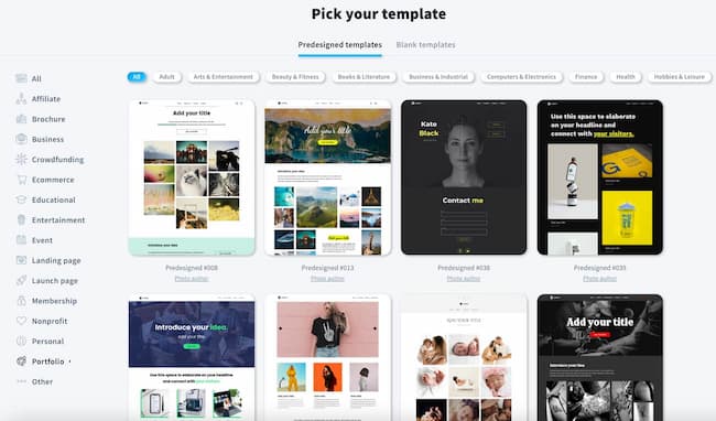
Did you know? With GetResponse Website Builder you can build your online portfolio and showcase your work with ease! It comes packed with ready-made website templates and an AI Wizard that’ll create an entire site for you in a matter of clicks. Check out this quick video to learn more about the tool.
Here are 12 of the best portfolio examples we’ve seen
1. Kristin Wong, writer

Why’s this a good example to follow?
When you pull up Kristin Wong’s website, it’s immediately clear that she’s legit. She prominently features big, recognizable names in her industry using copy and logos — The New York Times, Glamour, CNN, The Cut, etc.
And it’s all shown “above the fold” — a term originating in the newspaper industry that essentially refers to information a reader sees at first glance. With newspapers, that meant the front-page headline. With websites, it means the top part of the page that’s visible without scrolling.
Why does this matter? Because the most recent research from Nielsen/Norman Group shows users spend about 57% of their page-viewing time above the fold, and 74% of viewing time in the first two screenfuls. Then, they mostly scroll through the rest of the content before perking up again near the footer.
Speaking of which, Wong uses the footer on her personal portfolio to her advantage as well, featuring screenshots of her Instagram account that show off her work and a high following — social proof that she’s a well-regarded writer.
Key lessons from this example
- Put your most important content (like your value proposition) above the fold.
- If you’ve worked with big, recognizable companies, feature it prominently.
- Showcase samples of your best work on the first page of your website in a visual format.
- Use social proof to convince potential clients and boost conversions. This can come in the form of social media, as Wong’s does, or through testimonials.
2. Daniel Grindrod, cinematographer

Why’s this a good example to follow?
As a cinematographer, Daniel Grindrod uses a high-quality, cinematic highlight reel to hook visitors on his personal website. In fact, as soon as you pull up Grindrod’s site, the video begins to play, immediately drawing you in. And there’s nothing else on the homepage — just his name, the menu, and the video.
Visitors can then click through the simplified menu to see other examples of his work, categorized into video or still form. And Grindrod’s site includes an active, up-to-date blog that demonstrates industry authority, improves SEO, and drives organic traffic to his site.
Blogging helps boost SEO by making your website a relevant answer to customers’ questions via search. And blog posts that use a variety of SEO tactics often rank higher in search engines, leading more customers to your site.
Key lessons from this example
- Use your entire website, not just your portfolio pieces, to show what you can do. Grindrod is a cinematographer, for example, so he used cinematography. But writers can use exceptional copy, designers exceptional design, etc.
- If relevant, use video to both draw people in and keep them there. According to a 2020 survey by Wyzowl, 83% of respondents say video increases the average time their visitors spend on the page.
- Use an SEO-optimized blog to drive traffic and demonstrate authority.
3. Arlen McCluskey, UX designer

Why’s this a good example to follow?
Everything about Arlen McCluskey’s site reads techy web designer, from the vibrant color scheme and blurred background to the typography. And while it seems almost minimalist on the homepage, when visitors click through one of his projects, it’s full-on substance.
McCluskey dives deep into each project’s challenges, goals, and outcomes, almost like a case study — giving potential clients a fully developed idea of both his ability and approach. And like previous examples, McCluskey’s portfolio mentions big-name clients like AirBnB, Dropbox, Segment, and Xero above the fold.
Portfolios like these are especially important to those in UX design like McCluskey. As Nick Babich, Editor-in-chief at UX Planet, says, “In UX design, portfolios matter more than degrees. Employers and recruiters will use your portfolio to determine your experience and aesthetic and, most importantly, your ability to solve real-world business problems.”
Key lessons from this example
- Keep your homepage simple and clean but don’t shy away from substance on sub-pages. If someone has stayed on your site long enough to click through, they’re interested in more information. Don’t leave them wanting.
- Know your industry and what people are looking for. McCluskey did an excellent job of communicating his expertise and problem-solving approach right off the bat.
Read more related content:
1. How to Make a Website From Scratch (in 9 Easy Steps)
2. 17 Photography Portfolio Examples You Should See Today
3. Impressive Graphic Design Portfolio Examples and How To Create Yours
4. Raewyn Brandon, graphic design

Why’s this a good example to follow?
For starters, you can tell what Raewyn Brandon does right off the bat — “Raewyn Brandon is a Tauranga based Graphic Designer – Available for projects worldwide.” This copy itself gives you everything you need to know in two simple lines. And the crisp, uncluttered white space directs your eye to the text.
Brandon’s graphic design portfolio showcases her design skills, which is important considering her line of work. Her expertise shines through the simple, clean layout she used and her mastery of color.
Plus, Raewyn showcases her impressive client work at the top of the page. Visitors can click through to see a full run-down of each project, complete with quality images and descriptions.
The menu, horizontal at the top of the page, is also clear and client focused. She categorizes her work into either print or brand, so potential clients can easily find the type of samples they need.
And her about section is excellent. The copy is personable but also client focused, emphasizing the benefits of her work rather than just talking about herself. She includes a warm, stylish photo of both herself and her workspace that draws you in.
Key lessons from this example
- Always think about your website from a client’s perspective. It should be easy to navigate and you should present the information in a way that is relative to their needs, not yours.
- Use white space to emphasize design and/or copy.
- If you have a lot of big-name client work, showcase it immediately.
- Keep your menu simple and client focused.
5. Anton Cristell, graphic and interior designer

Why’s this a good example to follow?
When you first open Anton Cristell’s site, you’re faced with a blank page. At first, it seems like it’s not loading — not typically the most desirable first impression. But as soon as you move your mouse (or thumb), you realize it’s an interactive canvas, allowing you to draw on it.
This unique and memorable approach grabs the visitor’s attention, almost daring them to click through to see more. The top left features just his name — the only thing on the page. Once you click his name, two links show up – Works and About.
Cristell’s work, showcased on his project page, is extensive, and clicking through each link displays photos of each design project. His about page also explains a bit about his approach and blending of graphics, design, and architecture.
Key lessons from this example
- Don’t be afraid to break the rules or buck design trends. Cristell’s homepage, while puzzling at first, motivates visitors to click through even though it defies the “above the fold” rule.
6. Tara Pixley, photographer and visual journalist

Why’s this a good example to follow?
Tara Pixley, a photographer and video journalist, is the first in this series with a sidebar menu — useful because her work is complex, requiring several drop-down menus within the sidebar.
If it were at the top, it would create a confusing user experience. Being on the side, however, allows for easy navigation while keeping her photography front and center. This balances the complexity of the menu with the simplicity of the design.
Typically, it’s better to keep menus simple. Many websites follow the mantra of the “Magic Number 7 +/- 2” — which refers to research showing humans can only retain 7 items at a time in short-term memory.
But In Pixley’s case, she’s targeting major journalism outlets and high-profile organizations. So the complexity is appropriate for the intended audience.
Plus, Like Raewyn Brandon, Pixley’s site utilizes plenty of white space to clearly communicate what she does while simultaneously showcasing her artistic prowess.
Key lessons from this example:
- Consider your audience when designing the menu for your own website.
- Sidebar menus can be useful in balancing a depth of information with a simplistic design.
Editor’s note: Want to build a website just like this one? Here’s how you can build a photography website with our intuitive website builder.
7. Robby Leonardi, illustrative designer and animator

Why’s this a good example to follow?
Robby Leonardi’s site is one of the coolest around. An illustrative designer and animator, Leonardi puts his site to work by gamifying his resume. Users scroll through the interactive site using either a mouse or the down arrow on the keyboard.
He breaks his resume down into “levels” with the first being an about section where users find out he’s from New York and an NBA fan. In level two, the character runs through an underwater world listing his graphic and web software skills, along with gaming and coding language chops.
Level three shows Leonardi’s work experience with visual charts breaking down how much animation, code, and graphics were involved in each position. In the last section, the character floats up in a hot air balloon showing banners that highlight his awards and publications. The balloon “lands” at a contact section, complete with fun little fireworks and a celebration like you won the game.
Key lessons from this example
- Similar to Daniel Grinrod’s site, think about your specific skills and industry. Is there a way to use your website itself to show people what you can do? If so, go for it.
8. ToyFight, designers

Why’s this a good example to follow?
ToyFight goes to show you that portfolio pages aren’t only for solo acts. They can also be used for agencies and organizations.
Using vibrant colors, unique figures, and visual storytelling, this portfolio makes you want to keep scrolling just to see more of it. ToyFight’s website also uses cheeky visuals and conversational copy to get their personalities across. Testimonials are “sweet nothings,” for example. And they describe themselves as “creative rustlers” and “basically, your new BFF.”
Plus, ToyFight’s mobile optimized site features its own logo design and a full page of client design work.
Key lessons from this example
- Generic sites that try to be everything to everybody are a dime a dozen. Don’t be afraid to let your personality shine through. It might not please everyone, but it will attract the right kind of clients.
- The majority of visitors to your site will be on mobile so make sure your site is mobile responsive. That means taking the time to design how your site looks on mobile devices in addition to desktop screens.
- If you have any major accomplishments, showcase it. ToyFight has won numerous awards for their designs and the website features the awards in the “What” section.
9. Ashley N. Diers, illustrator

Why’s this a good example to follow?
Ashley N. Diers is a letterer, illustrator, and adventurer. Her site showcases her work above the fold and even includes a call-to-action (CTA) button as well.
The examples of her work include descriptions that show up when you hover over it, eliminating the need to click through and creating a simple user experience.
Plus, Diers’ site is unique in this list because it includes links to buy her products. In addition to working with clients, she also sells her wares on Etsy and Redbubble — both featured prominently in the top menu.
Key lessons from this example
- Portfolios come in all shapes and sizes. Think carefully about what you need yours to do for you and build it to suit. For example, your portfolio doesn’t need to only showcase your skills. It can also be used for selling products.
- Effective CTAs drive conversions and generate leads. And they do it better than AdWords! The average click-through rate (CTR) for Google Ads is 2 percent — while the average CTR for a CTA on a page is almost 3.5 percent.
10. Elna Cain, writer

Why’s this a good example to follow?
Elna Cain’s portfolio site leads with a smiling photo of herself along with a clear value proposition in animated type, immediately drawing your attention. She also includes social proof above the fold, letting visitors know she’s written for major brands in her niche, along with glowing testimonials further down the page.
Cain’s portfolio page is extensive but features visual snippets to make it more digestible. It’s also up-to-date, featuring a 2021 article right at the top. She also includes a “hire me” tab in her menu which communicates clearly that she’s available to work.
Key lessons from this example
- Take the time to keep your portfolio up-to-date, demonstrating to clients that you’re active in your field.
- Use visual cues to hook visitors such as animated type, bold colors, and crisp photos.
- Portfolio websites don’t always need to be stunningly creative. In fact, sometimes it’s better if they’re not. In Cain’s case, for example, she’s a writer. So she wants that to shine through, not the design.
- Use testimonials to drive conversion rates by as much as 34%!
11. Ximena Vengoechea, researcher, writer, and illustrator

Why’s this a good example to follow?
Talk about using white space! Ximena Vengoechea takes it to the next level. Her portfolio is simple and clean, letting her illustrations shine through using a unique slideshow format on her homepage.
Vengoechea uses her top menu to divide her portfolio into categories, making it easier for potential clients to find what they’re looking for. Within each category, Vengoechea lists clients within the industry that she’s worked with like Culture Lab, Designer Fund, and Fast Company, providing social proof for her unique work.
And the handwritten illustrations throughout her site make it feel personable and inviting while showcasing her artistic skills.
Key lessons from this example
- Use your unique skills to make your site stand out.
- Social proof is especially important when your work is unique.
12. Ian Enders, software architect

Why’s this a good example to follow?
Ian Enders’s portfolio is a good example of a super simple, one-page website. It’s also interesting because it doesn’t showcase his work in the way most portfolio sites do. Instead, Enders’ portfolio works a bit more like a resume (he actually has one linked) written in a snarky, hipster tone.
Rather than showing his actual work, Enders is displaying who he’s worked for, linking to companies within the copy itself. This likely works for him as he seems to be using his portfolio to land jobs with potential employers instead of clients.
Why bother to create a portfolio in this case? According to Tom Scott, Co-Founder at Fearless, “In an age where there is more emphasis on hiring people who match the culture of the business, a portfolio is a perfect opportunity to show that you’re a cultural fit.”
Key lessons from this example
- Rules are meant to be broken. Make your portfolio work for you and your industry, even if it’s different from others.
- Ender’s portfolio is a good reminder that it’s not just entrepreneurs and freelancers that can benefit from online portfolios. People looking for new 9-5 type jobs can use them as resumes and stand out in the crowd.
Questions you may have regarding online portfolios:
How do I make a portfolio?
Making a portfolio isn’t nearly as hard as it used to be thanks to easy-to-use website builders that eliminate the need for coding or website design skills. Take the GetResponse builder, for example.
Using basic information about your skills, the AI technology generates at least three personalized portfolio website templates for you to choose from in just minutes — simplifying the design process. After that, it’s just a matter of adding your work and using the beginner-friendly editor to get it just right.
This video will show you how this works in action. If you’d like to test the tool by yourself, you can do so on our Website Builder product page.
What should an online portfolio include?
An online portfolio should include a homepage with a clear value proposition, call to action, and testimonials. It should also include a portfolio page featuring your best work, an about page, and a contact information page, and a services page. Portfolios should also link to relevant social media profiles like Facebook, Twitter, and LinkedIn.
Here are some examples of ready-made portfolio website templates you’ll find in GetResponse that include these page types:
How do I build a strong online portfolio?
As these examples have shown, impressive online portfolios share some common elements. First, they should demonstrate your expertise quickly, featuring some of your best work on the first page.
They should also include elements that boost conversion rates like videos, CTA’s, and social proof. And they should communicate both your personality and style using a combination of text and design. Lastly, including and maintaining an active blog is a good way to demonstrate expertise while driving traffic to your site.
Conclusion
Portfolio websites are a must-have in today’s digital world. They showcase your work and serve as an online resume and client magnet. So whether you’re a freelancer, entrepreneur, or full-blown agency, we hope these examples provided some design inspiration. Now get out there and start building your own portfolio! Best of luck!
