Building a good waitlist landing page is no simple feat. You’ll need a skilled team of developers, copywriters, SEO specialists, marketing strategists, UX/UI designers, and analytics experts to design a viral page.
That means you’ll also need to invest a significant sum in such a page. Is it worth it? Are there any budget-friendly ways of building a waitlist landing page? What are some of the best examples of these pages, and what are the benefits you can expect from one?
In this guide, we will answer these questions, discussing everything from the basics of a waitlist landing page to the best landing page templates out there. Let’s dive in!
What is a waitlist landing page?
A waitlist landing page is a web page used to generate interest and anticipation for an upcoming product or service launch. It aims to evoke excitement and anticipation among your target audience and encourage landing page visitors to sign up and join the waitlist for upcoming products, features, or services.
A waitlist landing page is sometimes called a “coming soon landing page” or a “pre-launch landing page”. You can create one to complement your email marketing efforts and use it for:
- Events, conferences, or physical store openings
- New features, products, variants, or services
- Launching a website or a course
- Early access to discounts
- Beta testing
Here’s an example of what a waitlist landing page looks like (we will show more waitlist landing page examples later):

You can build a waitlist page for any new aspect of your business, but it’s more effective for specific use cases. These include:
- Startup landing pages introducing a new app or product
- Companies planning a significant product update
- Event organizers promoting an exclusive gathering
- Crowdfunding campaigns for a unique project
- App developers launching a new mobile app
- Exclusive product releases or limited editions
- Instructors offering new online courses or workshops
On the other hand, it may not be effective for:
- Established or evergreen products with no upcoming changes or additions
- Businesses with a low-risk, routine release schedule
- Public events with no capacity limitations or exclusivity
- Projects with broad appeal and minimal need for anticipation
- Well-established apps with a large and loyal user base
- Mass-produced items with no scarcity factor
- Ongoing courses with no specific launch dates
The common theme in all these situations is stability and predictability.
6 essential elements of a high-converting waitlist landing page
Building a waitlist landing page that captures attention and converts visitors into eager subscribers requires careful consideration of six key elements. These are:
1. Product value proposition
The main element of your waitlist page is your offer. You want to tell visitors:
- What it is
- How is it unique from others
- What it looks like
Here’s an example:

You’ll need the help of a copywriter (such as the talented Joanna Wiebe we interviewed) to put these points together concisely and compellingly. Ensure the words they string together excite the readers and retain their interest until your product launches.
A general formula for formatting this information is as follows:
- Heading
- Subheading
- Three bullet points on unique features or user benefits
- Supporting visual
There’s no hard and fast rule for the length of this copy, but it’s a good idea to keep it as short as possible.
2. Waitlist value proposition
Next, focus on why people would want to join your waitlist. Common reasons include:
- Low prices
- Early access
- Special benefits
Here’s an example:

You want to make this proposition enticing enough to convince visitors that being on the waitlist is not just a formality but an opportunity to gain something valuable.
3. Compelling images
80% of visitors are more likely to read content containing visuals. So, incorporate high-quality, compelling images showcasing your product or service.
Here’s an example:

The above is Human’s prelaunch landing page, which combines an attractive outdoor image with a screenshot of the app’s interface.
You can also include product shots, countdown timers, GIFs, or even memes (depending on your goal and target market) to make your landing page stand out.
4. Clear call to action (CTA)
You want to guide your visitors to action with a clear and persuasive call to action. It can be a simple button that says “Join the Waitlist” or “Get Early Access”. Just make sure it’s clear what the reader should do next.
You can use contrasting colors, bold fonts, a big enough size, and ample whitespace around the CTA button to make it stand out.
5. Social sharing buttons
Incorporating social media sharing buttons on your waitlist landing page is also a good idea. These will make it easier for your audience to share the page with their family and friends.
Keep in mind that word-of-mouth marketing can significantly contribute to the virality of your waitlist page.
6. Deadline/launch date
Lastly, you want to instill a sense of urgency by mentioning the deadline or launch date. This can be done through a countdown timer or a bold launch day announcement.
Such an announcement creates anticipation and motivates visitors to sign up promptly because the opportunity is limited.
How to design a high-converting waitlist landing page?
Here’s how to create a waitlist landing page:
1. Choose a reliable landing page builder
Begin by choosing a good landing page builder. You’ll want a tool that offers:
- User-friendly interface
- Mobile-friendly templates
- Integrations
- Analytics and tracking
- Customer support
- SEO options
- A form builder
While there are many respectable tools out there, we stand by the GetResponse Landing Page Builder.
Our platform features a drag-and-drop page builder powered by an AI content creator to simplify the landing page creation process. You also get built-in SEO tools and A/B testing options to help you optimize your waitlist landing page to attract more visitors and boost conversions.
If you’d rather shop around, we’ve curated a list of the best landing page builders, including both free and paid options.
2. Craft an engaging page design
Once you’ve chosen a suitable landing page builder, you must set up a clean and visually appealing design. Select a layout that effectively complements your brand and showcases your product or service to achieve this.
Remember, simplicity often enhances user experience, so ensure a clean and clutter-free design to prevent distracting your audience.
A good idea is to use landing page templates, which normally come with the builder. Pick a template with a clean design and customize it to match your branding style.

3. Incorporate essential elements of a waitlist landing page
Next, ensure you include all the important elements of a waitlist landing page discussed earlier. You want to include a compelling product value proposition, a persuasive waitlist value proposition, high-quality images, a clear CTA, social sharing buttons, and a visible deadline or launch date.
The beauty of a modern landing page builder like GetResponse’s is that it comes with an AI content generator. This should make it easier for you to come up with the copy for your landing page. The AI tool will suggest a value proposition and headline that you can finetune to meet your unique needs.
4. Optimize your CTA
The CTA on your waitlist landing page is the gateway to conversions. The CTA button plays such a critical role, so we recommend using contrasting colors, compelling copy, and a design that draws attention.
Other best practices include:
- Use action-oriented text: This includes verbs like “get,” “read,” or “try” instead of generic words like “submit” or “click here”.
- Keep it short: CTAs should be brief and to the point, typically around two to five words.
- Create urgency: Incorporate a sense of urgency in the CTA to encourage immediate action. Adding words like “now” can help create a subtle sense of urgency.
- Make it look like a button: Design the CTA as a button, as this format tends to convert better than plain text, links, or images.
- Place your CTA buttons strategically: Place one CTA button above the fold and additional buttons throughout the page if it’s a long landing page.
You can also test different variations to find the most effective button.
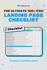
The ultimate 100+ item landing page checklist
If you’re a marketer, designer, or business owner, this 100-point audit will help you identify the hidden “leaks” in your funnel and turn your landing page into a high-efficiency revenue driver.
5. Develop a user-friendly signup form
Ensure the signup form asks for essential information like email addresses alone. Unnecessary fields may discourage sign-ups, so you don’t want an unnecessarily long form.
You also want to implement real-time validation to reduce errors and ensure a seamless user experience. This is where you connect your sign-up form to an email checker to ensure it accepts only correct and deliverable addresses.

6. Create a thoughtful thank you page
When users sign up, you want to redirect them to a “thank you page” that goes beyond a simple acknowledgment. Express gratitude, reiterate the value of being on the waitlist, and provide additional information or resources.
You can also use this opportunity to get people to refer their friends and family, as shown below.

Don’t sleep on a thank you page. With a page like the one above, the chances of making your waitlist landing page go viral are very high. Plus, you can use a template to create one pretty quickly.
6 waitlist landing page examples to inspire your design
Before you create your page, here are six of the best waitlist landing pages to inspire your design.
1. Fintech web application

A fintech web application is a technology-driven financial solution, spanning services like online banking, payments, investments, and more. Given this, most fintech waitlist pages have a corporate and serious look.
But this waitlist page example keeps it simple and light-hearted. The design is neat, with a calm and subtle background. The rest of the page is studded with black text, which draws the reader’s attention.
However, there are no images or graphics on the page. Adding some would certainly enhance the performance of this page. The waitlist proposition is also missing, something to keep in mind when you’re designing your page.
2. OpenTable

OpenTable simplifies the restaurant reservation process. It bridges diners and dining establishments, enabling users to discover, book, and experience diverse culinary delights.
Their waitlist is designed with user-friendliness in mind, capitalizing on the fact that visitors are eager to gain early access to newly opened restaurants, chef specials, and coveted dining events.
The color theme of the OpenTable waitlist is crafted to reflect the vibrancy and diversity of the culinary world. However, it is worth noting that their landing pages usually have inviting hues that evoke a sense of warmth and sophistication.
3. Affluence

Affluence is an upcoming tool that aims to connect influencers with each other and the general public. On their coming soon page, we see a dark, well-balanced theme with accenting colors and neat formatting. There’s a central heading, a small description, logos of the supported media platforms, and an email field.
Below that, three boxes highlight the uniqueness and benefits of the product — the product value proposition.
You also see a block text under the heading ‘About Us’. It informs visitors about the mission and vision of Affluence and sets the stage for what to expect. The visuals show influencers’ profiles, as users can expect to see them on Affluence.
The page ends with another field for email collection. If users weren’t convinced to join the waitlist earlier, they’d have a chance again, increasing the chances of conversion.
This waitlist landing page does a great job of including all the critical elements discussed above. However, the design could have been improved for appeal. Check out these landing page themes for a better design.
4. Gyre

Gyre helps with relationship management in the Web3 space. It makes it easier for users to coordinate over platforms like Telegram, Twitter, and Discord.
Their waitlist landing page template adopts a futuristic and cutting-edge aesthetic, like most other Web3 landing pages. It’s neat, featuring modern typography and gradient.
You have a heading that explains what the user must do, input fields for email and full name, a button, and links to their Twitter and Medium profiles.
However, the color of the CTA button could have been different, so it stands out against the background. Adding some explanatory text would also help provide a better user experience.
5. Medplus

The dominant colors on this waitlist landing page are white and brown. The picture on the right-hand side gives the user an idea of what to expect.
On the left-hand side, there’s text and a sign-up form. The text explains what this page is about and highlights the waitlist value proposition.
The social media links at the bottom allow the user to easily visit Medplus’s social media pages and learn more about their services
6. Invest

Here’s another Web3-style waitlist landing page example. This one has a lighter theme and is more appealing.
On the left-hand side is text explaining what the page is about, user benefits, and a brief description of the waitlist value proposition.
On the right-hand side, a visual gives visitors an idea of the conversion rates and potential earnings they can experience by signing up.
How to get started?
A compelling waitlist landing page is a gateway to heightened anticipation and community engagement before a product launch. That means this landing page is a non-negotiable if you want a successful upcoming launch.
But you want to ensure your waitlist landing page contains all the elements we’ve discussed above. To do that, you’ll need an easy-to-use, feature-rich page builder when designing your page.
That’s where GetResponse comes in. We offer an easy drag-and-drop landing page creator and an AI content generator to help you create an effective landing page within minutes.
