Since the pandemic began, one thing has become clear in the restaurant industry: having a solid online presence is critical for every restaurant business.
Digital ordering and delivery have grown 300% faster than dine-in traffic since 2014. As the demand for online ordering and takeout continues to grow, your restaurant has to stay visible to potential customers looking for mouth-watering menus online.
Square’s Future of Restaurants report also shows that 67% of consumers prefer to use a restaurant’s own website or app rather than a third-party site. So, having a website is a step in the right direction.
If you’re looking for web design inspiration for your restaurant, this article covers some great restaurant website design examples to help you get started with building your own.
Did you know? With GetResponse Website Builder you can build a website for your restaurant business with ease! It’s an AI-driven website creator packed with ready-made templates and intuitive UI that’ll help you create a website for your business in minutes.
Here are 21 of the best restaurant website designs we’ve seen
1. Quay

Why’s this a good example to follow?
Quay’s website is a modern fast-loading masterpiece complete with the right features and functionality — stunning images of signature dishes and the restaurant’s interior, online reservations, and a gift shop.
The restaurant’s contact information, opening hours, and social media handles are also prominently displayed in the footer. The website includes an enticing newsletter subscription form for customers interested in Quay updates.
Key takeaway from this example
Including an email subscription form on your restaurant website is almost always a smart move. According to Getresponse email marketing benchmark figures, the Restaurants and Food industry have one of the highest email open rates, next only to non-profits. That’s an opportunity for restaurant owners to engage and stay connected with customers.
2. El Catrin

Why’s this a good example to follow?
This Mexican restaurant/distillery uses a playful theme, beautiful pastel color scheme and subtle animations on its website. The homepage features a slideshow of the restaurant’s interiors which highlights the dining experience. The website is equipped for online ordering and reservations and includes a live chat option, so customers can get answers to their questions right away.
Key takeaway from this example
Consider adding a live chat software to your restaurant website — 92% of customers feel more satisfied when they use the live chat feature compared to other communication options like voice (88%), email (85%), or Facebook (84%).
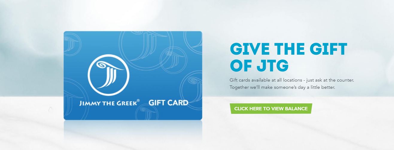
3. Jimmy the Greek

Why’s this a good example to follow?
Jimmy The Greek is simple, loads quickly and highlights the most important information for website visitors. The homepage slideshow features mouth-watering images of well-plated dishes accompanied with excellent copy.
A section on the homepage zooms in on the JTG gift card which is available at all the restaurant locations.
Key takeaway from this example
One important use of your website is to provide relevant information to your website visitors. And since the restaurant industry has been particularly hit by the pandemic, customers will be interested in the safety measures you are taking to protect them. So your website should always have up-to-date information about opening hours, safety protocols, and any other details that are relevant to diners.
4. Girl & The Goat

Why’s this a good example to follow?
This website uses a left sidebar to immediately draw attention. The menu-themed sidebar includes links to all the important pages on the website, including newsletter signup, gallery, accessibility, and safety guidelines related to the COVID-19 pandemic. Girl & The Goat also uses a pop-up form to inform website visitors about their latest promotions.
Key takeaway from this example
Well-designed popup forms ensure your promotion gets maximum views from website visitors and they can boost email conversion rates. Exit popups can boost conversion rates by up to 17%.
5. La Pierre Qui Tourne

Why’s this a good example to follow?
This website features a creative slideshow with smooth scrolling effects. The design is minimalistic with no clutter. The homepage contains only two sections and the footer, highlighting the most important information for website visitors. The website is also e-commerce-ready and has a functional online store.
Key takeaway from this example
Keep things simple. Minimalistic design, unobtrusive animations and website effects ensure a pleasant user experience.
Get your restaurant online with ease using GetResponse’s collection of restaurant website templates. Choose from a range of designs, add your menu, and let your customers know all about your delicious offerings with a beautiful, professional-looking website.
6. Bevri

Why’s this a good example to follow?
Bevri’s website shines the torchlight on their food using stunning professional images. The food is at the center of a restaurant’s activities, and the website does a good job of highlighting Bevri’s Georgian cuisine. Available delivery options are also prominently displayed. For social proof, they include a video review and a list of awards from Tripadvisor.
Key takeaway from this example
Invest in professional images when creating your website. High-quality professional photos of your food and drink ensure that potential customers form a good first impression and increase their chances of patronizing your eatery. Two-thirds of consumers say that the quality of a product image is “very important” in selecting and purchasing a product.
7. O ya

Why’s this a good example to follow?
This sushi restaurant’s website is a clean minimalistic site with clear navigation. The header menu only lists the restaurant’s two locations — Mexico and Boston. Website visitors can view the menu and make reservations at either location using the dropdown menu links. They also top it up with social proof by featuring reviews from the New York Times, Eater and Bravo.
Key takeaway from this example
Customer reviews are super important in the restaurant industry. According to Bright Local’s Consumer Review Survey 2020, out of all industries, consumers read restaurant reviews more than any other industry.
8. Bare Pizza Poco

Why’s this a good example to follow?
This website has a warm, welcoming ambiance and features great storytelling. This restaurant highlights several employee photos, creating a sense of community and giving the business an approachable feel. Beautiful cartoon images ensure a consistent overall fun feeling that ties in with the restaurant’s signature product — pizza.
Key takeaway from this example
The dining experience starts with your online presence. Use your website as a window into your physical location by creating a welcoming ambiance and pleasant user experience.
9. Adachi

Why’s this a good example to follow?
This Awwwards-nominated website features stunning food photography, elegant typography, and breath-taking animations. Customers can order online, make reservations, or purchase gift cards. The contact phone number is prominently displayed in the header for easy access.
Key takeaway from this example
While you can definitely get a DIY website using a website builder, hiring a web designer to build a high-end website is also worth it, especially if you wish to highlight a fine dining experience.
Research by Stanford University credibility experts showed that the average consumer pays far more attention to the superficial aspects of a site, such as visual cues, than to its content. And nearly half of all consumers (46.1%) assess the credibility of a website based on the visual design appeal, such as layout, typography, font size, and color schemes.
10. Ammolite

Why’s this a good example to follow?
This website is all about highlighting the fine dining experience. The slow-moving GIF on the restaurant’s interiors ensures an immersive experience for site visitors. The about and team pages feature great storytelling that emphasizes the restaurant’s “noble ambience” and “exclusive atmosphere.”
Key takeaway from this example
When it comes to restaurant web design, the experience is as important as the food. Highlighting experiences is a smart strategy because 78% of millennials would rather spend money on an experience, such as a restaurant or other activity than buying a store product.
11. Michi Ramen

Why’s this a good example to follow?
Michi Ramen’s website is a delight to view and navigate. It’s simple and has good contrast and a bold typography. There’s a brilliant how to order section which shows customers how to order their ramen. A prominent call to action button leaves no ambiguity — the restaurant wants more online orders.
Key takeaway from this example
According to Nielsen, small font sizes and low-contrast are the number one complaint from web users as it relates to reading online. Use bold typography and good contrast when designing your new website.
12. Le Bernadin

Why’s this a good example to follow?
Le Bernadin’s is a long one-page website that showcases all the website pages in one continuous scroll. Stunning images of the restaurant dishes and interiors emphasize the fine dining experience. The website is e-commerce ready and the business knows its digital marketing onions. Website visitors can book online, buy gift cards, or order books written by the restaurant owner. Overall, the website communicates elegance and poise.
Key takeaway from this example
One-page websites are great at improving user experience because website visitors can access all the information they need on one page. If you are not ready to invest in a website, you can also use well-designed landing pages to promote a special offer or event.
13. The Restaurant At Meadowood

Why’s this a good example to follow?
This restaurant website is another example of experience-focused minimalistic design. The homepage features only an autoplay image slider that spotlights the restaurant’s interior and exteriors. The navigation menu includes links for reservations, social media, and contact pages.
Key takeaway from this example
Accentuate your restaurant’s best-selling features, whether it’s the experience or your dishes. Give potential customers a feel for what they can expect by creating an experience-focused website.
14. Gourmet Natural

Why’s this a good example to follow?
This website works because of its clear navigation menu and well-presented sections. The top-level header shows directions, links to the restaurant’s social media pages and Tripadvisor review page. The restaurant has a newsletter and includes an email subscription form before the footer.
Key takeaway from this example
Your website can serve as a landing page linking to your other important pages online, such as business directories and social media pages.
15. Astrid & Gastón

Why’s this a good example to follow?
This minimalist website features seamless parallax scrolling and great use of white space in the hero section. An arrow points the user in the right direction.
Key takeaway from this example
Direction cues, such as arrows and human gestures are helpful to website visitors, especially on websites that follow an unconventional design pattern.
16. Le 28

Why’s this a good example to follow?
This video-focused website starts off with an immersive video in the hero section and features other videos that highlight the food preparation process and dining experience at Le 28. The website copy changes based on the time of the day. For example, site visitors see the message below when they visit the website a few minutes before opening hours.

Key takeaway from this example
Website users spend 88% more time on pages with videos compared to pages without videos. Borrow a leaf from Le 28 and use videos to showcase your restaurant’s unique offerings.
17. Charlie Brown’s

Why’s this a good example to follow?
The highlight of this website is the beautifully designed card-based menu that shows the prices of the restaurant’s specials.

Website visitors can order online or purchase gift cards directly from the website. Overall, the website is easy to navigate and is replete with images of mouth-watering meals.
Key takeaway from this example
Find creative ways to present your restaurant’s menu. Well-designed sections will keep website visitors engaged and nudge them to take action. Adobe found that 38% of people will stop engaging with a website if the content or layout is unattractive.
18. Ali Baba Restaurant

Why’s this a good example to follow?
The website of this 40-year-old-plus restaurant has a vintage feel. The design highlights its Mediterranean cuisine and halal-certified dishes. The website features a 3D interactive tour of the restaurant’s interiors, providing website visitors with a super immersive experience.
Key takeaway from this example
Virtual tours are a smart way to boost website engagement and restaurant patronage. Customers aged 18 to 34 are 130% more likely to book a place if there is a virtual tour. In addition, 67% of consumers want more businesses to use virtual tours.
19. Arethusa Al Tavolo

Why’s this a good example to follow?
The standout feature on Arethusa Al Tavolo’s website is the gorgeous immersive video that tells the story of their supply chain and it ties in neatly with the homepage copy: diary & seed to table. It makes the brand feel authentic and trustworthy.
The navigation menu becomes sticky as users scroll, so it’s easy to navigate to any part of the website. Their website covers all the bases — online reservations, email marketing integration, contact information, and business hours.
Key takeaway from this example
Use videos to tell your brand story by taking website visitors behind the scenes of your food procurement and food preparation process.
If you’re taking actions to help the environment, you should highlight this. According to the National Restaurant Association, 51% of consumers say the availability of environmentally friendly food would make them choose one restaurant over another.
20. Vernick Food & Drink

Why’s this a good example to follow?
This one-page website shifts from the norm by leaning heavily towards text content, but the approach is well-executed. The introductory text on the homepage feels like a personal letter from an old friend so it’s not off-putting. Images further down the page also compensate for leading text-heavy content.
Website visitors can quickly navigate to different sections of the website without leaving the page. The left footer sidebar shows all the important information — business address and hours, google maps address, social media and online reservation links, plus a gift card CTA — all without feeling overloaded.

Key takeaway from this example
While stepping away from conventional website design can make your website unique, ensure you do it right. Focus on the user experience and use consistent design elements.
21. Sushi Nakazawa

Why’s this a good example to follow?
Sushi Nakazawa’s homepage is both welcoming and reassuring. It features a bold photo of the smiling chef and not much else, creating a thoroughly immersive experience. Navigation menus and reservation details fly out from either side of the screen while the background stays consistent. The minimalist navigation menu highlights only what’s important, such as the menu, the restaurant’s other locations, gallery, Instagram and contact pages.
Key takeaway from this example
Using well-shot images of a staff or team member can help to boost engagement on your website. Eye-tracking studies by Nielsen show that website users pay close attention to photos of real people compared to stock photos of models.
Summing it up
Creating a website for your restaurant is important as more consumers make orders online and search for places to dine. In summary, here are the points to keep in mind:
- Highlight your restaurant’s unique selling points using a combination of images, video, and website copy.
- Where possible, weave in your restaurant’s theme into the website design — consumers are interested in the experience as much as they are in the food.
- Ensure your website loads fast and has smooth transitions that won’t hurt user experience.
- Hiring a web designer if you want to build a high-end website with custom superior design.
- Build your website using an intuitive tool like the GetResponse Website Builder if you want to have full flexibility and control over what your website looks like.
- Include an email marketing signup form on your website to capture leads and grow your email list.
Overall, the most important function of your website is to attract potential customers to your restaurant. Keep this in mind and ensure that every element on your website nudges your visitors towards that goal.
Feeling inspired and ready to build a website of your own? See the GetResponse Website Builder in action and try it for yourself today.
