An abandoned browse email is sent to shoppers who viewed a specific product or category page on your website but left without adding a product to their online cart. A familiar struggle, isn’t it?
Abandoned browse emails are slightly different from cart abandonment emails which are triggered when shoppers add products to their cart but do not check out.
An abandoned browse email aims to motivate prospects to purchase the products they spent time viewing on your page. The automated email also provides the perfect opportunity to recommend similar products the customers may like.
The data below from Oberlo shows that only about 5.94% of shoppers added products to their carts in October 2024, and there has been a noticeable downward trend since November 2023.
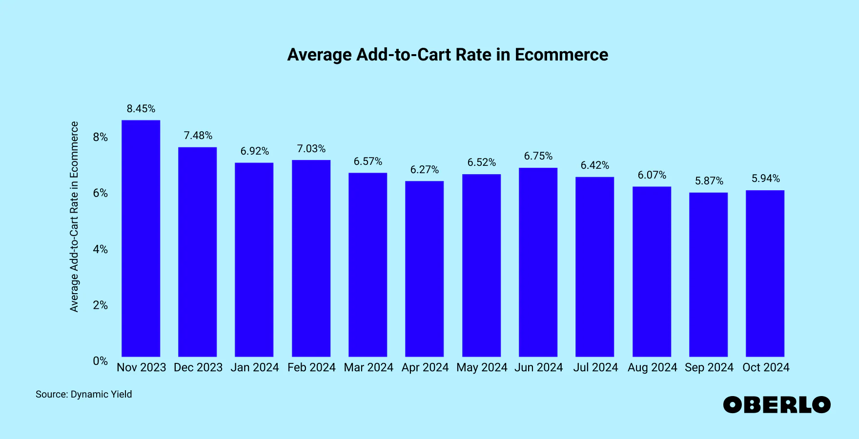
While these figures could be higher, there’s a possibility that your ecommerce store does not record up to the global average, and that’s not good for your revenue.
So, as you successfully attract potential customers to your ecommerce website through social media, SEO, and email marketing techniques, you must also ensure that these leads buy from you. One of the proven ways to get the results you’re hoping for is to send browse abandonment emails.
And we are here with some powerful browse abandonment email examples to inspire you.
11 best browse abandonment email examples
Some of the reasons behind browse abandonment in ecommerce sites are poor product page design, too much clutter, misleading ads, or poor user experience. So you should always look out for these.
But what if your store’s design is flawless and yet people keep on bouncing? That’s about time for you to craft those browse abandonment emails and encourage those visitors to make a purchase and become loyal customers.
That said, let’s show you 11 interesting examples of browse abandonment messages we’ve seen:
1. Cole Haan
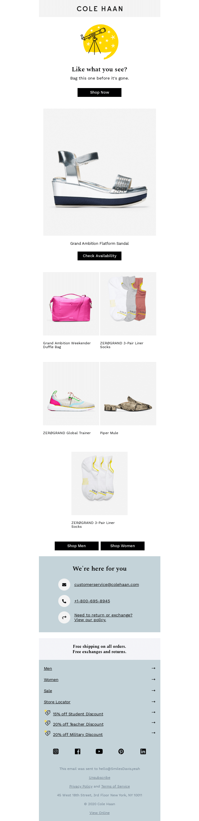
Cole Haan’s abandonment email example comes with a subtle design. They do not hesitate to build the sense of urgency with the “bag this one before it’s gone” caption. However, the email is neither pushy nor overwhelming, just a simple reminder.
Cole Haan also strikes your curiosity a little with the “check availability” CTA.
Like the email subject line says, Cole Haan was keen to recommend products similar to what the browse abandoner had viewed on their ecommerce store. This is an effective way to engage potential customers based on their interests.
The browse abandonment email subject line is straightforward and precise. It also lets the recipients know that the products in the email were specially curated for them. This will further inspire the potential customer’s purchase intent.
So, like Cole Haan, you can opt for subtle abandonment emails. Keep only the necessary details and try not to overwhelm your customers. Integrating automated AI recommendations on your ecommerce store can help you curate relevant products like the Cole Haan example we just saw.
2. Lego
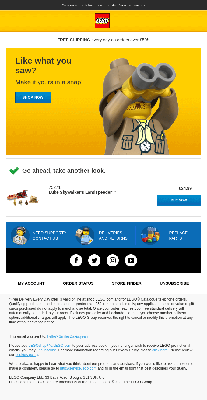
Lego’s browse abandonment email does not fall short with the captivating visuals. Unlike the Cole Haan example, Lego’s email focuses on a single product. However, they do not overlook the fact that people love incentives. Hence, they add a “free shipping” notification to their email.
Notice that they also include clear and specific calls to action.
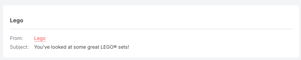
The email subject is an obvious reminder that the customer recently viewed some products in their store, and that’s enough to get them back—especially if they had gotten distracted while browsing.
You can learn from Lego and use engaging visuals in the browse abandonment emails to boost engagement and pick your potential shoppers’ interest.
3. Adidas
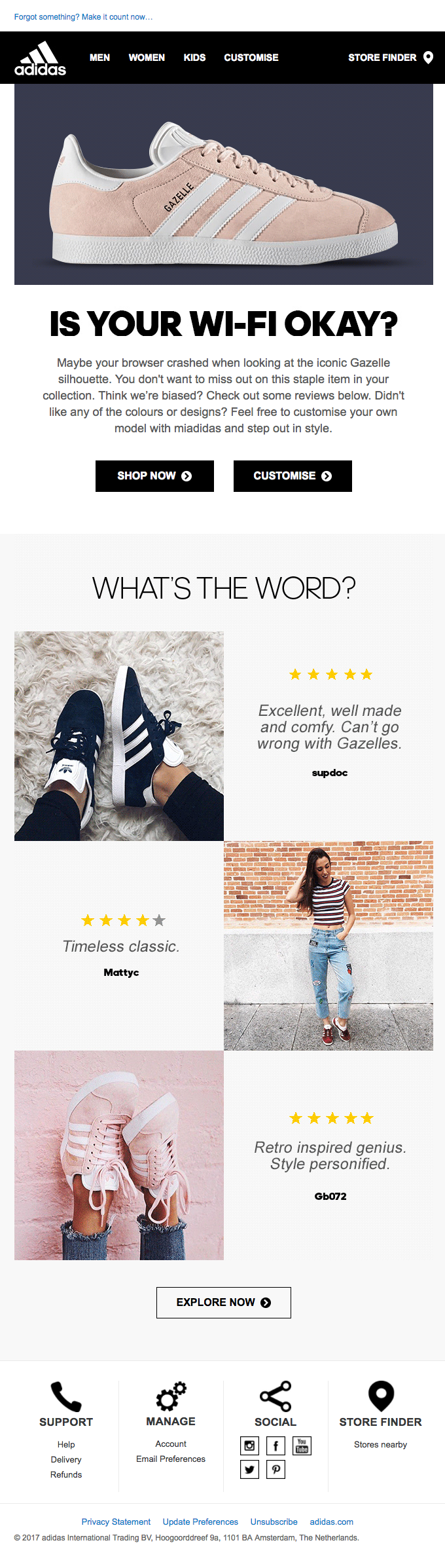
Adidas understands that a browser issue could also affect the buying journey, so they choose to empathize with the customer.
They start by showing concern about what may have been the reason for the abandonment. Even if the customer didn’t have a browser issue, it would be good to know that the brand cared enough to ask.
Also, Adidas subtly integrates the fear of missing out (FOMO) into the copy instead of an outright promotional message. They focus on the customer by saying, “you don’t want to miss out.”
The browse abandonment email gets even better with the curation of reviews about the product. This way, potential buyers are encouraged to continue their shopping based on reviews from other buyers—and according to research, 58% out of 95% of customers will buy products with positive reviews.
Also, although the email has multiple CTAs, they’re all precise and do not confuse the customer.
The email subject in this abandonment email example is an excellent attention grabber, too. It’ll either get the customer curious about what happened to their Wi-Fi or show genuine concern from Adidas. Either way, it’s enough to get a click without being too clickbait-ish.
Another thing you can learn from Adidas is to throw in some reviews about the abandoned product that your recipients viewed when sending an abandoned browse email.
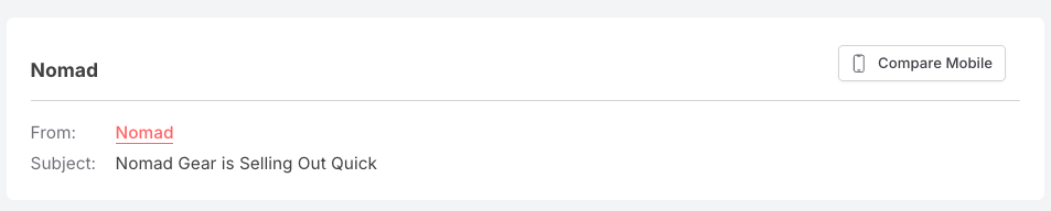
4. Nomad
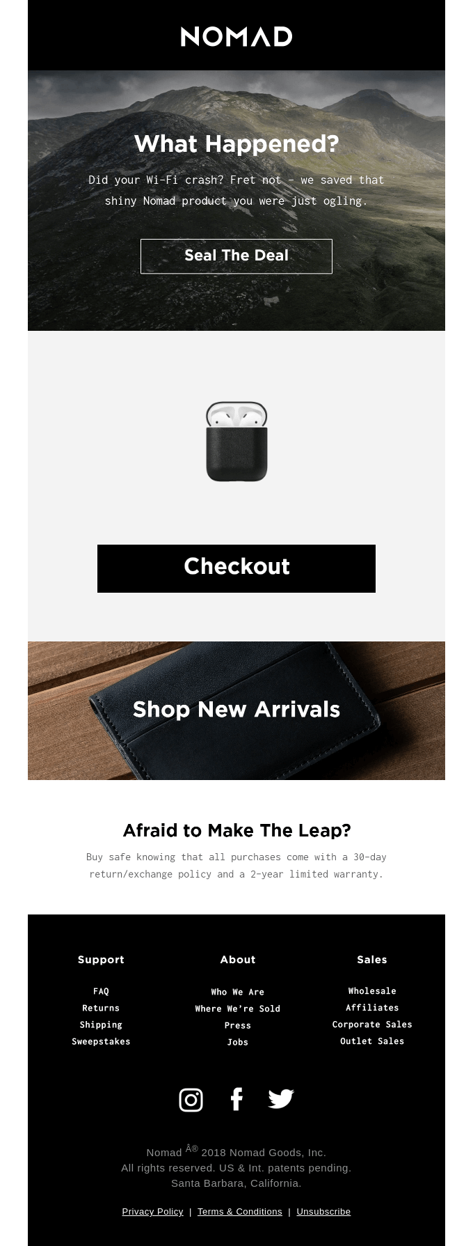
Like Adidas, Nomad wants to know why the customer dropped off without adding the products to their cart. They use a well-crafted copy to indicate this and nudge the customer to continue shopping. Rather than a regular CTA, Nomad stands out with the “seal the deal” caption.
But that’s not all. Nomad also understands that a potential customer might need some reassurance before buying from them. So, they indicate that there’s a return policy and a 2-year warranty. With this, a skeptical prospect is encouraged to buy from them.
The subject line for this email is direct, based on urgency, and indicates a sense of authority.
Like Nomad, you can use the browse abandonment emails to nurture trust with your prospect and show customers that you want them to enjoy an uninterrupted shopping experience.
5. Haoma
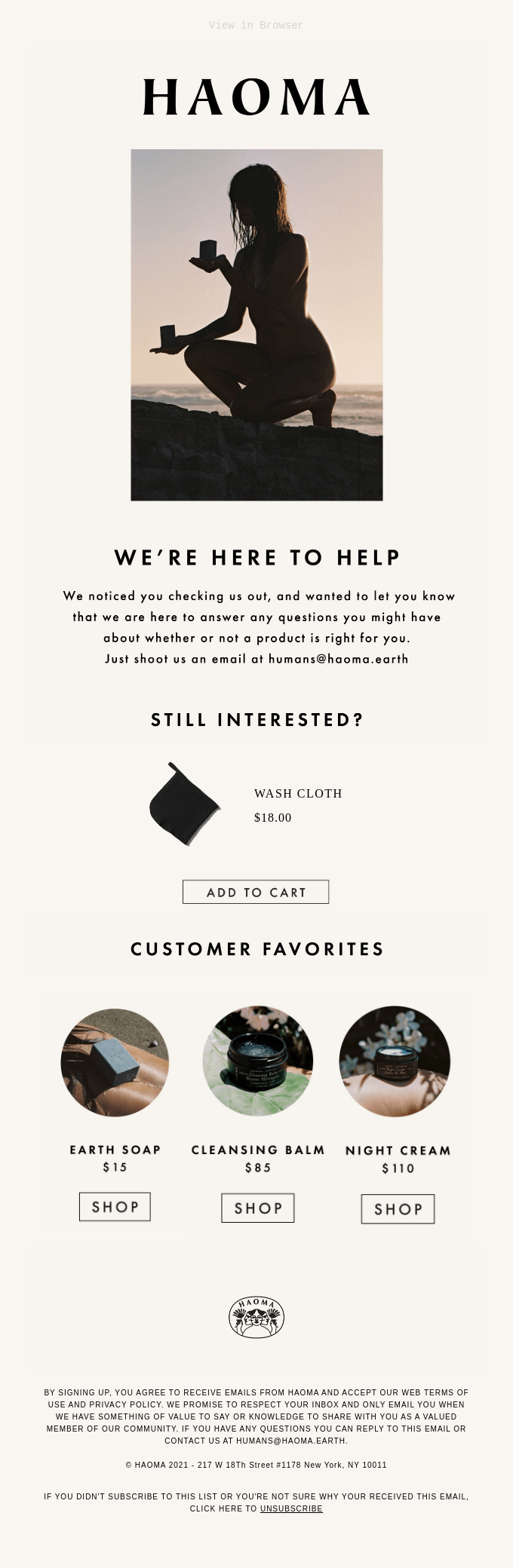
Haomas’ browse abandonment email is a great example of how a creative image and copy can emphasize the shop’s readiness to help the customer. They understand that the customer might have some questions or need assistance to continue shopping. They do not hesitate to provide this to recover lost sales.
The email copy is direct. Also, they add a specific product that the customer has shown interest in and use the “Add to cart” call to action, which is more precise.
Next, Haoma throws in some customer favorites to ensure that the shopper visits their store again. The subject line is an open-ended question that aims to immediately engage the customer.
When you send your browse abandonment emails, like Haoma, you should consider if the customer may have had some queries but could not get in touch quickly. Offering your support right in their mailbox with a quick follow-up email would be an effective way to pick the shopper’s interest and get them to make a purchase on your ecommerce site.
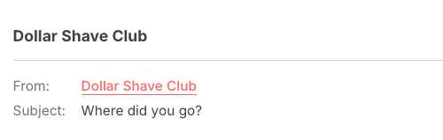
6. The Dollar Shave Club
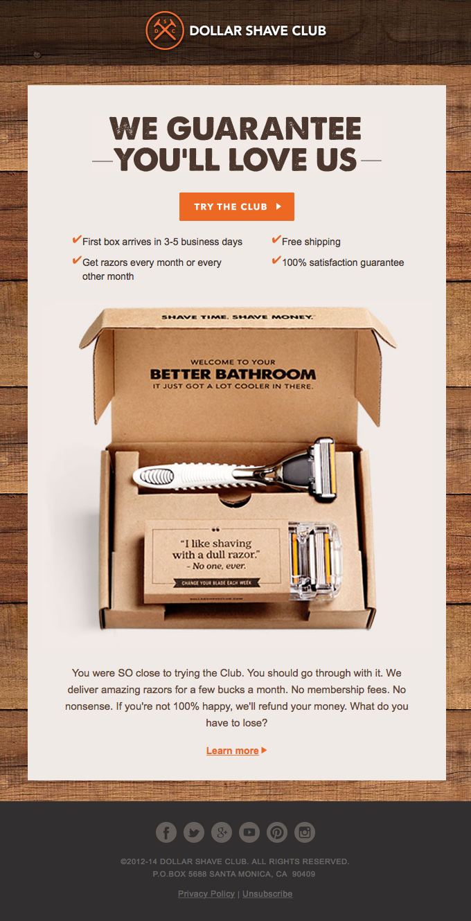
The Dollar Shave club is known for its remarkable boldness, and this abandoned browse email stays on brand.
The email focuses on the benefits of shopping from the online store.
Also, The Dollar Shave Club’s email copy gives the customer a guarantee that they’ll find what they need and assures them that they can get a refund if they don’t. With this assurance, a doubting prospect will no longer be reluctant to complete the purchase.
There’s also a high-quality image of their shaving kit. They finish off with some humor and visible CTAs. Notice that the “Try the club” CTA is highlighted more than the “learn more” CTA below. Obviously, they want to drive more clicks on the first call to action.
The Dollar Shave Club also calls for attention with the “where did you go” subject line, maximizing curiosity.
With the email from The Dollar Shave Club, we see that you can lure prospects back and encourage them to stop searching for alternatives by highlighting the benefits they’ll get from your products.
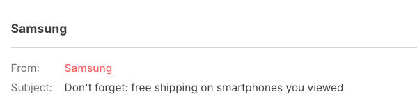
7. Samsung
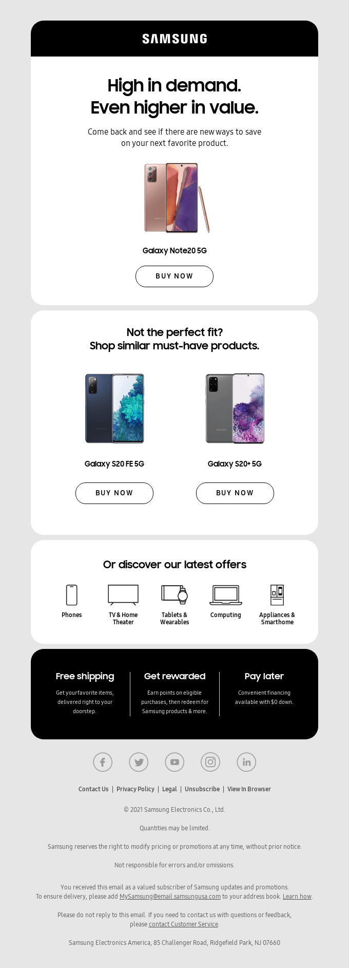
Samsung’s abandonment message is not just a follow-up action we often see in many automated emails. Samsung starts by telling customers the product they like is in high demand— that’s FOMO in play. They also prompt the customer to check their store for other products they’d like.
The subject line uses free shipping to encourage clicks:
Additionally, they include suggestions for similar products.
Samsung also didn’t miss out on a chance to cross-sell by mentioning the other product categories they want the customer to check. They finish off by highlighting incentives and reward programs customers can enjoy.
You can use similar browse abandonment email templates to create a strong sense of value around your products and match this with an indication of urgency. If the customer who is already interested in the product sees that it may run out soon, and knows they can save money—they’ll most likely take the bait.
Many browse abandonment emails already use urgency in their copy — but you can reinforce it visually as well. For example, adding elements like countdown timer emails can make limited-time offers more compelling and encourage shoppers to return before the opportunity disappears.
8. On
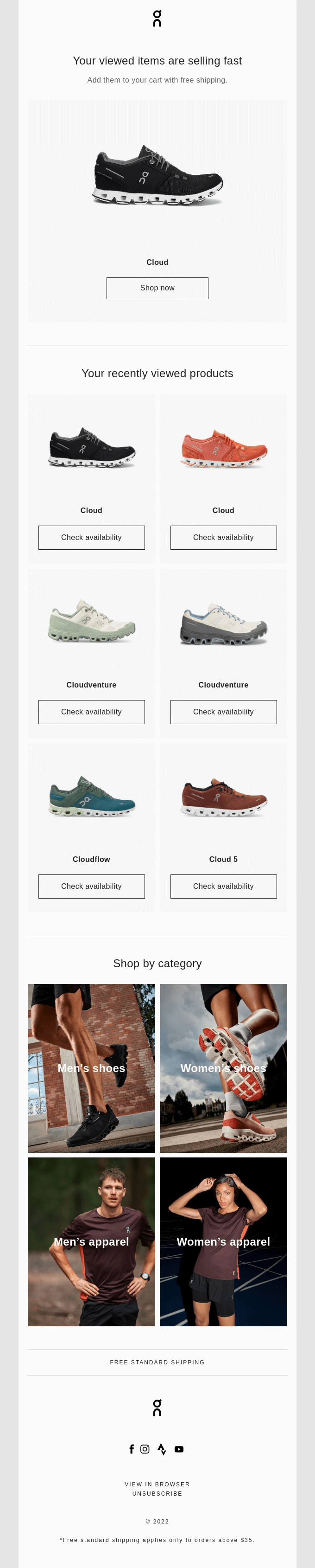
On’s email is a little similar to Samsung’s. They build urgency around the products that the customer has viewed. They also add the “free shipping” incentive and include the various categories of products in their store.
The email design is sleek and easy on the eyes. The call to action is also straightforward.
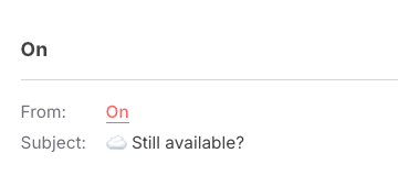
On uses the caption “still available?” A precise subject line that’ll trigger curiosity with the prospect and get them to open the email.
9. National Mattress Outlet
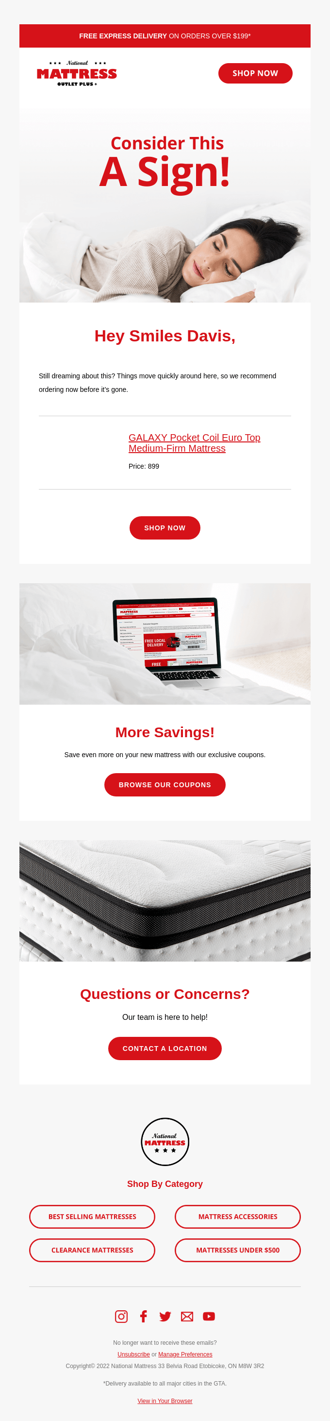
It’ll be hard to ignore the catchy color combination in the above browse abandonment email from National Mattress Outlet.
In this abandoned browse message, the caption – “express delivery” is what customers see first. This quantity-based offer is one way for the store to increase the conversion rate while boosting the average order value. Again, there’s a subtle hint that the product will sell out soon.
The email also includes a prompt for customers to contact them with questions they might have and includes other product categories. They offer coupons that’ll help customers save more money.
“Get it before it’s gone!” is a nice catch for customers who don’t want to miss out on the high-quality mattress they like.
You can send a similar abandonment email that combines all the factors— incentives, great design, personalization, and customer support.
10. Pulp & Press
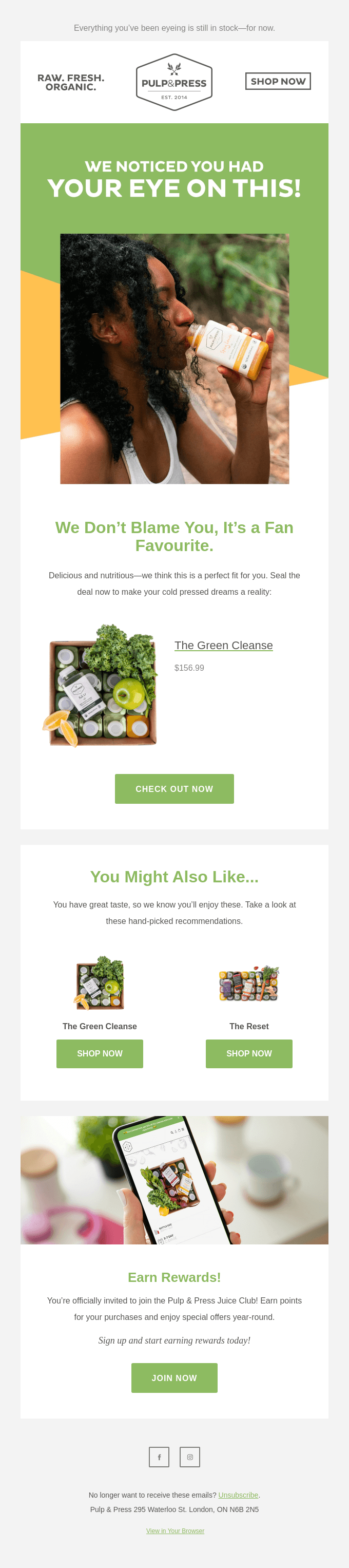
This Pulp & Press email essentially says: we know you love this product, but others love it too, so get it before they do.
The focal image also contributes to showing the delight in consuming their product.
Pulp & Press does not shy away from a perfect cross-selling opportunity. The CTA buttons are clear, and the texts are precise. And finally, they encourage the customer to join their reward program. Everything about this browse abandonment email is built to engage the customer.
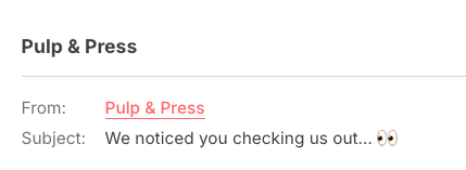
Further, Pulp & Press uses a cheerful and exciting subject line to get the customers’ attention. This is something you can definitely emulate with your own emails, too.
11. American Giant
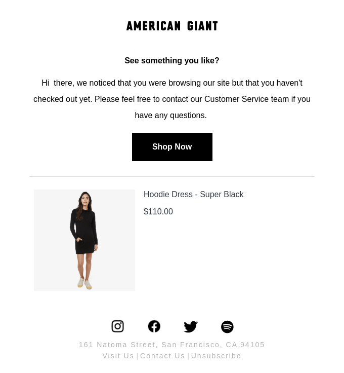
American Giant uses plain text to drive its message across. The copy is straightforward: they let the prospects know that customer service is readily available.
There’s a distinct “Shop Now” button that’s impossible to miss. This abandonment email by American Giant focuses on a single product neatly placed within the email.
Also, the subject line is a curious one that’ll get the recipient to click. Simple emails like this one are easy to pull off, and you’d be surprised by how effective they can be.
How to create browse abandonment campaigns in GetResponse
An abandoned browse email is typically sent when a visitor views a product or category page but leaves without taking the next step, like adding an item to their cart .
In GetResponse, you can approach this in a couple of ways depending on how and when you want to reach your audience.
Using automation workflows (on-site and email)
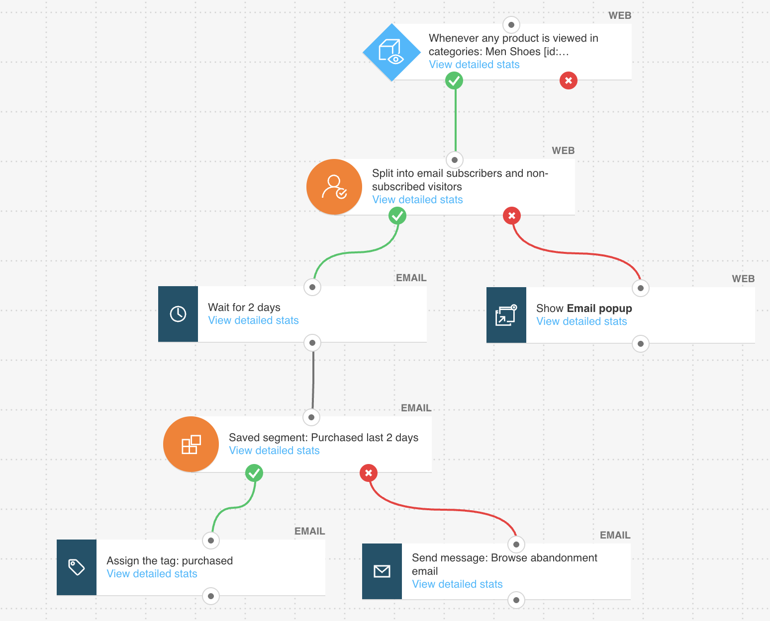
One option is to build a workflow using GetResponse Marketing Automation based on a visitor’s activity on your website.
For example, you can trigger a workflow when someone views a product page or category page but doesn’t make a purchase.
From there, you can respond in two ways. You might display a popup while they’re still browsing and about to leave the page — for instance, offering a discount or highlighting product benefits.
If they leave without converting, you can follow up with an email featuring the products they viewed or similar recommendations.
This approach works well because it reacts directly to user behavior and allows you to engage visitors while their interest is still fresh.
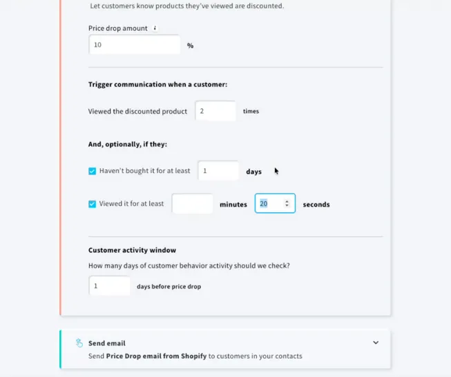
Using price drop campaigns (email only)
Another way to re-engage browsing visitors is through price drop campaigns.
Instead of reaching out immediately after someone leaves your site, this method focuses on timing. If a visitor has viewed a product multiple times and its price decreases, you can automatically email them informing them about the change.
This type of message can be especially effective for shoppers who are still considering their options or waiting for a better deal, as it gives them a clear reason to return and complete their purchase.
Setting up abandoned browse campaigns this way is simple. Once your store is integrated, just head over to Ecommerce Campaigns, pick a Price Drop campaign template, specify when the campaign should be triggered, and select your email.
Here’s what this looks like:
Which one should you use?
Both approaches can be useful, depending on your strategy.
Automation workflows are better suited for immediate engagement based on browsing behavior, while price drop campaigns help you reconnect with visitors later, when there’s a stronger incentive to buy.
Using a combination of both can help you cover different stages of the decision-making process and improve your chances of converting browsing visitors into customers.
Final words
Your email marketing strategy should not only aim to nurture new and existing customers. It can also be an avenue to increase sales through browse abandonment email campaigns.
Sending browse abandonment emails is an effective way to regain potential buyers. Use these emails to show prospects what they are missing out on. You can also use them to cross-sell alternative products or offer customer support. The latter works best if the user abandoned your site due to technical issues.
GetResponse MAX helps you automate your browse abandonment emails with more precision and less hassle thanks to enhanced customization and professional support eager to help you succeed.
Now that you know this, go ahead and create some awesome browse abandonment emails to turn window shoppers into buyers. Good luck!
