Introduction
According to statistics from various sources, mobile is taking over the Internet. People use mobile devices not only to interact with others, e.g. by checking and answering emails and using social media, but also to find information, do online shopping and seek relaxation and entertainment (according to “Seven Shades of Mobile” study, conducted by InsightsNow for AOL and BBDO).
This guide will help you discover the full potential of responsive landing pages. You’ll learn why you need responsive landing pages, find out about best practices in landing page design, and discover how to use Landing Page Creator to prepare beautiful landing pages that convert.
We’ve included some great-looking designs to inspire you to use our practical tips to create magic with GetResponse Landing Page Creator.
Designing landing pages for mobile
Before we go into details and explain the concept of responsive web design, let’s make sure we all know what a landing page is and why every email marketing campaign needs them.
In marketing, a landing page is designed for a single, focused objective.
The idea is to set up a landing page that will not distract visitors from a particular call to action. A landing page is carefully designed to drive conversions.
All successful email marketers know how important a landing page is in an email marketing campaign. The main role of an email is to direct subscribers to a dedicated page – where conversion takes place.
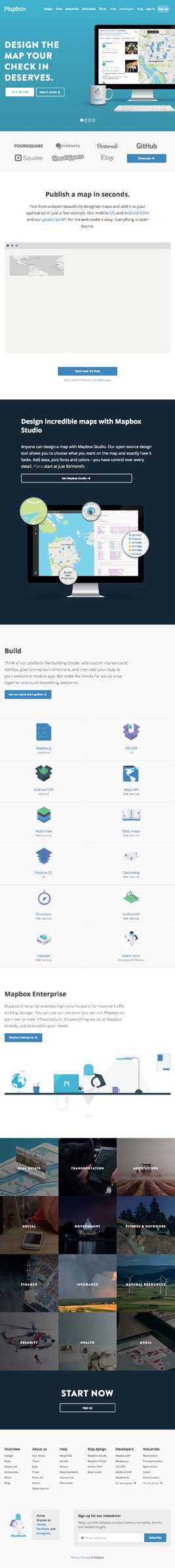
Below is an example of a single-purpose landing page from bitlit. In the above the fold (ATF) section the user can see a single call to action, prompting the reader to download an e-book.

What is RWD?
Kayla Knight, author of Smashing Magazine
Responsive web design is the approach that suggests that design and development should respond to the user’s behavior and environment based on screen size, platform and orientation. The practice consists of a mix of flexible grids and layouts, images and an intelligent use of CSS media queries. As the user switches from their laptop to iPad, the website should automatically switch to accommodate for resolution, image size and scripting abilities. In other words, the website should have the technology to automatically respond to the user’s preferences. This would eliminate the need for a different design and development phase for each new gadget on the market.
Here are some statistics from Pew Research Center’s Mobile Technology Fact Sheet:
- 58% of American adults have a smartphone.
- 32% of American adults own an e-reader.
- 42% of American adults own a tablet computer.
As you can see, more and more people own several mobile devices that serve different purposes and come in different screen sizes. It’s no longer enough simply to design a website for desktop and provide a separate mobile version.
It’s impossible to keep up with all the new devices and resolutions coming out every month. That’s why web designers came up with the idea called Responsive Web Design, which takes us to the concept of responsive landing pages.
What is a responsive landing page?
A responsive landing page is a web page that renders correctly on all the devices such as computers, mobile phones, tablets, or different operating systems. Having a responsive page is very important to remain accessible for all users and make the most of your opportunities.
Why do you need responsive landing pages?
The answer is pretty straightforward. If you want to deliver your message to your audience, you need to adapt it for the devices they use. Most people check their email regularly using a mobile device such as smartphone or tablet. Make sure they get the same user experience no matter the device they use.
A landing page is a crucial element of an email marketing campaign. For many email marketers, this is the place where the magic happens. If your landing page is well designed, it makes the visitor want to respond to your call to action: subscribe to a newsletter, download an e-book, buy a product – you name it.
Responsive design of your landing page allows users to do whatever you ask them to do in your call to action. You can no longer afford to lose your mobile users.
Bringing landing pages to mobile users
Desktop vs. mobile
In early 2014, for the first time, the number of mobile Internet users was greater than the number of desktop users. As a result, we can observe a huge change in the way people use social media, check email, search for products and shop.

http://www.smartinsights.com
It turns out that with several mobile devices at hand, we tend to browse the web throughout the day. So your campaigns must be adjusted to multiple devices and available for users at any time.
According to a 10ZiG study, mobile traffic to websites will overtake desktop by March 2017, based on the current rate of growth. As you can see, going responsive seems to be the best strategy for the future.
The ROPO effect
It’s impossible to draw a clear distinction between online and offline shopping. According to a recent study by Forrester, as many as 88% percent of consumers research online before making an offline purchase. Websites often serve as showrooms and sources of information, but the conversion takes place offline.
With a well-structured responsive landing page, you can reverse the process. A customer using a mobile device can find your product online while inside your brick-and-mortar store and compare the price to other offers. If you provide a first-class buying experience by offering wide selection, fast delivery, and competitive price, you can get the customer to take the next step and make a purchase.
Differences in UX for mobile and desktop
There are a few fundamental differences between mobile and desktop UX to bear in mind when designing a mobile web page:
Screen size is limited
Be selective. Don’t try to include every message on a mobile landing page. If a website is cluttered with too many elements, users are more likely to leave.
Typing is problematic
Too much typing will discourage visitors from filling up your contact form. Checkboxes and drop-down lists are better than text boxes. Your landing page should make conversion easy.
Buttons are smaller
According to Fitts’s law, a small target slows users down because they have to pay extra attention to hit the target accurately. So apply finger-friendly design. Make button size optimal for mobile users – use the actual size of the human finger in order to avoid touch-target problems.
Image loading is slower
Keep your website fast by reducing image dimensions. This saves processing power and memory otherwise used to resize high-resolution images.
Best practices in landing page design
In our infographic, Creating Pages That Convert, we used the acronym CONVERTS to present the basic principles of landing page design. Follow the rules below to optimize your pages for best results.

How important is the ATF section?
The phrase “above the fold” (ATF) originates from the newspaper industry and refers to the space above the crease in the newspaper. As applied to landing pages, the ATF section contains all the elements you see before you scroll down.
The ATF section is your only chance to attract customers and convince them to view the rest of your landing page. Each product is different, so there is no universal layout that works for all. You should test important elements and find out what resonates best with your audience. When planning you ATF section, consider the following elements:
- Powerful headline
- Supporting sub-header
- Piero shot
- List of benefits
- Clear call to action
- Customer testimonials
Where should the CTA button be placed?
You have two choices: above the fold or below the fold. So it depends on the complexity of your product and the amount of information you want to put on a landing page.
Here’s a diagram from the KISSmetrics blog, showing the correlation between the level of complexity and the best choice of CTA placement on a landing page.

Should I use long or short landing pages?
That’s an excellent question, but you’ll need to find the answer yourself. There are two types of consumers, each of which wants a different amount of explanation:
- Explanation fiends: deep, detailed explanations help them develop a desire for products. These users are genuinely interested in how your product works.
- Explanation foes: brief explanations give them a strong understanding and desire for products. These users prefer minimal details and won’t bother reading a long paragraph or explanation.
So get to know your audience and optimize your marketing message according to their preferences. Try A/B testing to find out what type of landing page converts better.
Mobile first
Mobile first is an interesting approach using something called progressive enhancement. You start your design with the smallest screen size and enhance your website for larger platforms.
Since you start with a limited space, you include only the necessary elements. This approach might result in less clutter, better arrangement, and a better overall user experience.
Return on investment
As a marketer, you constantly need to measure ROI. Here are four consequences of switching to responsive design:
Your readers can access your landing pages while they’re on the go. They can navigate without having to pinch, resize or scroll sideways to get the message. With bigger, better-spaced CTAs, they know where to click to make the purchase without worrying about imprecise clicking.
If your landing pages follow the rules of responsive design, low conversion rates (due to faulty design rendering on mobile devices) will be a thing of the past. By aligning how you sell your products or services with how your subscribers shop, you can get orders regardless of where your readers are. Whether they are on the move or relaxing on the sofa – you’re always ready!
Now that you’ve captured the reader’s interest, they may prefer to make the purchase on a laptop or desktop rather than a mobile phone. That’s great! Responsive email looks great on all devices. If your readers prefer to make the purchase decision while seated and relaxed, you’re likely to sell even more. You made a great first impression and can then show a wider offer.
If you create a great user experience and avoid frustrating your readers, there’s no need to worry about high unsubscribe or complaint rates.
- Improved user experience
- Better conversion metrics
- Bigger sales
- Lower complaint rates
GetResponse Landing Page Creator
You already know how important a landing page is for a successful email marketing campaign. Here are a few features of GetResponse Landing Page Creator that you may find interesting:
Responsive design
You can prepare mobile-friendly landing pages in minutes and with no IT skills required. Use Inbox Preview to make sure your pages automatically adjust for all display options: mobile, tablet and desktop.
Built-in web forms
To capture leads and user data in seconds, design a landing page with custo input fields, labels, and fields.
100+ templates
Our growing collection of ready-to-go templates enables you to create stunning, high-performing pages in less than 30 minutes.
Image editor
You can choose from 1000+ free photos or use your own images. The built-ir toolkit includes filters, stickers, brushes, etc.
No HTML coding
Move, resize, rescale, crop, group and re-shape any element of your landing page: text boxes, images, backgrounds, input fields and buttons.
A/B testing
Find the best-performing web design by using A/B testing to track and improve your page stats. Use the SEO tools to reach your audience in the crowded online world.
Useful reminders
Here are a few tips to help you get started with Landing Page Creator. With the drag-and-drop WYSIWYG editor, it’s easy to edit every element of your page. But there are certain characteristics of Responsive Web Design that might require some clarification.
Positioning
All elements are positioned using absolute positioning, meaning that each element is a separate layer.
In your mobile layout preview, you may be surprised to discover that the elements are positioned in a different order. That’s because the editor places them according to the tree of objects: elements positioned up-down are reversed by the editor.
Block elements
You can create block elements to use as containers for smaller elements. Putting things in a container allows you to preserve the order and makes transferring the design to a mobile version much easier.
Arrange your landing page in boxes such as header, body, footer, etc., so you can introduce changes to certain elements without losing control over the layout structure.
For the same reason, we suggest putting several paragraphs of text into a single block element.
Images in block elements
If you want to display an image as a background of a block element, use the background image option. Otherwise, the image will become a separate element in the mobile version of your project.
Measuring effectiveness using landing page statistics
It’s easy to track your landing page performance and optimize particular elements in order to reduce bounce rate and increase conversions.
Go to the Manage landing pages section in the dashboard, where you’ll see thumbnails of all your landing pages. On the right are the available statistics:
- Subscribers with sign-up ratio
If the goal of your landing page is to build your email list, prepare a strong lead magnet and a clear sign-up form. You can watch the number of subscribers grow in real time. The sign-up ratio tells you how many visitors subscribe to your list.
- Visitors and unique visitors
This statistic shows the total number of visits to your landing page and the number of unique visitors.
Landing Page Lookbook