Great email design helps you build stronger relationships, sell more, and improve your email marketing ROI… and you don’t need to be a designer to get it right. The essentials come down to 18 best practices: nail the “envelope” first (sender name, subject line, preheader), keep emails on-brand and accessible, use images and CTAs strategically, pick a mobile-friendly layout around 600 px wide, use supported fonts, and design for dark mode.
This guide walks through all 18 practices with examples, so you can build good-looking, high-performing email templates step by step.
Want your email marketing campaigns to shine and get your audience clicking? Then let’s talk about email design.
Not a designer? Check out the GetResponse AI Email Generator or our 150+ free email templates and get your campaigns off the ground in moments.
The 18 email design best practices at a glance
| # | Best practice | Why |
|---|---|---|
| 1 | Earn trust with your sender name | Recognizable, non-deceptive sender name lifts opens |
| 2 | Grab attention with the subject line | Interesting, specific; keep ~under 60 characters but prioritize specificity |
| 3 | Add preheader text | Extends the subject line; emails with preheaders saw ~44.67% open rates |
| 4 | Stand out with email annotations | Use Gmail Promotions tab logo/offer/carousel |
| 5 | Keep your email on-brand | Consistent logo, colors, fonts, CTAs |
| 6 | Feature the offer in your header | Above-the-fold header; top ~300 px is what most see first |
| 7 | Use images strategically | Mind format, weight, image-to-text ratio, ALT text |
| 8 | Use video to drive engagement | Use a linked thumbnail (limited native video support) |
| 9 | Pay attention to hyperlinks | Prefer HTML for tracking; mind text-to-link ratio |
| 10 | Make your CTAs prominent | One primary CTA, above the fold, high contrast |
| 11 | Don’t neglect the footer | Compliance + creative uses (USP, feedback, promos) |
| 12 | Make your emails accessible | ALT text, contrast, 14–16 px fonts, descriptive links |
| 13 | Use supported fonts | System fonts or web fonts with fallbacks; up to two |
| 14 | Craft compelling copy | Concise, skimmable, bulleted, emphasized |
| 15 | Make your emails feel personal | Dynamic content; +1.27% avg CTR with body personalization |
| 16 | Pick the optimal email layout | One-column, inverted pyramid, zig-zag, two-column |
| 17 | Make your emails responsive | 50%+ open on mobile; build mobile-responsive |
| 18 | Don’t neglect dark mode | ~80% switch to dark mode where available |
Whether you realize this or not, your email template’s design (and its optimization) starts even before your subscribers open your message – right in their inboxes.
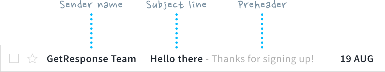
There are three main elements of your email that your audience will see before they decide to read it – sender name, subject line, and preheader. We’ll start with these three elements, sometimes referred to as the envelope, then move on to the building blocks of your email.
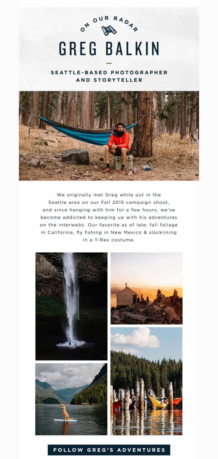
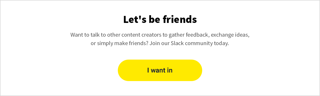
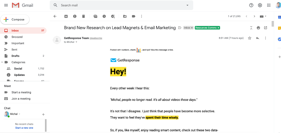
To help you better visualize each element, we’ll be using this email template we created for our imaginary content creators newsletter 🙂
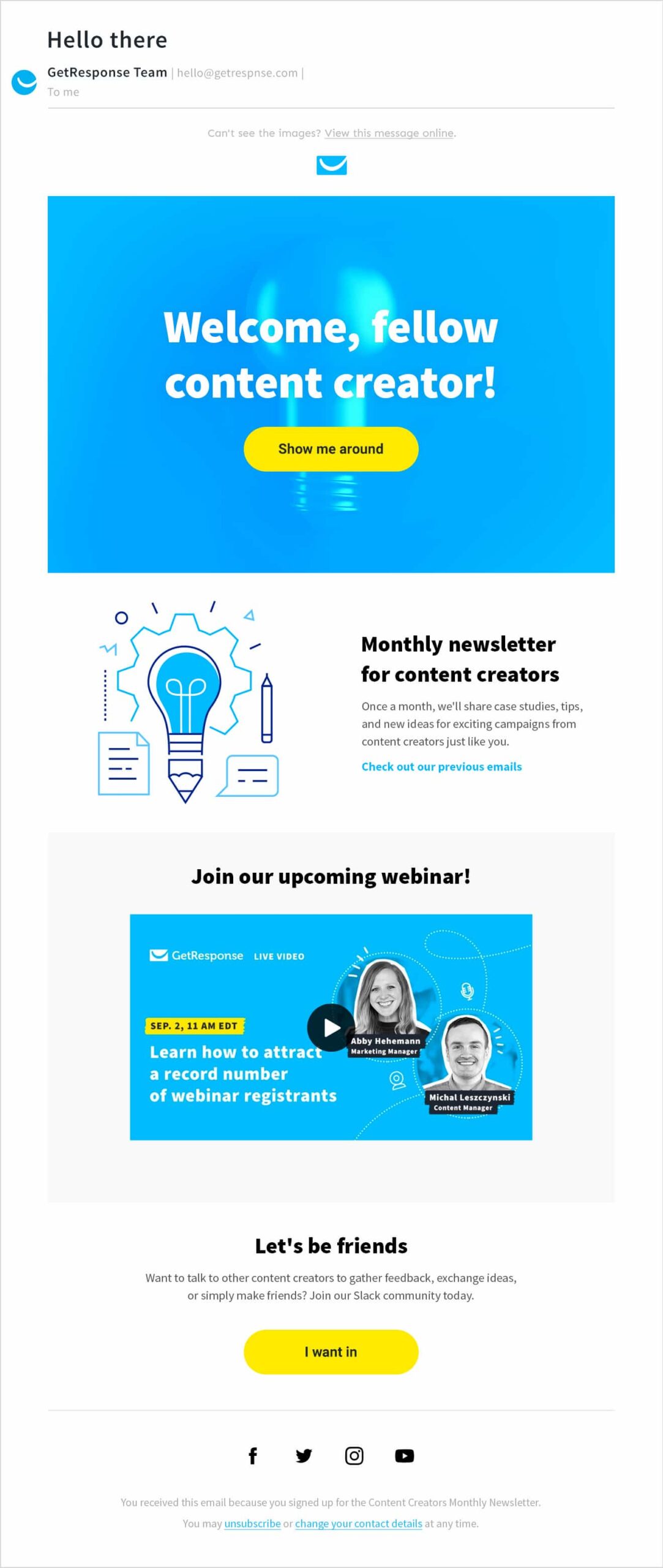
1. Earn trust with your sender name
The primary goal of the sender name email field is to inform the recipient of who the message came from. But that’s not all. The sender name also has the power to reinforce your subject line and preheader, therefore, increasing your email open rates.
For this to happen, your sender name must be recognizable and trustworthy, and it absolutely cannot be deceptive. Provided that your subscribers have positive experiences with your brand, they’ll be more prone to open messages with your sender name next to them.
What to put in your sender name
There are several ways to construct your sender name. Here are some of the popular patterns you could follow (with examples):
- [Name of the company] – GetResponse
- [Name of the person] from [Name of the company] – Michal from GetResponse
- [Name of the company] [Name of the message or topic] – GetResponse Newsletter
- [Name of the department] at [Name of the company] – Content at GetResponse
- [Name of the company] Team/Community/Crew – GetResponse Team
- [Name of the employee] – John Smith
When choosing your sender name, make sure to check how it appears in your recipient’s mailbox. If it’s too long, it might get truncated, and your subscriber may have trouble recognizing who the email is from.

Pro tip: To improve your brand’s image and deliverability, make sure to send your email using a custom email domain, e.g., james@yourdomain.com, instead of using free domains from services like Google or Yahoo! And while you’re at it, don’t forget to authenticate it, too.
2. Grab attention with the subject line

Just like a good movie trailer, your subject line needs to be either interesting, entertaining, or engaging, and provide enough information to convince your recipients to open up your email. And as email inboxes tend to be very busy places, it won’t hurt if your subject line also stands out in some way.
Email subject lines dos and don’ts
Here are some of the elements you can use in your subject lines to make them more visible in an inbox. To learn more strategies, read our guide on how to write effective email subject lines.
- Personalization (for example, your recipient’s name)
- Numbers
- Emojis
- Power words
- Questions
- Puns
- Idioms
- Terms related to your brand
- Brand names your audience will immediately recognize
At the same time, you should avoid the following:
- Writing your subject lines in all caps
- Using excessive punctuation
- Using RE:, FW: and other phrases that may trick the recipient into thinking this is a personal communication
- Using phrases commonly associated with spam
- Deceiving or tricking people into opening your emails
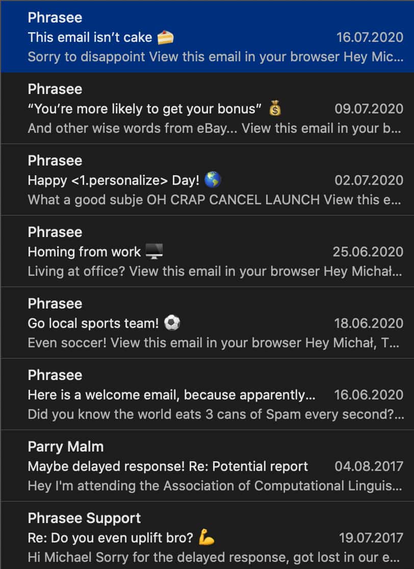
For your inspiration, here are creative email subject lines that Phrasee’s uses in their email newsletters:
Subject line length
If you have too many characters in your subject line it may get truncated in some of the email mailbox providers. Because of this your message may lose its meaning (and impact), or even end up looking funny or awkward at times. To make sure your message comes across, you’ll want to keep your subject lines relatively short (below 60 characters).
That said, don’t be too worried if you’re unable to cut down on words. Our study has shown that the best performing subject lines don’t follow the “keep it short” rule and focus more on being specific. After all, if your brand has an engaged audience, they won’t care if you’re using emojis or an excessive number of characters.

Notice the difference in length of these email subject lines
Using emojis in email subject lines
Emojis can help your emails stand out, but is it always a good idea to include them in your subject lines? So far, there’s no consensus.

In this article on using emojis in email subject lines we’ve referred to different studies that have shown both the positive and negative effects of this tactic. We’ve even done our own research, which showed that emojis can lower your open rate by 5%, but they’re only used by about 25% of messages.
While we’re fans of using emojis, you’ll need to test this tactic yourself (via an A/B test) and see whether it matches the tone of your communication and your target audiences’ needs.
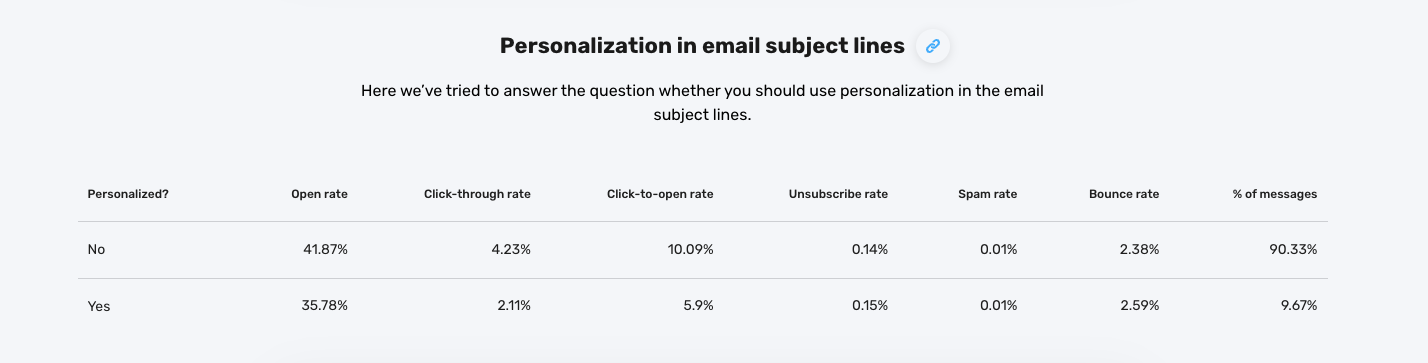
Personalization in email subject lines
Personalization is a fairly common tactic used by marketers crafting their email subject lines.
Most often, you’ll see it being used to display the name of the recipient or some other characteristic, like company name or their location.

In a more sophisticated scenario, you could create entirely different subject lines based on your subscribers past behaviors.
For example, if you know your customer has previously bought a shampoo for curly hair or a special hair dye, you could reference their type or hair color in the email subject line.
While personalizing email subject lines is a best practice, you’ll want to test this and see if it’s going to deliver positive results to your target audience.
Read more:
1. What is email marketing?
2. How to send an email blast the right way?
3. Inspiring email marketing campaign examples
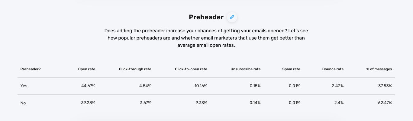
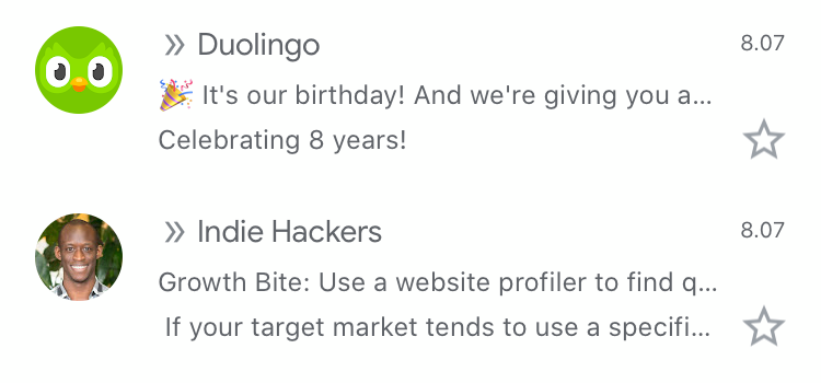
3. Add a preheader text

Our data shows that messages with preheaders have average open rates of around 44.67%. That’s around 5% more than emails without preheaders. Yet surprisingly, only 37.53% of messages have one.
While this could only be a correlation, we believe preheaders work and are worth giving it a try. Especially that adding a “view this message online” link to your preheader won’t take too long and it can help your audience view the newsletter, even if the images have been automatically blocked by their email client.
How to create a good preheader
Think of the preheader as the extension of your subject line. Your additional chance to provide more value or something else interesting that you couldn’t fit into your subject line.
The best approach is to create these two elements in pair so that the preheader builds upon and enhances your subject line.
In our article on email marketing best practices, we’ve shared some great examples that’ll inspire you. Let’s check them out again here:
Email subject line: Drop Everything. Sitewide Sale. Now.
Preheader text: It’s our birthday 🎉 Sitewide Sale + Free Shipping & Returns to celebrate!
Subject line: It’s now or never!
Preheader: Only 8 hours left on these Cyber Monday deals
Preheader length
One thing to keep in mind is that it may be difficult to estimate how much of your preheader will be visible in the email client, which you can observe in this image below.
It’ll depend on the email client itself, the device your recipient’s using, and the length of your subject line. Because of this, make sure your most important message is placed at the very beginning of your preheader.
Want to learn more? Here are two articles on the dos and don’ts of email preheader texts.
4. Stand out with email annotations
Want your email to pop before it’s even opened? Gmail’s Promotions tab lets you add email annotations — tiny visual extras like your logo, offer badge, or even a mini product carousel. It’s a quick way to grab attention and make your message look more legit.
Here’s how to set it up in GetResponse:
- Create a new email and scroll down to Email annotations for Gmail Promotions tab, and toggle it on.
- Add your logo (PNG, JPG, or JPEG max 3 MB) to boost brand recognition.
- Write a short deal description — think “Ends tonight” or “Free shipping inside.”
- Optionally include a promo code or validity dates so Gmail can show “Expires soon.”
- If you’re approved for it, add an image carousel with products or offers (up to 10 slides).
Pro tip: Keep your annotation consistent with your subject line and preheader – they should feel like one story, not three competing headlines. Even if Gmail doesn’t always show annotations, when it does, you’ll look miles ahead of the pack.
👉 See how to set it up step-by-step
5. Keep your email on-brand
To help your recipients form a stronger relationship with your brand, make sure your email templates match your visual identity.
This means that your logo, imagery, typography, colors, and call-to-action buttons need to be consistent with what you’re presenting on your website and other marketing channels.
If you’re still working on an established visual identity, consider these pointers:
- Create a color scheme using interesting, complementary colors. If you don’t know how, you’ll be able to generate them using a tool called Coolors (free). That means you’ll have specific set of colors to use for individual elements like headers, CTAs, and copy.
- Choose up to two fonts that work well together (more on this later) and use them throughout your emails. One for the headlines, and one for the main text and CTAs.
- Don’t overcomplicate your email templates. Make sure that they’re simple, aesthetically pleasing, and recognizable.
- Look for inspiration in articles like this one on best email marketing examples and sites like ReallyGoodEmails or Email Love.
Your company logo
Adding your company logo to your emails can help you distinguish your brand from all the other businesses your recipients will see in their inboxes.
In the email template itself, you’ll want to add the logo at the very top of your message – either in the middle or the left corner. Some email marketers also like to put their logo in the footer, right above the disclaimer section and the unsubscribe links.
You may have also noticed that in some email clients, the logo appears next to the sender name, like in the image below:
This feature isn’t fully supported by all email mailbox providers, but some of the bigger ones have already started to roll it out.
To be able to show your logo in the Gmail email apps, your domain needs to be hosted by GSuite. If you’re sending your emails through an external service (such as email newsletter software like GetResponse), you need to make sure your domain is authenticated with a custom DKIM. When these two requirements are met, the logo should be visible in the Gmail environment.
You can also now show your logo in the Oath email providers (Yahoo!, AOL, etc.). This is due to the new authentication method called Brand Indicators for Message Identification (BIMI). This method is still in the beta phase, because of which it’s only supported by certain email provers, but it’s likely to be picked up by other such services in the near future.
To learn more about adding your logo and implementing BIMI, check out this post from Agari.
Pro tip:
GetResponse offers custom DKIM for free – here’s how you can set it up and deliver your emails better.
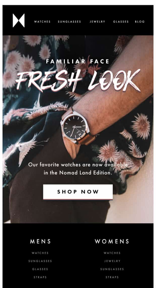
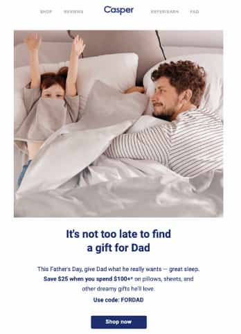
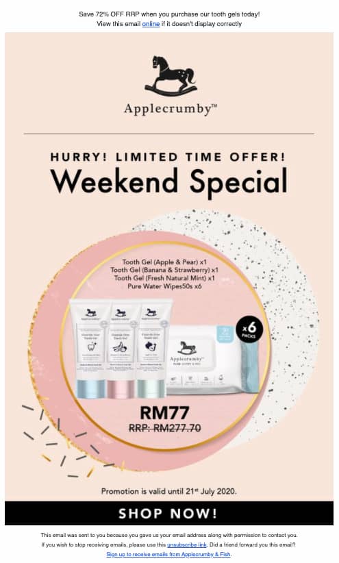
6. Feature the offer in your header
Getting people to open your email is just the first step. In order to get them to click through your offer, you need to pull them in and get them to scroll through your message. A great way of doing this is by making good use of the above the fold section. Mainly, your header.
An email header is mostly used to summarize the main offer of a given message. It’s located at the top of email body and can either be an image,text, or a mix of both. An effective email header stands out, clearly communicates what the message is about, and gives a good reason to keep reading it.
Here are few elements that you’ll want to use in your email header to achieve this:
- Your brand name and/or logo
- Menu or navigational bar
- A powerful headline that summarizes your main offer
- A CTA leading to your website
- Something interesting or enticing that immediately captures attention
- Other reasons or incentives to keep scrolling down
Keep in mind that your header won’t always be displayed in-full to all your recipients, which is due to the range of devices they could be using to open your messages. Most devices and email clients will only show the top 300 pixels, so your header needs to convince them to keep scrolling down.
Also, if you choose to create an image header, make sure to provide the ALT text (and potentially style it) to make your message more impactful for those subscribers who have images blocked in their emails by default.
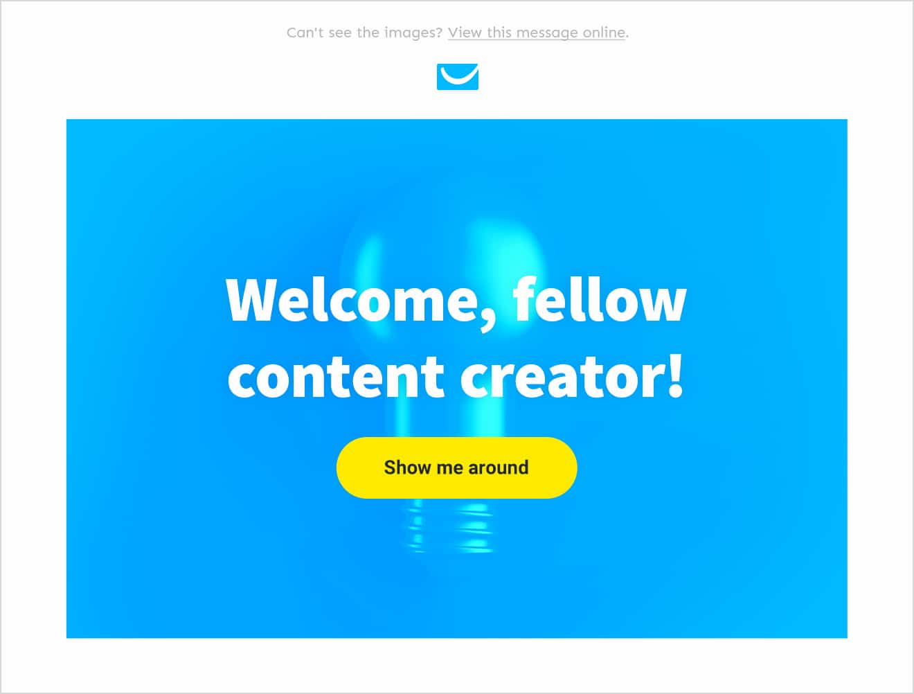
Here’s an example of an email header that follows several of the above-mentioned best practices:
- It’s got the company logo clearly visible at the top of the message
- Bold and intriguing headline and a subheading right underneath
- An intriguing but hard-to-describe image in the middle
- A bubble that reinforces the interest sparked by the headline
Menu and Navigation
Sometimes you’ll want to include a navigation bar on top of your email header. This is a tactic mostly used by ecommerce brands that can help you drive more clicks to the new or featured areas of your website.
This section can especially come in handy if you track the clicks in each individual menu item. This can help you segment your audience better and even trigger automated email sequences if you’re using email automation.
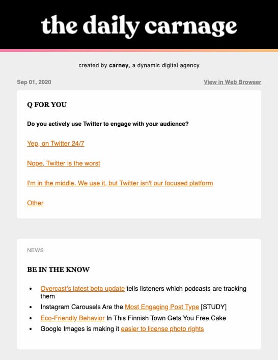
Here’s an example of a newsletter that uses this feature to drive people to their different product categories – Men’s, Women’s, Jerseys, and Hats:
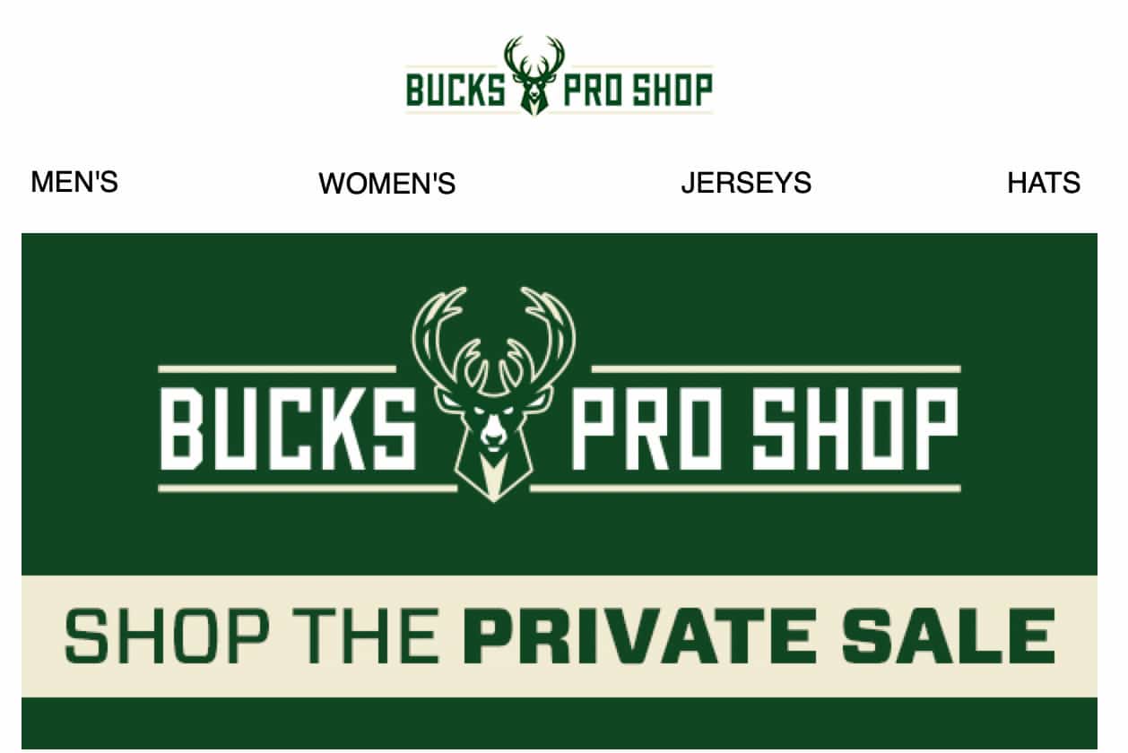
When using navigational bars in your emails, make sure to check if they look good and scale properly across all the different types of devices. An email inbox has only a limited width and simply copying the menu bar from your website might not be the best approach.
If you’d like to learn more about the types of email campaigns that work best for online stores consider reading our guide to email marketing for ecommerce.
Case study: Learn how TechSoup Polska, an organization helping nonprofits get access to new technologies, increased their orders’ value by 1200% year over year thanks to targeted email campaigns.
7. Use images strategically
Great images matter in all aspects of marketing, including emails.
When choosing graphics for your email campaigns, you’ll need to decide on the following:
- Where are you going to source your images from? (stock, custom-made, open license)
- What format will you use? (.jpg, .png, .gif)
- How much space in the email will your images take?
- What will you do when images get blocked in your recipient’s mailbox?
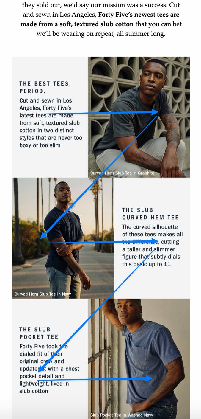
Using stock vs. custom-made images
When it comes to choosing between stock vs. custom-made images, there’s no right or wrong way to go. Just make sure the approach you choose fits your overall visual identity and helps you create the right feel for your brand.
Here’s an example from a brand called United by Blue which uses custom-made photos in their emails:
Pro tip: GetResponse Email Creator comes with over 2 million free high-quality stock images from Shutterstock you can easily customize and use inside of your email campaigns.
Different image formats (.jpg, .png, .rgb)
When it comes to image formatting, the situation’s different. Of course, you’ll want to show high-quality images that present your offer in the best possible way, but you also need to keep in mind the size of your image files.
In general, the heavier your files are, the harder it’ll be to deliver them to your subscribers’ inboxes, so whenever you’re creating graphics for your emails, make sure they’re web-optimized.
In most cases, you’ll want to stick with the .jpg and .png formats and optimize your images with a tool such as Squoosh.
Image-to-text ratio
When creating emails, you should also pay attention to how much of your message is taken up by images and text. This refers to the so-called image-to-text ratio, an aspect we’ve talked about in our post on how to improve email deliverability.
In general, the more text, the better your deliverability. The more space within your email is taken up by images, the more difficult it may be to for you to reach the inbox.
This doesn’t mean your emails shouldn’t contain images. That’s not feasible and no ecommerce business would allow that. But your message shouldn’t consist of just one big image and a footer.
Example of an email that’s made almost entirely of an image
Pro tip:
If you’re using the GetResponse Email Creator to build your emails and you’re uploading your own custom graphics, be sure to optimize them first with our image editing tool. Just open up the image like in the GIF below and save it, and it’ll be automatically compressed to better fit the ISPs needs.
ALT attribute and what to do when images are automatically blocked
When designing your emails, be sure to consider people that don’t have the automatic image downloading switched on. Even without the images loaded, your emails need to convince these consumers that your communication is worth reading.
So, what can you do? First of all, make sure your newsletters consist of both elements – text that’s styled properly and images that have the ALT attribute filled in.
Adding the ALT attribute has another benefit to it, which is also the key reason why you should be using it in the first place. If some of your recipients use a screen reader to discover your emails, the ALT attribute will help them understand what’s inside of your content.
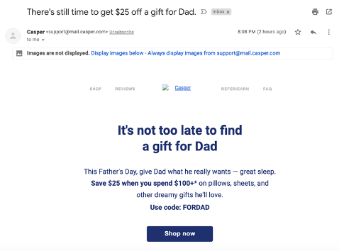
As an inspiration, consider this newsletter that looks good before and after you load the images. Even though they haven’t provided the ALT text for their header image, their email includes well-styled text that’s appealing enough to convince the subscriber to click-through their offer.
And now let’s look at an email that hasn’t checked any of the two boxes we mentioned.
This doesn’t make you want to click this email, right?
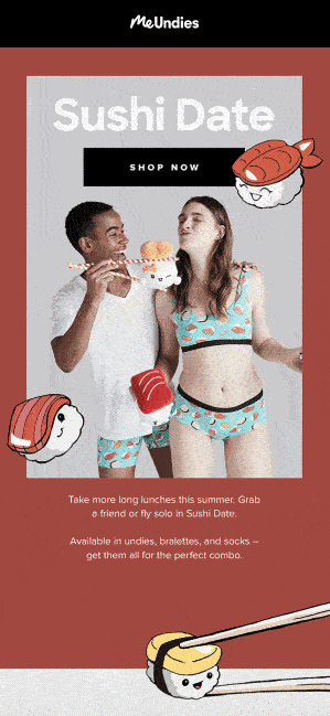
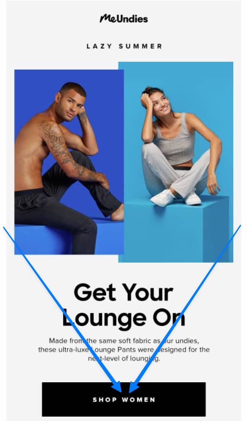
GIFs
One way to increase your email engagement rates is to add short GIFs to your messages. Their support is nearly universal and many of us enjoy sharing them around either on Slack, Facebook, or Instagram.
When using GIFs, pay attention to the size of your files. It may be tempting to share long and high-quality animations, but these can impact your deliverability and take a lot of time before loading in front of your recipients’ eyes. To compress your GIFs, you can use one of the many free tools that are available online, e.g. Ezgif.
There are many ways in which you can use GIFs to increase your engagement rates. Below is just one example that comes from a newsletter sent by a brand called MeUndies.
Pro tip:
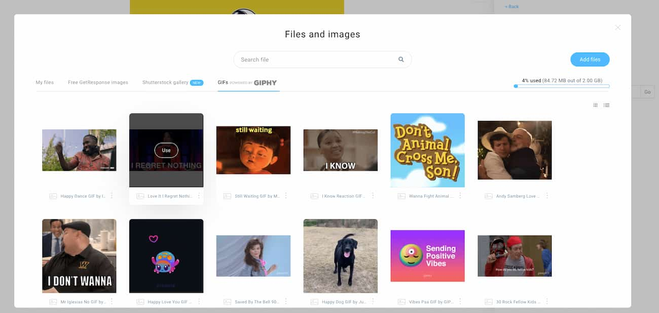
Adding GIFs to your email works the same way as if you were adding a normal static image. In GetResponse, this is further simplified due to the built-in integration with GIPHY.
8. Use video to drive engagement
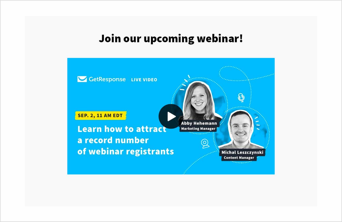
If you want to engage your audience, there’s nothing better than videos. Unfortunately, email clients are still behind the trends, and video support is limited to only a handful of mailbox providers (such as Apple Mail, Outlook for Mac, and Thunderbird). That doesn’t mean you can’t send videos through email. You can, but the safest approach is to use a thumbnail (a static image or a gif with a play button) and hyperlink it to your video file.
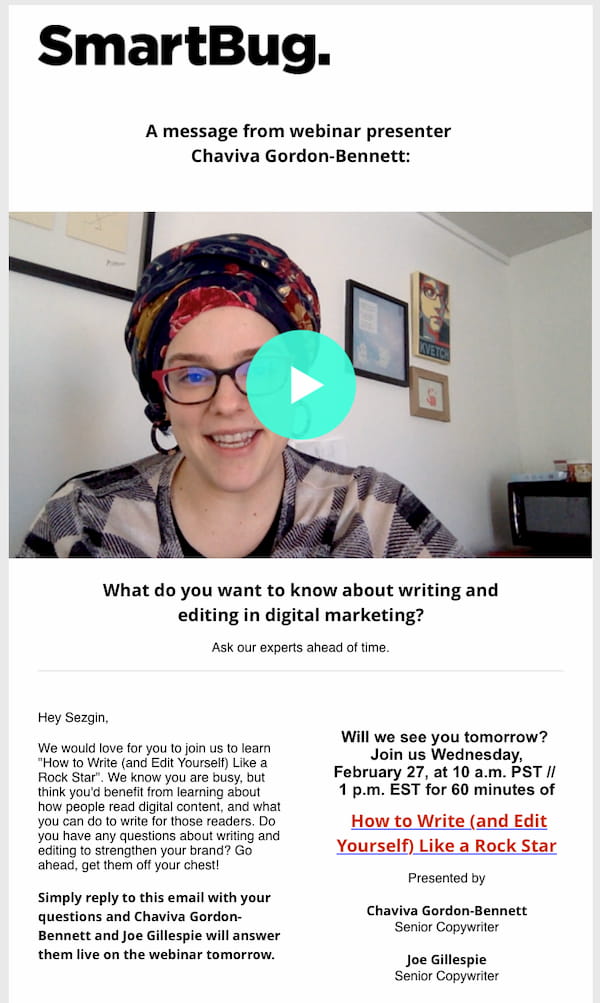
Smart Bug uses a video thumbnail image to promote their webinar
This approach may not seem ideal, but it guarantees that all your email recipients will be able to view your video. Plus, when they click on the thumbnail the video will open up in their app or browser of choice. One could argue that this a better user experience than having to watch a video in an email.
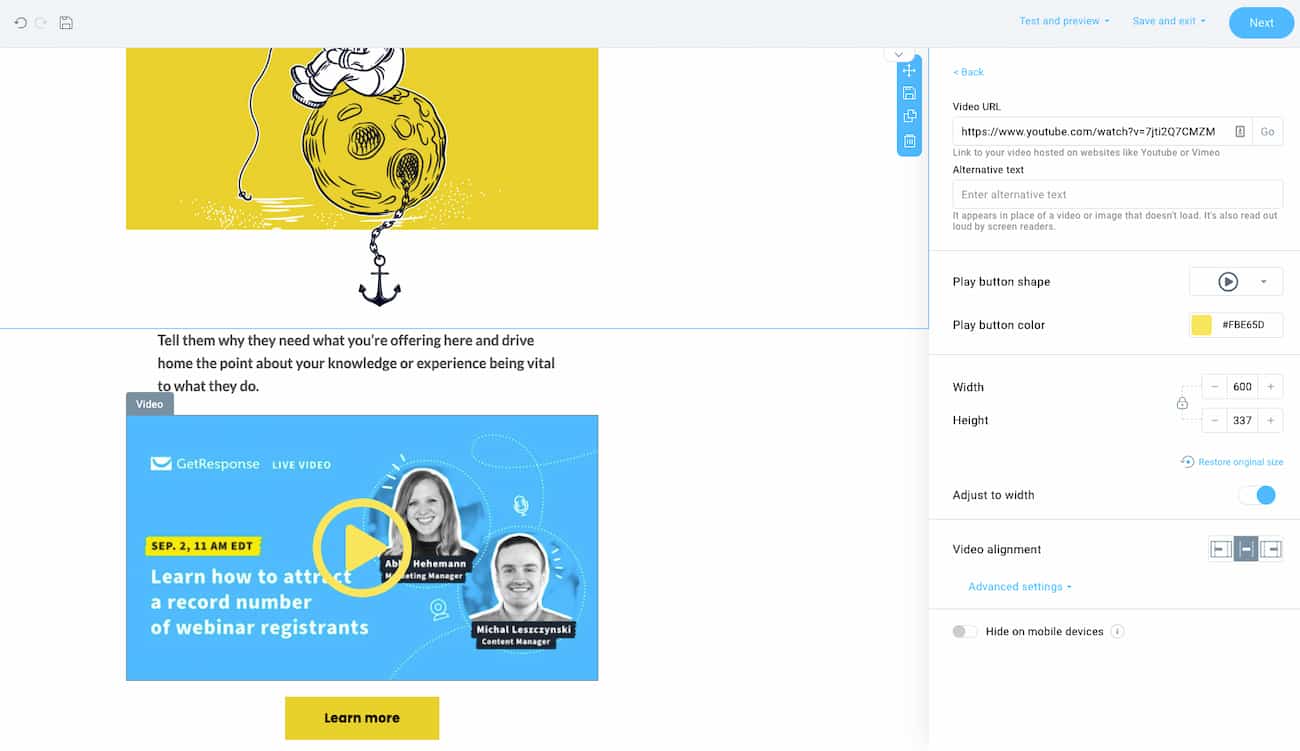
Pro tip:
Adding YouTube videos to your emails is easy in GetResponse. All you have to do is provide the URL and it’ll automatically create a thumbnail with a play button for you.
Pro tip: Video isn’t the only engaging content format that you can embed into your emails. Interactive content like clickable surveys, forms, and games are becoming more popular as more mailbox providers start to support them. Read our guide to learn more about using gamification in emails.
9. Pay attention to hyperlinks
Email marketing campaigns aim to drive clicks to your site or landing page through links in your messages.
If you’re building HTML emails, you can hyperlink virtually anything – a piece of text, an image (even a GIF), or a call-to-action button.
For plain text emails, including a URL directly may result in automatic hyperlinking or require manual copy-pasting by the recipient.
Which approach should you use? Generally, HTML emails are preferable, especially for tracking purposes.
Before we go there, however, there’s one more thing you should keep in mind. It’s important to keep your text-to-link ratio, which you can read more about in this post on improving your email deliverability.
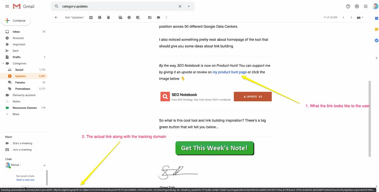
Tracking & UTMs
One of the key advantages of using HTML emails is tracking. The two main things that you can track with emails are message opens and link clicks.
The first one’s achieved through the use of a small static image that’s loaded along with all the other images within your email. That said, if your recipient doesn’t load the images within your email, you won’t know whether they’ve actually opened it or not.
The click-tracking is achieved by using an extra domain that’s added on top of your email links. So, if someone clicks on one of your links, for a split-second they’re taken to a domain that’s used only for tracking purposes and then onto the page you wanted them to land on.
You can see what this looks like, by hovering over any link within your email inbox:
For more insights, you can add UTM parameters to your links (if you’re using Google Analytics). This will let you track your email campaigns in your GA account and provide you with more information about your subscribers’ behavior and preferences.
You can learn more about this in our post on using Google Analytics to improve your email campaigns.
10. Make your CTAs prominent
To boost email click rates, focus on a primary call-to-action (CTA) highlighting your main offer, and use secondary CTAs sparingly. Ensure your CTA is visible (ideally in the above-the-fold section) and accessible, using contrasting colors and ample whitespace for easy tapping.
While incorporating CTAs in images is an option, standalone CTAs are preferable due to common image blocking in emails.
Additionally, experiment with both standard and descriptive CTA copy, like “Buy now” or “Try this sweater,” to determine what best aligns with your brand and yields optimal results.
To make your calls to action even more compelling, consider adding urgency-driven elements like countdown timers. These dynamic components can significantly boost click-through rates — learn how to use them effectively in our guide to countdown timer emails.
11. Don’t neglect the footer
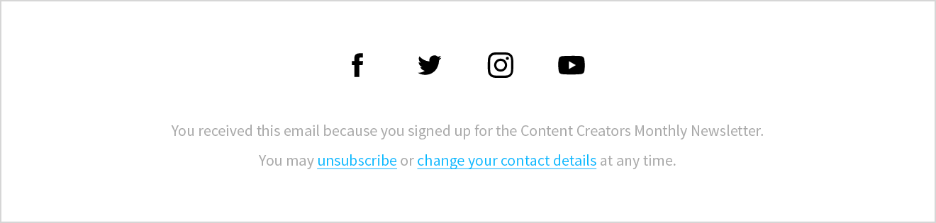
Last but not least comes the footer, another important part of your email templates.
A vast majority of email marketers use the footer in a rather generic way, including only the elements they’re required to include by law (such as company information, an unsubscribe link) and social media icons linked to their company profiles.
However, you can be more creative with your email footer design and use it to build a positive brand experience and reach additional goals. For example:
- Emphasizing your unique selling proposition
- Collecting feedback from your audience
- Promoting your blog, podcast, or other content
- Promoting a special offer visible only to the most-engaged fans
- Promoting your app, useful links (ex: store locator), and phone numbers
- Showing the more human side of your company
Here are few examples of great email footers worth getting inspired by:

Footer in an email from Magic Spoon carries a promise of happiness
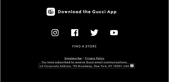
Gucci uses the email footer to promote the Gucci App
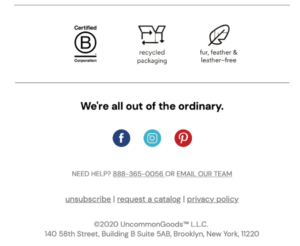
Uncommon Goods use the footer to remind the audience about their core values
12. Make your emails accessible
We’re all a diverse audience and your email marketing campaigns need to be designed in a way that lets everyone access and understand them.
According to the World Health Organization, over 2.2 billion people live with some form of visual impairment. And it’s not only about being able to read or see your emails. Millions others have hearing, cognitive, mental, or emotional impairment.
Odds are, some of your subscribers are affected by this. And if you want them to access your emails better, here are some things you should keep in mind:
- Always add the ALT text to your images if they’re introducing some new information. This way people using screen readers will be able to understand the content better
- Be careful about the contrast ratio of your images and colors. For example, white text over yellow background may be hard to read. Tools like WebAIM Contrast Checker will help you evaluate if your content’s got enough contrast.
- Use a reasonable font size (typically 14-16 px) with decent line spacing
- Provide enough whitespace between different sections and elements
- Stick to legible fonts
- Avoid referencing images. Use captions and be careful about substituting actual text with images (this also applies to gifs and emojis).
- Ensure that your email content is readable, ideally at a Grade 6 level. Tools like the Hemingway Editor will help you evaluate that.
- Use hyperlink text that tells the audience what they’ll see upon clicking the link. Stay away from generic phrases like “click here”.
- If you want to emphasize a piece of information, don’t just do it with color.
Also, in your copy, avoid referencing colors or spatial placement of elements within the message (e.g. Click the green button below to proceed).
To learn more about email accessibility, consider this video from Timothy Buck.
13. Use supported fonts
The fonts you choose define the look and feel of your emails. While there are hundreds of thousands of fonts available on the web, not all of them will be the right fit for email communication.
Naturally, you can use any font you want (that fits your visual brand identity) in static images and GIFs. But in text, you’ll want to stick to using system fonts and web fonts.
System fonts are the types of fonts that can be displayed on all devices or within any application – they’ll always look the same. These include Georgia, Times New Roman, and Verdana.
Web fonts, on the other hand, while widely supported, can sometimes be rendered differently on your recipients’ device. Some of the more popular ones are Roboto, Lato, and Montserrat.
That’s why the best solution is to: 1) either stick to system fonts, or 2) use web fonts alongside a fallback system font that’ll be displayed in case the custom font can’t be used.
Ideally, you’ll only have to use up to two different fonts in your email templates (one for the header and one for the main text and CTAs). To find fonts that work together well, consider using Fontpair or viewing the popular pairings in Google Fonts.
To explore this further, read our guide to the best email fonts.
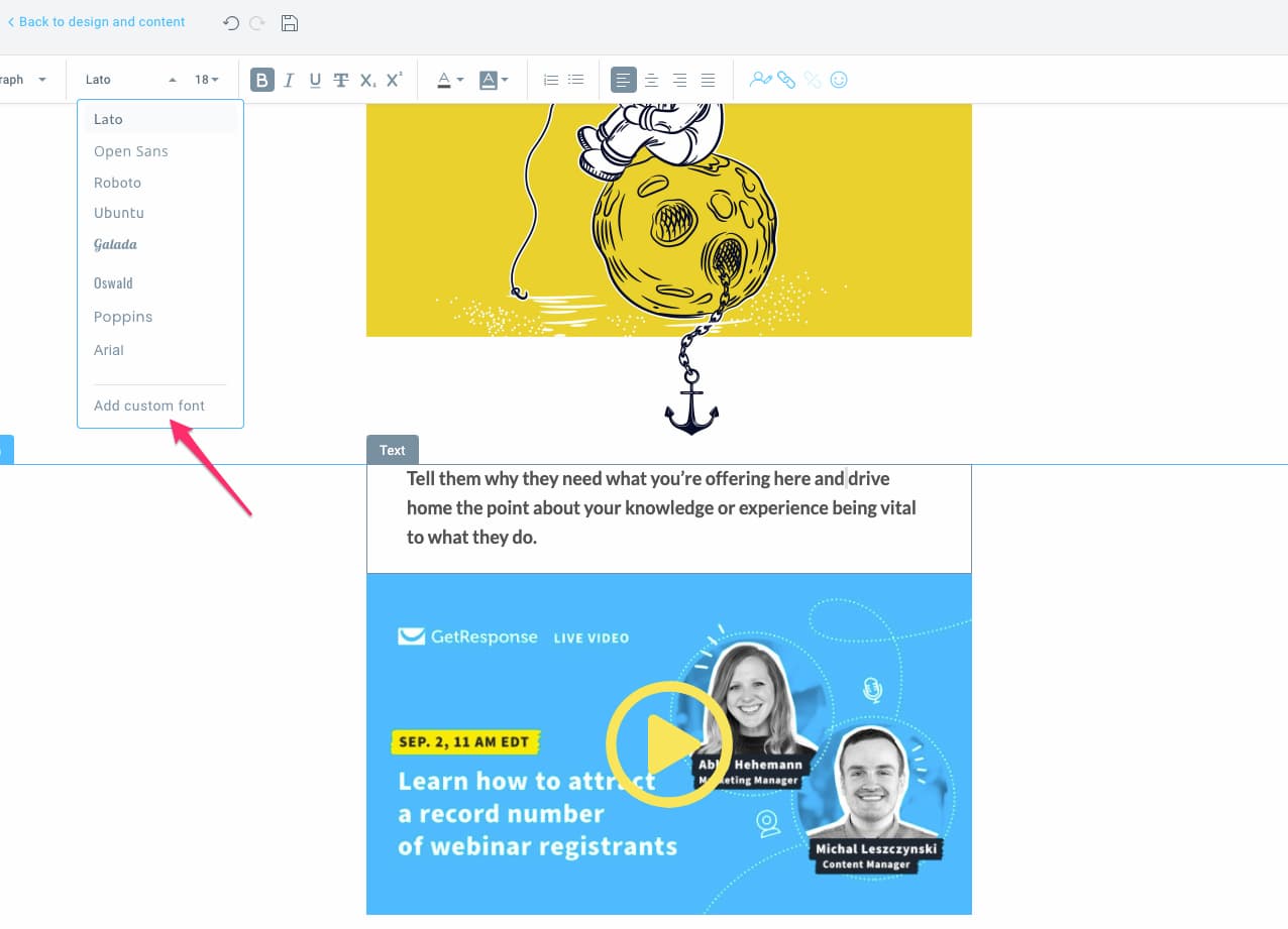
Pro tip:
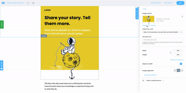
Here’s how you’d set your fonts in GetResponse Email Creator:
14. Craft compelling copy
Writing copy for emails is a topic of its own and one could write a whole ebook about it.
As a matter of fact, Joanna Wiebe, of Copy Hackers, wrote one and you can read it over here – How to Write Newsletters that Get Opened, Read, and Clicked. It’ll help you increase your opens, clicks, and conversions. In other words, it’ll make your email campaigns more successful.
Aside from the tips you’ll read in this ebook, you’ll want to pay attention to the fact that people often don’t spend too much time on emails. They skim them and often click-through to the website to the read the full information there.
Because of this, you may want to keep your copy concise and straight to the point. You may also want to use bulleted lists, headlines, and emphasize the most important parts by bolding or highlighting your text.
Related:
1. Company newsletter ideas and examples
2. Win-back customer email templates and examples
15. Make your emails feel personal
We’ve briefly talked about personalization in the context of email subject lines. But how does one personalize their emails in general?
This is done through the use of dynamic content, a syntax that lets you essentially decide what type of content will be displayed to a particular subscriber. Don’t worry , though; thanks to tools like GetResponse’s Visual Dynamic Content Builder you don’t actually need to code at all.
In the simplest form, you could write out something like [[firstname]], and this would show your subscriber’s name inside your message. And what if you don’t have such information? You could provide a fallback message that would appear in case the first name wasn’t available.
More advanced use cases of dynamic content would allow you to display an entirely different message (copy, images, links) based on the customer information you have stored in your database.
Thanks to this, you could show a different number of points your subscriber accumulated in your loyalty program as well as the different rewards they could redeem. Or you could show a different set of products they’ve looked at on your website or purchased in the past.
According to our data, emails that use personalization in the email body have a 1.27% higher average click-through rate. Despite that, it’s mostly the larger organizations (or ones with a heavier focus on marketing) that make use of personalization.
This is largely because email marketers either don’t have enough data to personalize their emails or the time and effort to tailor their communication at scale doesn’t provide the ROI that’d justify the costs.
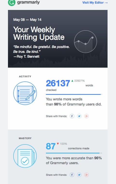
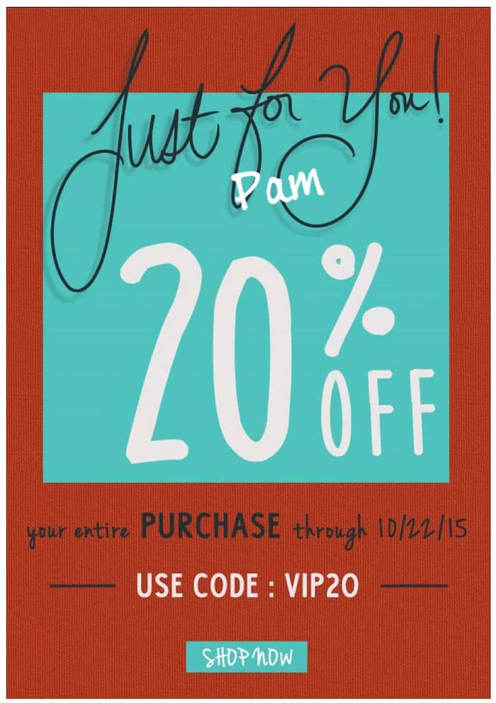
Still, we suggest you try personalizing your email campaigns, even in the simplest form. You could start by greeting your subscriber by name in the subject line, email body, or even image – if you’re using a tool like NiftyImages. These can help you engage your audience better and lead to outcomes like in the example below.
16. Pick the optimal email layout
The layout of your email should help your recipients consume the content of your message with ease and in the right order. There are several popular email layouts you’re likely going to use.
| Layout | Best for | Watch-out |
|---|---|---|
| One-column | Mobile-first; focusing attention | — (safest default) |
| Inverted pyramid | Driving the eye toward a single CTA | Best for single-offer emails |
| Zig-zag | Showing products with description + CTA | Mobile stacking order can confuse |
| Two-column | Image-heavy brands | Blocks stack on mobile unless set side-by-side |
One-column
In a one-column layout all your email content is placed within a single column, one after another. This is a simple, mobile-first approach that ensures that all your information will render perfectly on email devices as well as other larger screens. It’s also great for focusing your audiences’ attention in the places you want them to look at.
Inverted pyramid
Inverted pyramid framework makes it even easier to drive the focus and clicks in the areas you want your audience to be. By placing your wider content (usually the header or a banner) at the top and the slimmer content at the bottom (your call-to-action), viewers’ eyes are automatically taken to the place directly tied to your conversions.
Zig-zag
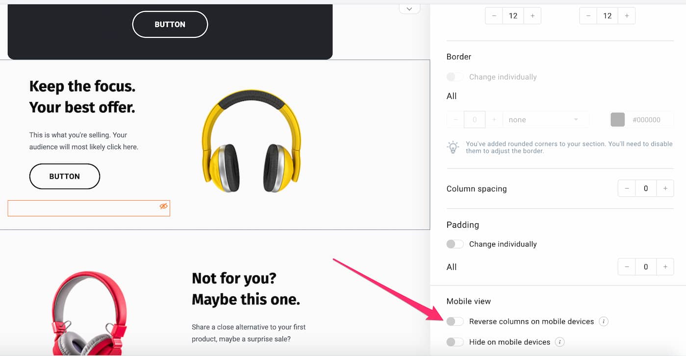
This is another interesting layout that takes your viewers’ eyes from one side of the screen to the other back and forth as you scroll down the message. It can be a very engaging layout that looks great if you’re showing off your products then following them with a description and a CTA leading to your product page.
But there’s a small caveat with this approach, which is why we’re not recommending it too often.
If each element in your message is a separate block (like a product image or description), and it goes at first from left to right and then from right to left, the order in which these elements are displayed on a mobile device may not be ideal.
Sometimes your description or CTA button will precede the image, which may be confusing for your recipients.
Luckily, if you’re using GetResponse, this can be easily fixed.
In the GetResponse Email Creator, you can adjust the order of your blocks for mobile devices separately. All you have to do is switch the toggle “Reverse columns on mobile devices” and your blocks will appear differently than on desktop clients. Thanks to this, you can be sure your email templates will look great on any device.
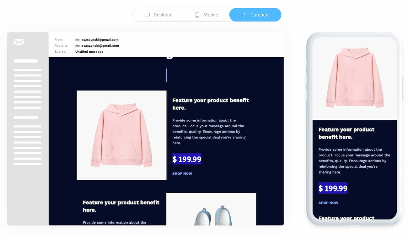
Two-column
Two-column layout is often used by brands that focus heavily on using imagery in their emails.
Most often, it includes a wide, single-column header at the top – featuring the main offer or product – and several blocks underneath split into two columns.
It’s kind of a mix between the single-column and zig-zag layout we’ve previously described. Because of that, it includes some of the pros and cons of these layouts.
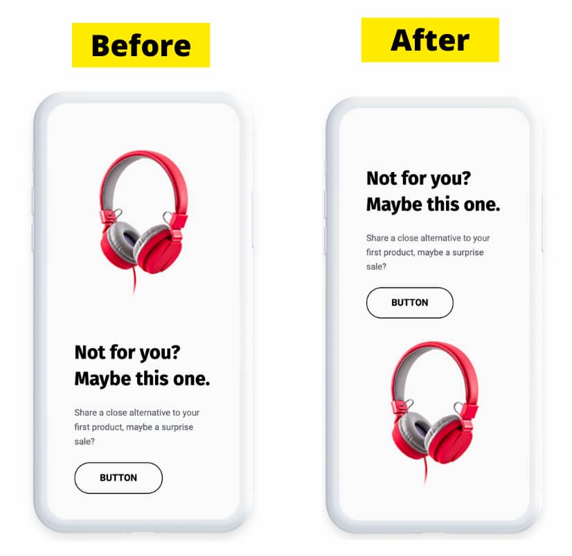
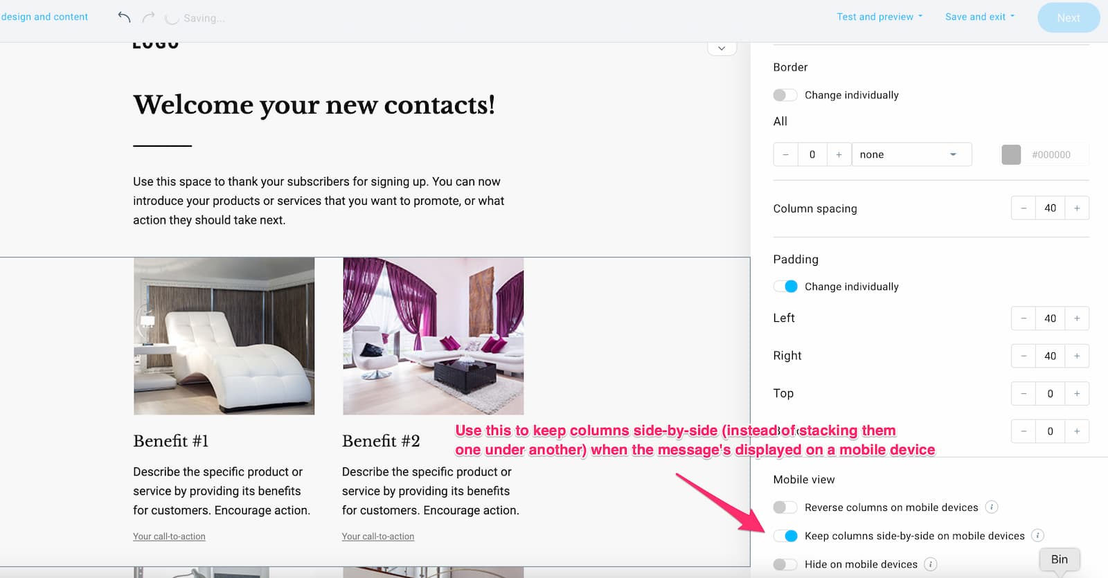
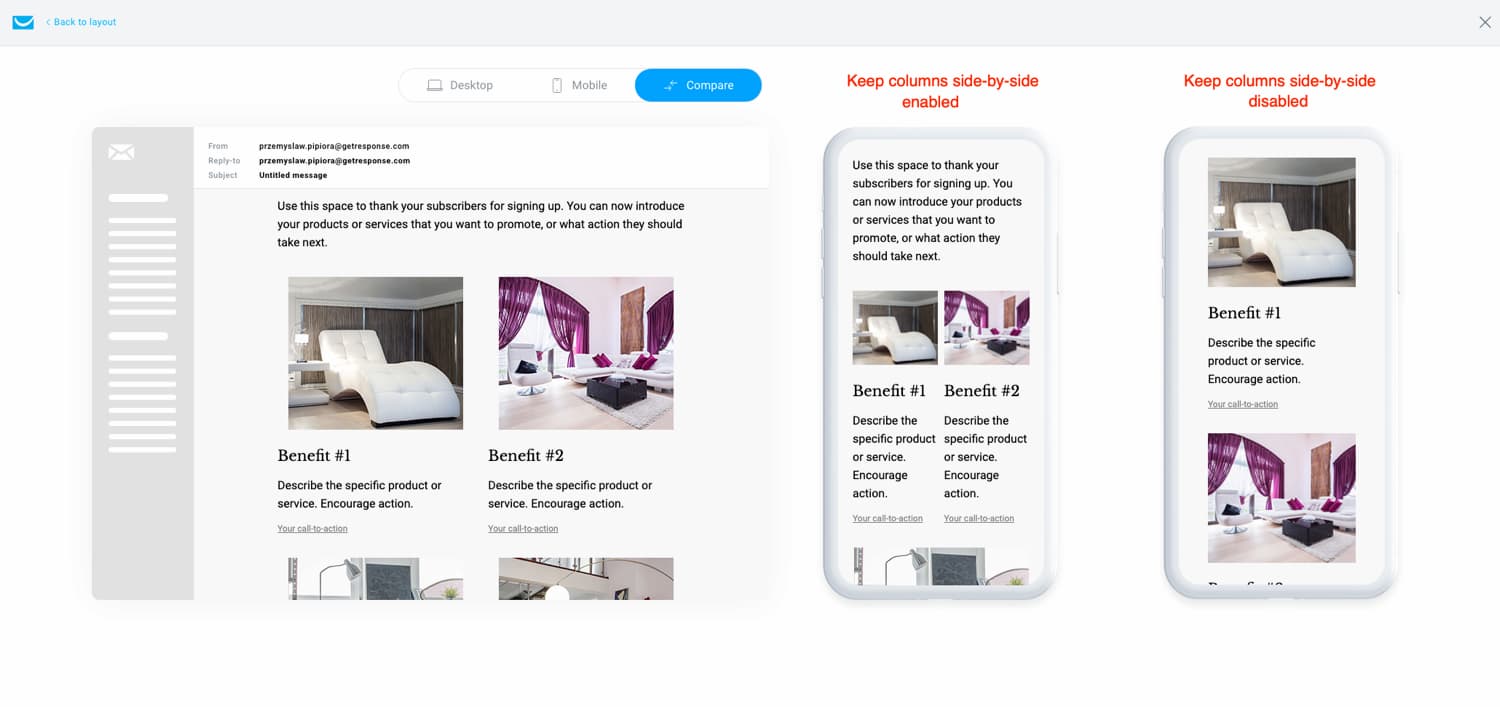
The main disadvantage is that when a two-column message is viewed on a mobile device, the blocks get stacked one after another – and some email marketers don’t like that. Instead, they’d rather see their products resized to fit a smaller screen and listed side by side.
Again, in GetResponse, there’s an easy fix for that. In your column settings, you can enable the option to keep your columns side-by-side when the message is being displayed on a mobile device (instead of having the stacked one after another).
This is where you switch on that option:
And here’s the comparison – with and without the feature enabled:
Email width
If you want to make sure your emails look good on most devices, then you’ll want to keep your email template width at 600 px (max 640 px).
It may sound counterintuitive at first, especially that our screens are getting bigger these days, but keep in mind that not all email clients work the same. Many mailboxes will display your message in a frame that’s surrounded by additional sections and tabs. Like in this example from our Gmail web client:
Email length
There are no clear guidelines as to how long your emails should be. Some marketers prefer to design their email templates so that they’re short and sweet, directly leading to their website. Others prefer to convey as much information as possible, and let the email do the talking.
If your newsletter mainly consists of text, then the only thing you need to ask yourself is whether people will scroll that far down in your message to read all of the contents. Many bloggers get away with this approach, but it may not be ideal if you’re looking to sell ecommerce products.
If your newsletter consists of several images, then having a long message with multiple graphics could lead to it getting truncated by larger ISPs such as Gmail. This may affect the overall feel of your message, so it’s better to keep this fact in mind.
Spacing and padding
Your email template consists of many different blocks and sections.
Most of the time, you’ll have the header image, a few blocks of text, a few images and CTAs, and a footer. All of these elements need to fit together, but there also needs to be some “breathing air” between them. By that, I mean whitespace.
Whitespace (or negative space) makes reading and clicking through your email much easier and more intuitive. And as such, it affects your conversions.
There’s no specific number as to what the appropriate spacing or padding should be. You need to test this yourself and decide on what looks good in your opinion.
In our email templates, we tend to add 20-30 px padding to the left and right side of each section that has a text block in it.
Thanks to this, when the email is viewed on a mobile device the text is not stuck to edge of the screen.
(This isn’t an issue for image blocks, so we sometimes skip the left and right padding there)
For top and bottom padding, we usually use 10 to 20px between each element or section. This helps us give some “breathing room” and makes our emails more readable.
Whenever you’re setting up your email template, make sure to check how it renders on different devices and email clients. What looks good on a desktop might not always look good on mobile devices.
17. Make your emails responsive
With more than 50% of your recipients opening your emails on mobile devices, you can’t build your email templates just thinking about big desktop screens.
The best way to ensure that all your recipients have the most optimal experience is to build mobile-responsive emails.
An email that’s mobile-responsive will look good on both smaller and larger devices. And since you’re building and sending just one email (that’s optimized for both types of devices) it won’t be a problem if your subscriber chooses to open your message using different tools.
We’re not going to go into detail about how you’d code a mobile-responsive email. Email builders, like the GetResponse Email Creator, do it automatically for you. This means the email templates you design with them will look good on all types of devices without having to write a single line of code.
| Element | Recommended value (per article) |
|---|---|
| Email width | 600 px (max 640 px) |
| Body font size | 14–16 px |
| Headline font size (mobile) | 22 px |
| Button size (mobile) | ~44 × 44 px (min 29 × 44 px) |
| Section side padding | 20–30 px left/right on text blocks |
| Element top/bottom padding | 10–20 px |
| Subject line length | Under ~60 chars (30–40 for mobile) |
| From name length | Under 30 characters |
Mobile email design best practices
These are the best practices you should keep in mind when designing your emails for mobile devices:
- Add a ‘View this message online’ URL at the top of your email.
- Make sure your copy is legible, even when someone’s reading your message while on the go. Consider increasing your line spacing and font size to 14-16 px for regular text and 22 px for headlines.
- Make sure your links and CTAs can be easily clicked when using a thumb. In most cases, you’ll want your buttons to have approximately 44 x 44 px (minimum 29 x 44 px)
- Include extra breathing room between CTAs to make clicking easier. Add 10-20 px of extra space around clickable areas and avoid adding several text links next to each other.
- Make sure your landing page is also optimized for mobile devices. Sending people off to a page that doesn’t look good on their device would be a loss of money and could cause a lot of frustration. Also, consider using deep links in your emails.
- Always test and check what your email template looks like on different devices before sending it out to the world. As we mentioned and it’s worth reiterating, what might look good on a desktop might not look the same on a mobile device (when your content is resized or stacked on top of each other)
- Consider hiding any sections that can’t be viewed or don’t add value to your mobile recipients’ experience
- If your message is long, consider repeating your main CTA further down in your email to save your recipients’ scrolling time
- To ensure your subject line doesn’t lose its meaning, keep it short (30-40 characters) or ensure the most important information is placed at the beginning
- To avoid your brand name being cut off in the inbox, keep your “from name” short (below 30 characters)
Read more on the blog:
18. Don’t neglect the dark mode
Even if you don’t personally use the dark mode, you can’t ignore it in your email design process.
Different studies have shown that as many as 80% of users switch to dark mode when it’s available, which suggests that designing for dark mode is no longer just a nice thing to do.
So what does the dark mode in email do? In simple terms, it shifts the color palette in your email, so instead of seeing dark fonts on a light background, you’ll see light fonts on a dark background.
While some users prefer the dark mode aesthetics, the two main benefits of using dark mode are:
- it makes reading emails easier on the eyes, especially in low-light situations
- it saves battery life by reducing screen brightness
Here, you can read more on how dark mode works and how you can test it.
Here are a few pointers that’ll help you ensure that your emails look good on dark mode:
- Use transparent images. Otherwise, they may look off when everything else in your email template has reversed colors.
- Add a white glow around your black images and icons. Otherwise, they may blend in with your template and remain unnoticed.
- Preview your emails before hitting send. With tools like the GetResponse Email Creator, you can preview what your emails will look like with the dark mode turned on. While it won’t cover 100% of the cases (as dark mode works differently on various devices and applications), it’ll help your email design process, and you’ll be able to send your email campaigns more confidently.
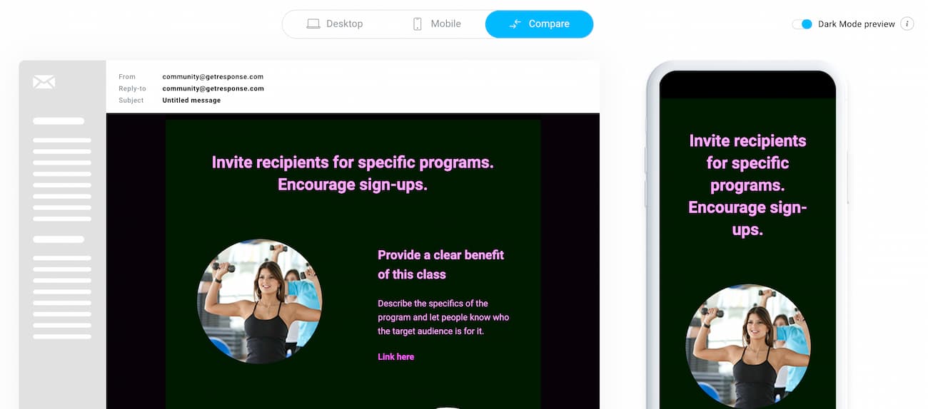
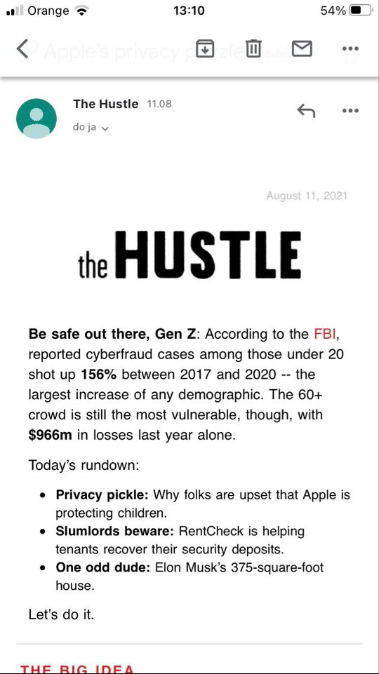
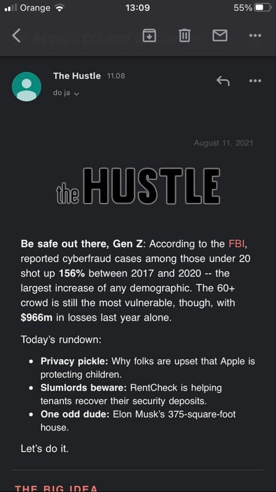
Below are two images showing the same email (from the Hustle) viewed in dark and light mode on a mobile device. As you’ll notice, their header image has a transparent background and a delicate glow around it so that the dark logo doesn’t go unnoticed.
Frequently asked questions
What makes a good email design?
Good email design makes your message easy to scan, easy to understand, and easy to act on. That usually means a recognizable sender name, a clear subject line + preheader pair, a strong above-the-fold header, readable typography, enough whitespace, and a prominent call-to-action (CTA).
What is the best width for an email template?
A common best practice is to keep your email width around 600 px (up to about 640 px max). This helps your design display well across major inboxes and devices, especially webmail clients that show emails inside a narrower frame.
Which email layout works best on mobile?
One-column layouts are usually the safest choice because they’re mobile-first and keep the reading flow simple. If you use multi-column layouts (like zig-zag or two-column), make sure the mobile stacking order still makes sense and your CTAs don’t end up appearing before the context.
Do images hurt email deliverability?
Images don’t automatically hurt deliverability, but “image-only” emails can. Keep a healthy image-to-text balance, compress your files, and avoid making the entire email one big graphic. Also remember that some subscribers block images by default — which is why you should always include meaningful text content.
Why is ALT text important in emails?
ALT text helps in two situations: when images are blocked (so recipients still understand what’s in the email), and for accessibility (screen readers rely on ALT text to describe visuals). If an image contains important information, the ALT text should communicate the same meaning.
Can I use video in emails?
Most email clients still have limited support for embedded video. The most reliable approach is to use a video thumbnail (or GIF with a play button) and link it to your video on a landing page, YouTube, or another hosting platform. This keeps the experience consistent across inboxes.
What CTA design choices lead to more clicks?
Use one primary CTA that’s easy to spot, ideally above the fold. Make it finger-friendly on mobile (with enough padding), surround it with whitespace, and use clear copy that matches the offer (for example, “Shop the new drop” instead of “Click here”). If you include multiple CTAs, make sure there’s still one obvious “main” action.
How do I make emails accessible?
Use legible font sizes (often 14–16 px for body text), strong color contrast, meaningful ALT text, descriptive link text, and enough spacing between clickable elements. Avoid relying on color alone to communicate meaning, and don’t reference layout visually (like “click the green button below”).
What should I do about dark mode in email?
Preview your emails in dark mode and watch for issues like logos disappearing, icons blending into dark backgrounds, or unexpected color inversion. Transparent PNGs often render better, and a subtle light outline (“glow”) can help dark logos stay visible. Always test before sending.
What’s the ideal email width in 2026?
Keep your email template width around 600 px, with a maximum of about 640 px. This displays well across major inboxes and devices, including webmail clients that frame your message inside a narrower column.
Should I personalize my email design?
Yes, even simple personalization helps. According to GetResponse data, emails that use personalization in the body have about a 1.27% higher average click-through rate. You can start with the recipient’s name in the subject line, body, or an image, and use dynamic content to tailor copy, images, and offers per subscriber.
Summary
Although email is such an old medium, a lot has changed in the email design world over the last several years.
We’re always keeping our eye out for new developments, practices, and trends, and will continue to update this guide to reflect the current state of things.
If you’d like to stay updated, make sure to sign up for our newsletter so we can notify you whenever we edit this and our other resources.
And if you’re looking for an email builder that makes creating email templates a fun and rewarding experience, be sure to sign up for a GetResponse free account.
Want to see it in action? Here’s a quick video tutorial for you.
