Congratulations on starting a business! The next big task on the list is making a great first impression with your target audience. First impressions at this stage determine the awareness, trust, and authority your brand will get. These then dictate your conversion rates and sales volume.
One of the ways you can capture the attention of potential customers, besides having a remarkable product, is through a striking online presence. While this can come in many forms, from an optimized website to great social media profiles, a compelling landing page takes the lead due to its conversion-focused capabilities.
Are you looking to create a compelling startup landing page? This article will guide you on creating one that will easily captivate your audience and convert visitors into customers. We’ll also feature some great startup landing page examples to inspire you.
But let’s start with the basics.
What is a startup landing page?
A startup landing page is a standalone web page designed for a specific campaign or to attract a particular target audience. Like any other landing page, this one is created with a single goal—conversion.
You’ll often see two types of startup landing pages:
Lead capture page
This type of landing page generates leads for your startups with the help of an embedded lead capture form. Your sales team can follow up through the contact details provided, nurture the leads, and ultimately convert them into customers.
Click-through page
A click-through page is designed to warm up and entice your target audience to click through to a conversion page, like a download or account creation page. This allows for immediate conversion, unlike the lead capture landing page, which requires follow-up.
For startups in the early stages with limited budgets, a good landing page can also double up as their homepage.
Using our free landing page creator, you can save even more time and resources. It helps you create custom landing pages in minutes with the AI content generator and the drag-and-drop editor.

Additionally, you can boost conversions with our customizable popups and forms and optimize your page with built-in SEO tools. You’ll also have access to the live web chat to help you nurture leads and support existing clients.
10 best practices for startup landing pages
Now, let’s explore how to create a compelling landing page for your startup. Here are the ten startup landing page best practices you must consider.
1. Start with competitor analysis
You must know what the competition is doing to ensure your startup landing page stands out from the rest in your industry or niche. A competitor analysis will help you learn this by identifying your competitors’ strengths and the gaps they’ve left, which can give you a headstart in the market.
Start by examining the visual elements of your competitors’ landing pages, which include typography, overall landing page design, form layout, and color schemes. Are they visually appealing? Do they align with the brands’ identity?
Next, check how they articulate their value proposition and address pain points. This analysis will help you craft unique and compelling copy that resonates with your audience and easily communicates the value you bring to the table.
The other key factor is the user experience. You can check for this by evaluating the navigation and user flow on competitor landing pages. Examine their navigation menu. Is it clear and concise? Does it provide easy access to relevant sections on the landing page? Do they have submenus or dropdowns that visitors can use to jump directly to specific content sections?
Below is an excellent example of how you can set up your startup landing page for easier navigation. Web visitors can skip directly to a specific section by clicking on the menu items at the top.


To understand the user flow, examine how your competitors guide visitors to take a specific action like signing up to use their product. You should also look at other factors that enhance user experience, like their CTA placements on the landing page, form structure, page load speed, and responsiveness.
Besides that, check out their conversion strategies. For instance, you can look at the types of call-to-action buttons they use or how they leverage testimonials and trust badges.
Remember that this process is not about imitation but gaining valuable insights that can inform your strategy and set you apart in a crowded digital landscape.
Also, it’s not a one-time task. So, you must regularly revisit and update your analysis to stay ahead of industry trends and maintain a competitive edge.
2. Use animations
Animations can add a dynamic and engaging touch to your landing page. They capture the user’s attention and boost your landing page’s visual appeal, creating a memorable browsing experience.
With animations, you can make certain elements respond to user interactions. For instance, clickable elements can change color or size when users hover on them. This will encourage engagement and overall interactivity with your landing page.
You can also use animations to make information more digestible for visitors. For instance, you can illustrate your signup process or showcase a product feature through animations.
Check out how Vaayu creatively uses animations on this page.

That said, animations can easily make your page heavier, lowering your load speed. Therefore, ensure you use animations moderately.
Additionally, test and optimize animations for responsiveness to ensure the user experience remains seamless, regardless of the device used.
The other downside of overusing animations is they can easily become distracting and annoying to users. So, stick with animations that have a purpose. It can be drawing attention to a critical element or guiding the user through a sequence.
3. Add attractive CTAs
A CTA must be compelling to grab visitors’ attention and encourage them to take your desired action.
To create a great CTA for your landing page, start by making it stand out visually with the help of contrasting colors that complement your overall design. But while the color should align with your brand, ensure it differs significantly from the background to grab attention. This will draw attention to your CTA.
Your CTA should also be placed prominently on your landing page to ensure it is visible to visitors. You can do this by placing the primary CTA above the fold to get users’ attention as soon as they land on your page.
See the example below.

Additionally, incorporate your CTA at various points on your landing page. However, ensure it strategically aligns with the content around it to facilitate a natural flow of details and avoid confusing visitors.
The text on your CTA button is also a crucial aspect. It can either entice visitors to click or lead them to ignore your CTA.
Great CTA text should be concise, action-oriented, and convey a sense of urgency. Also, ensure it communicates the benefit or outcome of clicking the button. For example, “Get Started Now” or “Claim Your Free Trial.”
Remember to constantly monitor key metrics, like click-through rates and conversion rates, and A/B test different CTA design elements. Doing this will help you identify the CTA variation that resonates best with your audience at all times.
4. Include social reviews
Integrating social reviews into your startup landing page can be a game-changer. The positive feedback helps you build trust and credibility since it assures potential customers that others have had a positive experience with your startup.
You can integrate social reviews in the form of customer testimonials, reviews, social media posts, or case studies of satisfied clients. However, authenticity is the foundation of great social reviews, so aim for genuine testimonials. Ensure you include the names, images, and credentials of the users behind each review to boost authenticity.
Additionally, regularly update the featured social reviews to reflect current customer sentiments.
If your business is still in its very early stages and has yet to have a portfolio, you can use other alternatives that help you earn visitors’ trust.
For instance, you can include any industry certifications, awards, or badges your startup has received. These symbols of trust will reassure visitors about the reliability and quality of your offerings.
5. Engage users with visual content
Visual content on a startup landing page is more likely to capture attention, enhance user engagement, and leave a lasting impression than static content. In fact, 38.6% of marketers believe video is the most high-converting element on most landing pages, closely followed by imagery and graphics at 35.6%.

To engage your audience with visual content, start by placing a visually striking hero image or video at the top of your landing page. This is the first visual element visitors encounter, so it sets the tone for their entire experience. Ensure it is high-quality, aligns with your branding style, and is relevant to your landing page content.
You can also use infographics to break down complex information into visually appealing and easily understandable snippets. This enhances user comprehension and retention, making them more likely to take action.
Additionally, you can feature product images or videos that show your product or service in action. Such visuals make highlighting key features and your product’s benefits and use cases easy.
GetResponse makes it super easy to add visuals to your pages. For instance, we have a good selection of video landing page templates. This feature lets you embed a promotional video (or any other type of video) in your hero section.
Though the templates are designed for general landing pages, you can definitely use them as startup landing page templates.

Here is the thing, though. Visual content can easily make your landing page too heavy, which will affect its loading speed. So limit the number of visuals you use. You should also compress them to reduce the file size. But do that without sacrificing the quality to maintain a seamless user experience.
Besides that, always test and optimize visual content for various devices to ensure visitors enjoy a seamless experience despite the device they are using.
6. Add an irresistible offer
One of the best ways to ensure high conversion rates is by giving your landing page visitors an offer they can’t refuse. You can have different offers, including limited-time discounts, exclusive access, and free trials or samples of your service or product.
However, how relevant your offer is to your target audience is what makes it irresistible. So avoid generic propositions and tailor your tempting offer to communicate what the audience can expect to gain from it. It should also address your target audience’s specific needs and pain points.
For instance, say you’re targeting new users for your software solution. In this case, a 30-day free trial is more irresistible than a one-time 5% discount.
That said, you should run split tests to determine what offers resonate the most with your target audience. Also, ensure the process of redeeming the offer is straightforward. A complicated or lengthy process will only deter users from taking advantage of the offer altogether. One of the ways to ensure a more straightforward offer redemption process is using promo codes and coupon links to apply the offer automatically during the checkout process.
7. Include simple lead generation forms
As we mentioned earlier, there are two types of landing pages, and one of them (the lead capture page) requires you to have an embedded lead generation form. The form is a dedicated space for visitors to share their contact details on your page.
Here’s an example.

With the information they provide, you and your teams can nurture web visitors into quality leads and loyal customers. You can’t afford to ignore these forms.
To direct your audience’s attention to your lead generation form, clearly state its purpose and the value proposition. You can encourage them to fill it by offering something valuable in return for their information, such as a newsletter, eBook, or product trial.
Opt for a clean, straightforward layout with clear input fields to avoid overwhelming users. Also, only ask for the details you truly need, the most crucial being the name, phone contact, and email address.
Your lead generation form should also be strategically placed on your startup landing page for maximum visibility. The best position is above the fold, making it among the first things visitors see on the page.
The Call-to-Action (CTA) buttons within your form play a significant role in encouraging users to submit the filled-out form. So avoid the usual “Submit” CTA text and instead use action-oriented text like “Get Started” or “Sign Up Now.”
Finally, establishing trust is vital to ensuring success in the lead-generation process. So include a brief statement letting people know how you will use their contact details or to reassure users about the security of their information.
8. Generate interest before proceeding for sale
While you might desperately need the sales to help your startup business take off, you don’t want it to seem like it’s all that matters to you.
Most visitors will come looking for the value you can offer, so you don’t want to start by pushing them to make purchases from the word go. This will probably have the contrary result, making prospective customers uncomfortable and unresponsive.
Instead, ensure your startup landing page guides visitors through a short journey of interest and information (through the content) before directly pushing for a sale. The gradual engagement increases the likelihood of conversions as visitors become more familiar with your startup.
So instead of selling to your target audience, first focus on acquiring valuable leads, which is where using lead generation landing pages comes in. The forms in these pages help you collect landing page visitors’ contact details, which your teams can use to make follow-up contact.
Doing this can shift your landing page’s focus to establishing a solid initial relationship with the visitors. This will make it easy for you to convert them into loyal customers when the time comes.
9. Focus on benefits over features
Website visitors get on the page intending to know what’s in it for them. Therefore, avoid focusing solely on your product’s technical aspects or functionalities.
Instead, shift your focus toward positive outcomes and advantages. By describing benefits over features, you convey how your product can improve a user’s life. This is how you create high-converting landing pages.
So, how does this work? Rather than merely stating what your product can do, emphasize the solutions it provides and the results customers can achieve.
For instance, say you’re selling a productivity tool, and the feature you want to position as a solution is real-time collaboration. You can highlight the benefits of the features, which could be streamlined teamwork, increased efficiency, and faster project completion.
That’s what big brands like Clickup do. Check out the landing page example below.

Additionally, you can use storytelling to illustrate the benefits of your product or service. For instance, share real-life scenarios or case studies that showcase how individuals or businesses have experienced positive changes through your product offering.
Ensure you also tap into the emotional aspect when telling your stories. For instance, include a client’s joy after achieving their goals or the relief they felt after overcoming a particular challenge with the help of your product. This results in great landing pages that sound even more relatable.
10. 1:1 attention ratio
The attention ratio is the ratio of links on a landing page to the number of conversion goals for your campaign. Your attention ratio should be 1:1 to ensure an optimized campaign. That means every campaign has one goal, and every corresponding landing page should only have a single call-to-action.
This concept helps channel visitors’ attention towards a singular, focused conversion goal. The goal can be completing a purchase, signing up for a trial, downloading a resource, or getting a demo, like in this Divvy example.

Besides the goal’s clarity, achieving the ratio means there are no navigation links to divert users away from the page. As a result, site visitors are more likely to follow through with the desired action.
The other core benefit of using the 1:1 attention ratio is that tracking and analyzing conversion metrics becomes more straightforward. After all, you only have one link and conversion goal, guaranteeing accurate measurements.
This provides even more clarity in the data interpretation process, helping you make more targeted improvements over time for better performance.
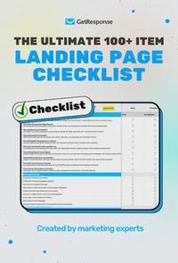
The ultimate 100+ item landing page checklist
If you’re a marketer, designer, or business owner, this 100-point audit will help you identify the hidden “leaks” in your funnel and turn your landing page into a high-efficiency revenue driver.
Examples of startup landing pages
Let’s now look at some of the best startup landing page examples. These examples showcase how successful startups strategically employed the key practices discussed above to capture visitor attention and drive meaningful actions.
1. Daily Harvest
The one thing that stands out the most in this Daily Harvest example is the high-quality images of their products in the hero section. The images grab your attention as soon as you land on the page.

Despite using different images, you’ll also notice that they fit right in with the rest of the content on the landing page, thanks to the neutral color backgrounds.
Once your attention wanders a little from the image, you can see the benefits-focused header “Let’s start with good clean food,” which the image compliments perfectly.
Also, notice how the form is super brief and prominently placed above the fold. It also includes a fairly conspicuous CTA. However, the color could have been a bit bolder to make the CTA stand out.
Daily Harvest also includes the logos of a couple of famous brands they’ve worked with, which most definitely boosts the brand’s credibility.

As you can tell, this example is highly visual, from the product images to the icons.
The “how this works” section placement is also a great idea since it sets the tone for the CTA right below it. Again, this CTA could also use some improvement, both in color and text, to make it more conspicuous.
Also, notice that the landing page has no navigation menu or other unnecessary external links, which would only distract the visitors.
Besides that, the landing page design is clean and concise. It is also uncluttered and has white spaces that make scanning and getting information about the company and the products easy.
2. Cybellum
This Cybellum landing page example has a clear and simple design. It includes several animations to complement the various headlines shown.

The company also includes the icons and testimonials of reputable companies they’ve worked with to pique your attention.

The page includes a navigation menu, making it easy for visitors to wander off to other web pages. As we mentioned earlier, this distraction will lead to most people not reading through the entire landing page content and thus not taking any action.
3.LimePay.io
LimePay.io is the other great startup landing page example. You’ll first notice that the landing page lacks a navigation menu. This should contribute to better engagement and conversion rates.

The hero section is well executed with the graphics, a great headline, and an equally superb subheading. Besides that, the CTA is well-placed and conspicuous in light blue.
Another section worth mentioning is the “How it works” part. The comparative illustration simplifies the process, making it easy to understand how LimePay works, even for people who don’t know much about crypto payments.

Besides that, it shows LimePay’s value by showing how much easier it is to use compared to traditional crypto payment processes.
The testimonial part is also great. As mentioned earlier, testimonials are deemed more authentic if you provide details like the image, name, and credentials, which LimePay has done.

The only fault with this example is the multiple CTAs–the live demo, get in touch, and email subscription one at the bottom. The many CTAs can easily confuse landing page visitors. It’s better to stick to the 1:1 attention ratio–where you only have one conversion goal.
4. Ranktracker
One of the elements that makes this Ranktracker example stand out is the video in the hero section. This video provides more information about the company and its benefits.
The headline is benefits-focused, which helps readers understand the brand’s value from the word go. Also, the CTA is compelling and prominently placed in a position their visitors can’t miss.
They’ve included a portfolio section right below the fold. However, including colored logos instead of having them in grayscale would have been a better idea. The trust badges should also have been featured at the bottom of the page.
Ranktacker includes well-executed customer testimonials with all the key details, as you can see below.
The prominent weak spot with this particular landing page is its length. Most people would probably not read the entire page.
5. Rubrik
In this example, Rubrik uses the landing page to collect email addresses in exchange for a free report. The concise signup form is placed above the fold with a conspicuous CTA.

The testimonial included is great and ticks all the right boxes. The clients and partner brand logos are also a great addition.

The landing page design is clean, and the copy is brief. That makes it easy to read through.
Additionally, you can easily see the brand’s focused conversion intent. They’ve stuck with a single CTA, which they’ve used multiple times throughout the landing page.
Build your startup landing page with GetResponse
A great startup landing page is a strategic asset for your business that can help you capture attention and drive meaningful conversions.
You must consider ten essential practices to create the best startup landing pages.
They include conducting competitor analysis, using animations, creating compelling CTAs, adding social reviews, and engaging the audience with visual content. Also, ensure you have an irresistible offer and simple lead generation forms, generate interest before pushing for sales, prioritize benefits over features, and follow the 1:1 Attention ratio.
The good news is you don’t have to start building landing pages from scratch – you can use various free startup landing page templates. For instance, our free landing page creator offers multiple templates, both predesigned and blank, allowing you to be even more creative with your landing page designs.
We’ve also shared five great startup landing page examples to pick inspiration from. That’s it. You’re ready to build a compelling startup landing page that earns you loyal customers who will grow with your business.
