Are you looking to make the most out of your online advertising efforts? Then designing visually appealing landing pages is key. This article will serve as a visual guide to landing page design, exploring what you need to know, the top trends for 2026, and how you can create a dazzling page for your business.
Let’s dive in!
Do you want to create a landing page, but don’t know where to start? Take a look at our collection of modern landing page templates for inspiration and create yours for free!
What is a landing page?
Landing pages are a type of website page created to generate leads or capture sales. Unlike homepages, they aim to persuade visitors to take immediate action, such as filling out a form or purchasing a product.
Why should you care about landing pages?
Landing pages are the perfect platform to convert website visitors into leads, which can be further nurtured and converted into sales.
They’re a fundamental part of any brand’s online presence; in a world where online journeys can start anywhere, they are the best way to direct online traffic from multiple sources to convert into customers.
Top landing page design trends for 2026
2026 is already shaping up to be a hot year for web design. From Bold Typography to 2000s Nostalgia, we’re bringing you the five most exciting landing page design trends of the moment.
1. Monochromatic aesthetic
Monochrome is a design style composed of a single color. It uses different tones and shades of the same hue instead of color variations to create a unified look.
Who it helps
This trend is perfect for brands that want a polished look and want to deliver a message of being a solid business.
How to use it
Muted and neutral colors work amazing in monochromatic looks. Also, pairing graphic elements within the same undertones – cool colors or warm colors – will keep things cohesive.
Take this landing page by Ellevest as an example. Its green palette creates a calming and sophisticated atmosphere while delivering its message of financial growth.

2. Collage art
The internet is a visual space – so why not design your landing page to speak its language? Collage art has become a popular trend for its ability to convey powerful messages through images. While collage can also include typography, this trend captures visitors’ attention through an eye-catching mixture of graphic elements.
Who it helps
Brands that celebrate creativity can benefit from this trend. Collage art adds excitement to a landing page and shows your brand as laid-back and artsy.
Lifestyle, home decor and some fashion brands are a perfect fit for this.
How to use it
Take some graphic elements –photos, custom illustrations, textures, text – that don’t belog together and play with the composition. This will result in a unique design that speaks volumes for your creative brand.
While simple, this landing page from Abbey Dawn’s website is an excellent example of image-heavy page design. It combines dynamic graphics transitioning to showcase its offerings, with few words required.

There’s also a more freeform side to the collage trend, as seen in the design platform Sketch’s website.

3. Hero video
Hero videos are full-screen videos that take up most of a landing page. They can illustrate a product, service, or concept and help captivate viewers quickly.
Who it helps
Fashion and apparel brands use videos that look like fashion shows, so their products are always on display.
It’s also a great choice for almost any brand that wants to showcase new products in a real-life scenario.
How to use it
Choose videos that have a straighforward message and visual flare. Ensure videos are optimized and don’t interfere with your copy, menus or pop-ups.
Additionally, keeping videos on the top section of your landing page will deliver better results. In fact, videos above the fold have up to 50% more engagement.
Rolex illustrates this perfectly with its US landing page. Visitors are treated to an expansive layout with short, elegant clips that feature the brand’s luxury watches as soon as it loads.

Read more:
1. How to create a lead generation funnel
4. 2000s nostalgia
But wait, wasn’t this just ten years ago? Sadly, no. It’s hard to believe how fast time flies, but we’ve reached a point where the Y2K trend is considered nostalgic.
The early age of the internet is now a source of design inspiration; chunky text, block images, and heavy formatting are in once again. In the context of landing pages, this might look like the use of simple emojis or stickers, GIFs, grids, and bright color palettes.
Who it helps
Make sure to dive deeper into Y2K fashion, as it is perfect for makeup and clothing brands, or companies that want to emphasize this aesthetic as part of their visuals. If Millennials or GenZers are your target, this is a no-brainer.
How to use it
Choose your favorite shade of pink, baby blue and other pastel colors to dominate your design. Then add some 2000s elements such as pop-up windows and iconography. If you want to take it further, add glitter and gradients.
This motion designer’s portfolio is a great example of all these elements. He mixes a variety of Y2K design motifs to create a simple yet unique personal brand that stands out.

5. Bold typography
Bold typography is a surefire way for your landing page to stand out from the crowd.
Who it helps
This trend is perfect for brands that want immediate attention. Bold typography is for those who want to send a loud message, so this is the perfect choice for headlines and hero text.
How to use it
To make an impact, think fancy fonts, large font sizes, and heavy titles. This trend is about being dramatic, drawing attention away from images and visuals, and directing it toward heavy-looking text.
Bold typography brings focus to powerful copy and highlighting text to send a powerful message about your brand.
You can’t get much bolder than Squarespace’s landing page seen here.

6. Minimalism
Deliver a flawless user experience with a minimalist landing page design. Straight lines, decluttered space, and essential imagery are key for smooth navigation.
Who it helps
Despite minimalism is not a new trend, it gives that future-like vibe. This trend works wonders for brands that want to look sleek and professional. Particularly lifestyle and technology brands can benefit from this.
How to use it
Focus on product and copy, rather than textures and background. White space should dominate the visual composition. Short copy using sans serif fonts will keep your landing page distraction-free and will make it easier to read.
Japanese clothing brand Auralee is a great example of a minimal landing page that avoids distracting elements and offers customers a simple, yet beautiful journey for shopping.

How do landing pages work
Landing pages are indirectly connected to a website’s main structure but serve as a standalone destination that is usually only accessible via URL. They are created with a specific purpose and can contain various features or tools to help that cause.
For example, a landing page could include a form for collecting user information, a list of features and benefits, images or videos to explain the product, FAQs, customer testimonials, and a call-to-action button encouraging customers to purchase or sign up.
Landing pages are typically the last stop in a visitor’s online journey and must be concise, direct, and straightforward.
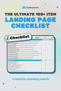
The ultimate 100+ item landing page checklist
If you’re a marketer, designer, or business owner, this 100-point audit will help you identify the hidden “leaks” in your funnel and turn your landing page into a high-efficiency revenue driver.
Benefits of landing pages
Landing pages are a potent tool that – when designed correctly – can yield many benefits.
Lead generation
Landing pages are a great way to capture a user’s information throughout their buying journey. They can capture names, emails, business phone numbers, and more – allowing brands to capture leads to convert into sales.
Conversion rate increase
When designing landing pages, direct website visitors straight to a desired goal. By removing all other options and focusing solely on the intended call-to-action, landing pages can increase the likelihood of a purchase or sign-up.
Audience segmentation
Another great benefit of landing pages is the ability to create multiple versions targeted at specific audiences. Brands can then create custom campaigns for different demographics, interests, or stages in the buyer’s journey.
How to design a landing page
Despite the variety of unique trends and design styles to consider, landing pages should all contain the following elements:
Hero image
This prominent image placement is the first thing visitors will see when they land on your page. You want to ensure it grabs their attention and effectively conveys your message.

Headline and subheadings
Headlines are large titles that provide visitors with the main gist of your message. Subheadings are smaller titles that further explain what your page is about to help visitors stay on track.
Copy
Copy refers to any text on a web page besides its headline and subheadings. It details the page’s message, provides in-depth information, and can be used to explain the benefits a visitor will receive from your product or offer.
Forms
Forms serve an incredibly important purpose as they allow visitors to respond to the page’s message. A good landing page should include forms that are optimized for conversions, making it easy for visitors to fill them out and submit them.
Call to Action (CTA)
Call-to-action (CTA) buttons are essential for any landing page as they prompt visitors to take action. They should stand out and tell visitors what they’re supposed to do.
Such is the case of this Fruit of the Loom website, where the copy is short, images are simple, and users can click on the CTA button to start shopping.

Pro tip: Want to learn more about building the perfect landing page? In just over 8 minutes, we’ll show how you can do it with the power of AI using our GetResponse Landing Page Generator.
Landing page best practices
Landing pages are pivotal in online lead acquisition, so getting yours right is essential. While no two should be made the same, several best practices can help improve a page’s effectiveness. We’ve outlined the top eight below.
1. Write a concise headline
A headline is one of the most critical elements of any landing page, as it communicates your message and explains what visitors can expect. This portion of the text should be concise and directly address the benefits of your product. Avoid using long words or jargon, as it makes people less likely to understand what you offer.
2. Include an eye-catching hero image
In addition to a punchy headline, your landing page should incorporate stunning visuals to help sell your product. This element should be placed “above the fold” so visitors see it as soon as they land on your page.
3. Write compelling copy
Copy gives visitors a brief overview of your product and how it can benefit them. Try to practice restraint; there’s an art to writing direct copy that is to the point. Also, emphasize the benefits of your product or service over its features.
Read: Landing Page Copywriting Principles That Work
4. Include a conversion form above the fold
A conversion form should always be placed “above the fold” so that visitors see it as soon as they land on your page. This will make it more difficult for visitors to skip over the form and leave without taking action.
5. Add CTA
Your design efforts will be worth nothing if users decline to take action on your landing page. Increase their likelihood of responding with a clear CTA. While it may seem simple, this little detail can significantly affect how people respond to a page’s message.
6. Ensure responsiveness
More people are accessing the web through their mobile devices than ever before. Optimize your landing page to guarantee accessibility and ensure your design suits all device types. Your page size should be appropriate for any screen, and all elements must look perfect on every mobile device.
Responsiveness may require some extra effort and utilization of usability testing tools but will help you maximize conversions.
One well-executed landing page example is this one from Beats’ website. The design adjusts perfectly depending on the screen size and even changes its hero image to fit a smaller size.


7. Avoid navigation
Landing pages are standalone entities that work independently from a site’s main layout. As such, they shouldn’t include navigational elements that take visitors away from one page and onto others. The only exception would be a link to your homepage or privacy statement page.
8. Optimize for search
Most high-converting landing pages are designed to reach a select group of people. However, optimizing the page for search engines is still important to ensure users can find it when they search for related topics. Ensure the page is indexed correctly and that you include relevant keywords in metadata and copy.
9. Ensure web accessibility
Providing accessible content means that people with disabilities can easily navigate a website.
Follow the ADA’s general nondiscrimination requirements and effective communication to give users the information they want when visiting a landing page.
These are some ways to make your content accessible:
- Using high-contrast in your landing page design.
- Writing text alternatives (alt text) on images.
- Caption your videos.
- Allow keyboard navigation on your website.
10. Microinteractions
Web interactions like clicking a link, watching a video, or filling out a form require some effort from users.
However, microinteractions like the use of progress indicators or progress bars can increase engagement and ensure users are navigating and responding to your content.
Conclusion
Effective landing page design is essential for advertising to consumers online. The right layout can significantly boost conversions, while the wrong one can lead to a high bounce rate and fewer leads. Hopefully, this article served as a good starting point – from here, it’s simply a matter of testing and refining to ensure your landing pages are as effective as possible. Good luck!
