If you want your newsletters to stay ahead of the curve year after year, it’s important to keep up with new design changes and trends. Although it’s essential to prioritize subject lines and content, you shouldn’t ignore the power of a well-designed email.
Editor’s note: Want to be sure your emails work well across all devices? Check out our email design guide and stay up to date with the latest design best practices.
Design trends are evolving every year, so we wanted to take some time to talk about a few email marketing design trends to pay attention to in 2025. For this article, we’ve partnered with three world-class email marketing agencies – SeeResponse, Inbox Army, and Email Industries – to showcase some of their best email designs.
Use these email design trends to revamp your email marketing strategy and ensure you’re sending out beautiful and engaging newsletters to your audience.
Learn more about the latest email design trends from Operation: Automation, our marketing podcast:
Ready to dive in?
Read more:
1. How to create an email newsletter
2. Email design guide
1. Incorporate darker designs
As more and more apps continue to add dark mode to their capabilities, many companies are starting to keep this in mind when it comes to design as well.
Dark mode allows users to rest their eyes a bit when looking at their devices, since they consist of a black background and white text. This limits the amount of blue light that comes through their screens, and even conserves battery power.
Designing darker emails, or even just keeping email client dark modes in mind with your design, is a big trend this year.
Take a look at this email from MacPaw. Their dark navy background and white text helps the words, graphics and call-to-action buttons to pop without straining the reader’s eyes.

Consider testing a darker design within your emails to see if your open rates start to increase among your readers.
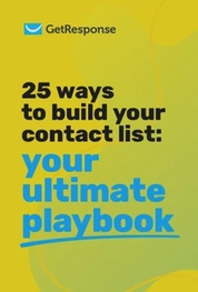
25 ways to build your contact list
We’ve compiled a list of 25 tried-and-tested tactics for the success of your future campaigns.
2. Add 3D visuals
3D and isometric illustrations and graphics have been gaining popularity, and they’re not going to stop anytime soon. You see them in nearly every new website design and they’re even making their way into email design.
Take a look at the graphic example in this Lyft newsletter.
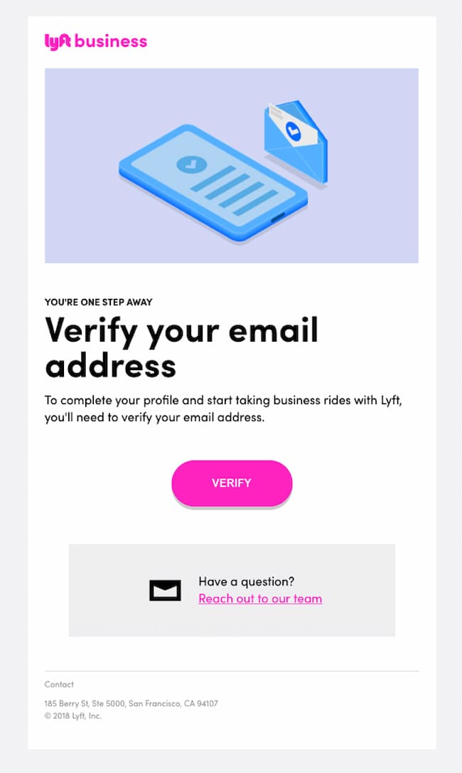
The 3D effects help to provide another dimension to the overall email design.
Here’s another great example from Algolia.

If you have a graphic designer on staff, adding visuals like these can help spice up your newsletter. Or, you can use a DIY design tool to find your own isometric icons and illustrations.
3. Make your emails interactive
Another huge email design trend in 2025 is interactivity. This strategy is becoming popular across the board in design, and not only in emails.
Here’s a stellar example of email interactivity from EmailMonks.

They’ve incorporated an entire game into their email newsletter, giving their audience a fun way to interact with their brand.
Here’s another great example of interactivity in Litmus’s Halloween newsletter, where they’ve included a feature where users can turn on and off the lights by clicking a button.

While interactivity doesn’t necessarily have to be this complicated, there are many ways to create an interactive experience for your audience.
Incorporate interactivity into your email design by adding valuable links throughout your emails, a clickable menu, add to cart buttons, and more. Take it up a notch by adding polls, gamification, and other interactive features into your emails as well.
4. Personalize your emails
This one should go without saying. In a world where we’re constantly bombarded with content, it’s the personal touches that truly make your subscribers feel seen and valued.
There’s something special about opening an email that feels like it was crafted just for you. It makes you sit up, take notice, and engage with the content. And that’s precisely what you want your readers to do.
You don’t have to stop at personalizing the salutation. You can also include personalized images in your emails, like Jet2holidays did.

Imagine opening an email to find a custom-designed banner with your name on it, or a product recommendation tailored to your preferences.
Tools like NiftyImages and Hyperise allow you to generate dynamic images and custom illustrations that incorporate your subscribers’ data, such as their names, locations, or other unique elements, making your emails visually engaging.
5. Make your emails accessible to everyone
Here’s another essential trend that you simply can’t afford to overlook in your marketing communications: making your emails accessible to everyone, including those with disabilities.
Ensuring that your emails are inclusive and easy to navigate for all your readers is not just the right thing to do, it’s a surefire way to build a positive brand image and expand your reach.

As someone who appreciates good design, I can’t stress enough the importance of creating emails that cater to a diverse audience. This includes using clear and legible fonts, providing sufficient contrast between text and background colors, and adding alternative text to images for screen readers.
If you want to go the extra mile, consider using accessible email templates or running your designs through an accessibility checker to make sure you’re covering all your bases.
Now, it’s time to hear what our experts have to say!
6. Use bold typography
SeeResponse – B2B email marketing agency
In our opinion, large and bold typography in emails is like a lighthouse in the night – they make key messages shine bright amidst the otherwise dull sea of emails. Not only do they grab readers’ attention, but their larger size also allows for improved readability, with large fonts helping draw attention to the important content within relatively large amounts of text.

Here we used larger fonts to create a visual hierarchy and emphasize certain pieces of information that readers should pay extra attention to – such as key stats and the steps of the process. The bigger typeface is more eye-catching than default font sizes, making sure the message stands out from competing marketing or informational emails people receive throughout their day.
Moreover, this technique helps users quickly scan through important points without having them absorb lots of text, which would, in turn, reduce user engagement and their general interest in reading an email about home offers in its entirety.
We wanted the large fonts to help readers skim down lengthy paragraphs into little digestible chunks while still successfully conveying a clear message.
In our webinar with Matthew Smith, the Founder of Really Good Emails, he talked about how the conscious use of typography is among of the hottest email design trends he sees. You can check out the full webinar recording below or skip to the 46:03 if you’d like to just listen to the Q&A.
7. Use bold color schemes…
SeeResponse – B2B email marketing agency
We believe color is an important factor when it comes to design. Bold colors signify energy, vibrancy, fun, and excitement – all of which are essential ingredients for successful email newsletters.

Here we used bright colors primarily as a tool to draw attention and create a strong visual impact. We wanted to give readers the impression that something exciting is being offered here. We also felt bright color combinations could help make text content easier to read by providing contrast between text elements and backgrounds.
In general, people respond positively when surrounded by vivid hues since they naturally associate them with something exciting; this psychological reaction encourages people to explore further into the content of your message instead of just quickly skimming over it – so the goal was to improve click-through rates on key points within the newsletter.
8. …or embrace minimalism
Email Industries – Email marketers and deliverability experts
Simplicity can be just as impactful as bold color schemes and intricate visuals. Minimalism in email design is about eliminating unnecessary elements and concentrating on the essentials, which can help your message stand out more effectively.
This doesn’t mean you have to sacrifice creativity either – you can experiment with different color shades, geometric shapes and even negative space.

For this design, we wanted to focus on staying with our minimalistic design approach. We use mostly greyscale to allow the few splashes of color to stand out. Our goal was to have the CTA’s take center stage. In our testing, we found out that allowing the buttons to take the main focus drives more clicks and conversions.
By using greyscale it allows for us to use larger images that are more interesting and easy to see. These large images also grab your attention and allow the reader to know what we are promoting without having to use words.
It’s also helpful when optimizing for mobile so that the images are still easily understood and don’t become too small and illegible. This mixture of large greyscale images and buttons that pop with color is the secret behind some of our best-converting emails.
Get more out of your email campaigns
Want to get a higher ROI from your email marketing campaigns? Then you need to understand the key metrics and what you can do to influence them. In this guide, we provide you with 20 ideas that’ll help you optimize your email campaigns for higher opens, clicks, and list engagement.
9. Consider using micro-animations
InboxArmy – Full service email marketing agency
In the ever-evolving world of email design, micro-animations have emerged as an innovative way to elevate the user experience without compromising readability or performance.
By incorporating subtle motion and interactivity, micro-animations can enhance the visual appeal of your emails, capture your recipients’ attention, and encourage engagement.

For this design, we decided to focus on Birthstone jewelry and wanted to showcase the different color stones in an efficient way without cluttering the email with too many images.
To achieve this, we created a visually appealing GIF that not only caught the recipient’s attention but also highlighted the various colors of the Birthstones. This approach catered to those who buy for Birthstone reasons as well as those who purchase based on their favorite color.
In the past, we have noticed that incorporating animations in this manner drives an increase in clicks and conversions, and this email was no exception. As we always prioritize designing for mobile devices, we made sure to optimize the GIF to load quickly, providing an excellent user experience.
10. Always optimize for mobile
InboxArmy – Full service email marketing agency
Optimizing your emails for mobile ensures that your content is easily accessible, readable, and visually appealing on a variety of screen sizes and devices.
By implementing responsive design, using clear and legible typography, and organizing your content in a way that’s easy to navigate on smaller screens, you’ll create a seamless and enjoyable user experience for your mobile audience.

We designed this email specifically for mobile devices, taking into consideration how it would appear in dark mode. To ensure that the text in the images would not appear too small on mobile devices, we used the show-hide method when coding the HTML email template. This allows the image sizes to adjust appropriately to the size of the mobile device screen.
Ready to test these email marketing design trends?
Looking for fresh inspiration for your email campaigns? Check out our collection of free newsletter templates that showcase the latest design trends! Better yet, let our AI email generator design your next newsletter!
Time to put each of these 2025 email design trends to the test! Create an interactive email, add in animations, and test different fonts and colors in your designs.
Which of these email design trends are you most excited about? Let us know in the comments!
