Introduction
Landing pages are an essential part of digital marketing. If you’re not using landing pages yet, you’re most definitely wasting a big chunk of your ad spend and attention.
Use this whitepaper to learn how landing pages work, how to use them, and how to build good ones.
What is a landing page?
A landing page is a standalone web page with a single purpose. It’s typically used for advertising and promotional campaigns. It’s the first page visitors see after clicking your banner ad, PPC ad, or promotional email.
Campaign traffic lands on the dedicated page (hence the name “landing page”), and that page gets people to take specific action. Typical uses:
- Get people to sign up for your newsletter
- Generate leads
- Solicit donations to a cause
- Sell a product
- Share content on social media
- … and more.
The importance of landing pages in marketing strategy
An effective landing page is crucial for converting shoppers into buyers.
What makes them so effective is that they focus on a single goal: get the visitor to take a single specific action. Everything that doesn’t directly contribute to getting more people to take action is removed. So ideally it doesn’t have links, a menu, or multiple calls to action.
A landing page is a key factor in the success of your ad campaign.
Good landing page = good ROI.
Bad landing pages = needless waste of money.

Where to start?
Follow these steps to create your first landing page.
Identify your audience
You can’t market to people if you don’t know who they are and what they want.
The landing page needs to speak to a specific audience. Make sure you know the problem, the need, and desire of your target audience.
If you run several advertising campaigns that drive traffic to a landing page, you should create several different landing pages. They can be mostly the same, but with different headlines and with small tweaks in the copy.
Define your most wanted action (MWA)
MWA is the one action people should take on the landing page.
Do you want them to join your email list? Buy a product? Sign up for a demo? Whatever it is, make sure you have a single objective.
Define your message
You know your audience, their problem, and the solution you offer. Now craft that into an easy-to-understand message. Your landing page has to make an offer, so it should be clear who this offer is for (so people can identify with it), what the offer is (specifics), and why it should be interested (benefits).
Avoid clever language, hype and business jargons. Go for simple and clear language. “Clarity trumps persuasion” is a good maxim to follow.
There’s no way to know for sure in advance what will work, so create several versions and split test them.

What to include
- A headline that speaks to the target audience
- Your company logo
- A quick explanation of your offer above the fold (the portion of the screen the average can see without scrolling)
- A longer explanation of the offer below the fold if needed (depending on the complexity of your offer and product)
- An image of the product offered
- A simple form, ideally with just 1 to 3 fields (usually name and e-mail, but do you actually need the name?)
- A buy button or signup button, depending on your predefined most wanted response
- A link to your privacy policy (to keep people on the page, this should open up in a pop-up window and not load in the same window)
Remember, the more fields you ask the visitor to fill in, the more friction you create and therefore the fewer the people who will fill out the form.
What to leave out
- Navigation menu – remember to focus only on your offer
- Links to other parts of your site such as “about”
- Pictures or images that don’t relate to the offer; these are only distractions
- Hard-to-read text – anything less than 12px is bad
- Links along the lines of “click here to subscribe” or “click here to read more.” If you can’t cram all your content into the upper fold of your landing page, just let the user scroll down. It’s almost always better than clicking to the next page.
- Discouraging forms with unnecessary fields such as “title” or “fax”
- Clear fields button
There are always exceptions, so you can’t just copy best practices, but this advice should be your starting point. Get the essentials in place first, then tweak.
Landing page vs. home page
Home pages are often brand carriers that try to tell a story of what the entire website is about. They are often cluttered with information and many possible actions a visitor can take -links, forms and buttons. As a result, the most important action might be missed.
That’s why you should never drive traffic from your promotional campaigns to your home page. Instead drive traffic to a page aimed at only one thing – getting them to take the action that is the goal of your campaign.
A landing page is far more effective at getting people to take that most wanted action.
These 3 angles typically work well:

#1: Say what it is
The brain is a questioning organ. Whenever we see something new, our brain asks, “What is it?” This formula addresses this fundamental question.

#2: State a benefit
This is a benefit-oriented statement that sums up what you get when you sign up.

#3: Say what you can do with it
This is where the headline makes it clear what you can accomplish if you accept the offer, use the service, etc.
Anatomy of a successful landing page
Headline
Advertising guru David Ogilvy said that five times as many people read the headline as read the body copy. Not much has changed since his day – the headline is still critically important.
It’s your grabber; it’s what gets people interested (or turns them away if it’s boring).
A good headline can be crafted in many different ways. There is no universal formula despite what some blog posts claim.
Writing a clear copy
The goal of most written content is to inform or entertain. The goal of landing page copy is to get people to do something.
When it comes to copywriting, there are 3 keys to keep in mind:
- Clarity: make everything as simple as possible; use the language of your customers; avoid technical jargon and buzzwords.
- Credibility: avoid big claims unless you have data to back them up; use specifics instead of superlatives, such as, “We deliver pizza in 10 minutes” (good) vs. “Fastest pizza delivery in town” (bad).
- Value: make it all about the visitor, their problems, and the benefits they can expect. Don’t make it about you.
Using images and videos
People rarely buy a thing without seeing it. Usually they also want to touch it, hold it, and take it for a spin. You really can’t do those things online (unless it’s web-based software). So to compensate, you need to work twice as hard to make your products come alive by using excellent photography, graphics or videos.
If your offer is a physical product – show it. If it’s a virtual product – show it. This will make your offer seem more tangible.
Use images that show an experience (example: campaign to win a trip to Kenya – show an image of Kenya), how your offer is used (example: show the product in action), demonstrate results (before and after) or show people using it.
Images of humans, especially their faces, can be very powerful for grabbing attention, sometimes even too powerful – they can take attention away from other elements. Make sure you test it! Also, the right face can make all the difference, so experiment with different faces.
Generally you want to avoid cheesy stock photos (take your own photos instead), closed poses (folded hands, hands on the hips, etc.) and disinterested people.
How to use call to action
Your landing page drives people to take action. The final step is to click your call to action button: “Buy now”, “Download e-book”, “Subscribe to newsletter”.
A good call to action finishes the sentence, “I want to…”. So avoid words such as “Submit” – nobody wants to submit. They might want to “Get instant access”.
Keep in mind the size, look and location of your call to action. To make it easy to spot, use a contrasting color and make it reasonably large.
Principles of good design
It only takes 0.013 seconds for your brain to identify an image and 0.05 seconds for visitors to form an opinion about your landing page.
The opinion they subconsciously form between 1/13th and 1/50th of a second influences every decision they make for the rest of their time on the page.
What is good design? According to research there are two main factors:
- Simplicity (simple doesn’t mean amateurish or ugly; simple design is the opposite of visually complex design)
- Prototypicality (how familiar it looks and whether it meets expectations)
Is your page arranged in a way that is intuitive to users? Are your product images up to the standards your target market experiences when browsing the Web?
The brain registers information faster than your user can consciously perceive it. So if these elements are even slightly off, conversion becomes an uphill battle.
Testimonials and social proof
You say you’re awesome – but who else thinks so? You need to establish credibility. If people have never heard of your business, there’s an inevitable amount of distrust and skepticism. You can’t fully get rid of it, but you can minimize it by providing proof that you and your offer are legit. You can do this with:
- Testimonials by people who use your services (full names with photos or videos, no anonymous testimonials)
- Mentions by well-known third-party media outlets (featured in Forbes magazine, for example)
- Impressive numbers (“500,000 people are already using it!”)
- Product ratings and reviews (research shows that 63% of consumers say they’re more likely to purchase from a site with ratings and reviews).
Don’t go overboard, because overcompensation can cause buyer anxiety.
Unless you get a lot of Facebook likes or tweets, don’t add social media sharing icons. It’s a distraction. And if you have only 2 likes and 1 tweet, it’s negative social proof (nobody shares this information) so it harms your credibility.
Your landing page has a single objective, and most likely it’s not to get a tweet. Focus on your main goal and move social media sharing to the thank you page.
Signup forms
Most landing pages have a form of some kind. It could be a simple form with just name and email fields or it could have 10 fields or more.
Flow to design a form that works?
- Less is more (few fields = more conversions). Every field you ask them to fill increases friction. To improve conversions, get rid of as many fields as possible. Ask yourself which you want more: email addresses or additional information? Of course, sometimes you want to add more fields to intentionally create friction in order to improve lead quality.
- Sell the signup. Getting people to give you their email address (sign up to your list) is a transaction. If you want them to give you their email address (and maybe other data), they’ll want something in return. Remind them what they get when they opt in, and be specific.
- Single-column forms tend to work better. Avoid multiple columns.
- Top-aligned form labels typically work best. It’s something you need to test, but this should be your starting point. Inline labels can cause usability problems.
- Submit button width = field width. The call to action is the most important part of your form. A small button has weak affordance and can make users feel uncertain. Make it as wide as the input fields.
What is responsive design and why it is so important
People don’t use only laptops and desktop computers to get online. On many websites mobile traffic (smartphones and tablets) forms 50% of the overall traffic or more.
Mobile device usage is increasing all over the world. That translates into a growing percentage of mobile visitors on websites. If online businesses want to benefit from this trend, they need to optimize the mobile experience for their website visitors.
Responsive design is a flexible layout that adapts to fit various screen sizes, resolutions and devices. It allows websites to automatically change layouts to fit to the visitor’s screen resolution – desktop, tablet, or smartphone – for a user-friendly interface.
It’s not just about user-friendliness. A better landing page experience on a mobile device means more conversions – more people taking action.
In this day and age, you shouldn’t have a landing page or a website that’s not responsive. If you do, you’re ignoring 50% of your audience, and they’ll happily spend their dollars with the competition.
Bottom line: if you want high conversions on mobile devices, make sure your landing page has responsive design.
Landing page positioning and exposure
So you’ve built yourself a landing page. How do you get traffic to it?
Email marketing tools
If you have an existing email list, the best way to get targeted traffic is by sending specific email offers to your list.
Make sure your email is focused – just a single message, one call to action. For best results don’t try to sell your offer in the email; focus only on getting them to click to the landing page. A landing page is far more effective at getting people to buy or subscribe.
Social media
If you have a large social media following, promote your landing page to that audience.
But remember that social media is not a direct response channel, so you don’t want to overdo it with commercial messages, or you’ll risk losing the audience.
SEO
Search engine optimization isn’t the fastest way to promote landing pages. You’d need to provide a good quantity of content, build links to it, and allow time for search-engine indexing.
If you have evergreen landing pages that you plan to keep for years, by all means start the SEO process now, so you can reap the rewards after many months and years. But it’s not a quick way to get results.
PPC
Unless you have a large audience that’s already big enough, pay-per-click is your best way to get lots of traffic right away. Google AdWords and Facebook ads can bring thousands of qualified visitors to your landing pages.
Bear in mind that it’s also quite easy to burn your entire advertising budget without getting satisfactory results. If you’re unfamiliar with the AdWords or Facebook ad platform, take time to study them first. Learn everything you can about Google Quality Score and Facebook advertising best practices.
The key to successful ad campaigns is laser-targeted traffic. Identify people who might care about your offer and publish ad copy that speaks to them. Inevitably there will be quite a bit of trial and error with a new campaign, so be prepared to invest some “school money’ before you start getting your ROI.
Message alignment
If you drive paid traffic to your landing page, the ads and landing pages need to be aligned. Make sure the message in your ad matches the message on the landing page – verbatim in most cases.
And make sure they have the same “scent”. The ad they see or the email they read needs to smell like the landing page they land on. While landing page optimization efforts often go toward improving the structure, copy, design, and call to action, it’s often the missing scent that’s the culprit.

A great example of “scent” is the remarketing ad and landing page for Highrise.
Same girl, same design, same call to action look, same copy. Great stuff
How to maintain a strong scent
It’s very easy if you keep a few rules in mind:
- Ad copy (or email copy, or copy of whatever promotional channel you use) needs to match the landing page copy. The closer, the better. Verbatim would be best.
- While your landing page can fit much more content than a display ad, make the ad message the centerpiece of the landing page message.
- Ad design (or email design) needs to match landing page design.
That’s it! If you follow these three steps, you’re rocking.
Where to start? Decide on your landing page content first, then create ads that match.
Effective copywriting for landing pages
Why do some books become bestsellers and others hardly sell a hundred copies? Why is it that you read some books with passion and interest, and with others you can’t get past the first ten pages? What’s the difference?
It’s simple: choice of words. The words you use and their order make all the difference! Here are the principles of writing good sales copy.
How long should the copy be? That depends whether your offer is free Choose the length of landing page copy based on:
- Nature of visitor motivation
- Initial level of anxiety about product and company
- Level of cost or commitment associated with conversion
Short copy tends to perform better when there is low perceived risk, low cost, and low commitment, and when the customer has an emotional, impulsive, “want-oriented” motivation.
In other words, if you want to write high-impact copy for concert tickets, designer shoes, or mp3 players… keep it short. The same goes for when your offer is free.
Long copy is typically the better performer when there is a rational, analytical, need-oriented motivation. Think consumer insurance products or complex B2B offers.
Read more: 9 Landing Page Copywriting Principles for High Conversions
1. Define who you’re talking to.
If you’re writing sales copy for a product, always write with a specific person in mind.
You should talk differently to each person – no brainer, right? Still most people try to write copy that works for everybody. Try to figure out the common denominator between all the potential buyers.
2. Write as if to your friend (wife, colleague, etc.).
Don’t forget you’re dealing with people. Even if you sell B2B products, there’s always a person with a name and an identity reading your copy and making decisions.
If you know this, then why do you write business jargon’? Forget buzzwords (e.g. social media management system) and nonsense that doesn’t mean anything (e.g. flexible solutions). Say what it is.
Use the “friend test”. Read your copy, and if you spot a sentence you wouldn’t use in a conversation with a friend, omit it or change it.
3. Don’t make them think.
Thinking is hard. Most people don’t want to do it.
They look at your copy and want to understand what you’re offering. If it’s not obvious in seconds, they move on.
Your main headline can be benefit-oriented. But beneath it, take a few lines to describe what your product is, what it does, and who it’s for. It’s a smart idea to include a photo or screenshot of the product. People “get” images much faster than text.
4. AVOID ALL CAPS AND MULTIPLE EXCLAMATION MARKS!!!
There’s no good reason to put your text in all capital letters or bold. It slows reading and reduces comprehension and interest.
Words in lower-case letters are recognized faster than all caps, because they have more shape differences than capitals letters.
Also, using more than one exclamation mark in a row shows you’re 12 years old. Nobody wants your stuff more just because you add exclamation marks. Au contraire.
5. Readability matters.
If you want people to read your text, make it readable. Even the most interesting copy in the world is not read if the readability is poor.
Key things to improve readability:
- Set font size at minimum 14px, preferably 16px.
- Start a new paragraph every 3-4 lines (empty line between paragraphs).
- Use sub-headlines (at least after every 2 paragraphs).
- Use images to break-up text. People read more if patterns are broken.
- Set line width to 80 characters max. If lines are too long, people won’t read them.
- Use dark text on a light background, ideally black text on white background.
6. Long or short?
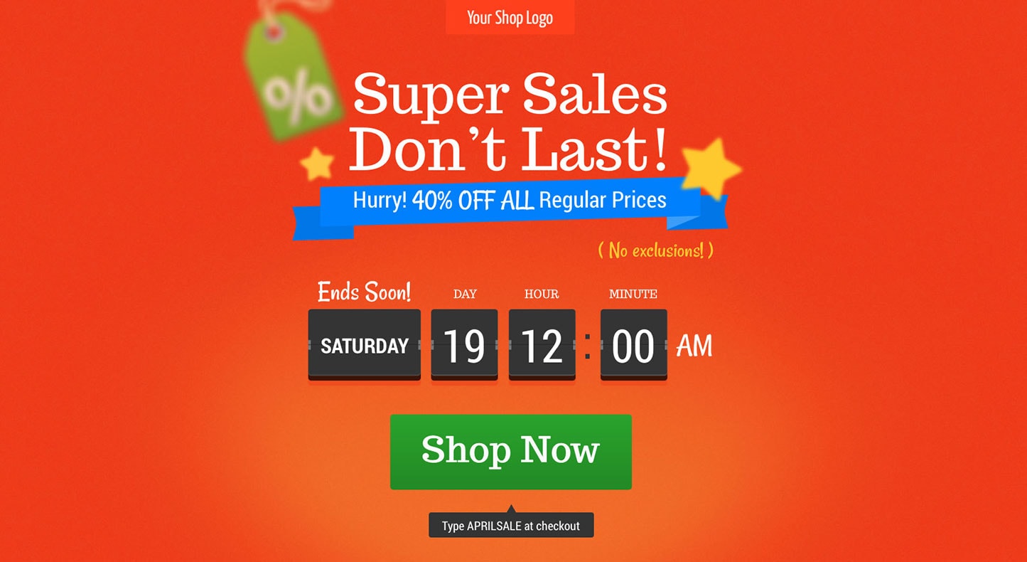
Examples of effective landing pages

- Specific offer with a benefit statement
- Great visual hierarchy: headline grabs your attention, followed by video and the form
- Video to learn more
- Social proof + testimonials
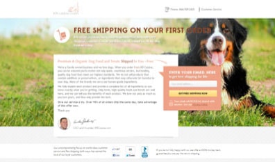
- Specific, attractive offer
- Simple form
- Contextual background image
- Social proof + authority logo (BBB)
- Personal touch via CEO’s photo and signature

- Benefit-oriented headline
- Detailed, highly specific copy
- Large background photo to increase the likeability of the page
- Indirect proof to support the offer
- Simple form

- Specific offer
- Contextual imagery (military) Great form
- Visual cues to direct attention to the form

- Benefit-oriented headline
- Specific copy, clear offer
- Contextual imagery
- Visual cue to drive attention to the form
Summary
Landing pages are an important tool for customer acquisition and list building. They’re also easy to build, and easy to get right. Go build one today.
Author
Peep Laja is an entrepreneur and conversion optimization expert. He’s been doing digital marketing for 10+ years in Europe, Middle East, Central America and the U.S. He has extensive experience across verticals: in the past he’s run a software company in Europe, an SEO agency in Panama, real estate portal in Dubai and worked for an international non-profit.
Today he writes the world’s most popular conversion optimization blog ConversionXL, and runs a conversion optimization agency Markitekt.
You can find him on Twitter @peeplaja or email him peep@conversionxl.com.