How to add and edit a site menu to my website?
Your website can have multiple pages. To make browsing easy for your visitors, add a site menu to guide them between different pages on your website.
Add your own site menu or edit the default one included in the template.
Click here to learn more about managing pages on your website.
How can I add a site menu?
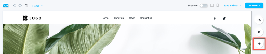
- When in the Website Builder editor, click on the Add elements button.
- Drag and drop the Site menu element into your page content. Note that the editor will highlight the spots where you can drop it.
Note: you can add the site menu not only to header and footer areas, but also inside the content of your page.
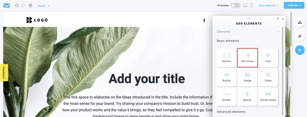
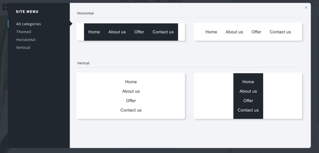
- Select the design of the menu from the layout library. Click on the one you want to add to your page.
Note: If you set up the maximum width for your website in the global design tab, the side menu will appear as a hamburger icon (3 horizontal lines). Our editor supports up to 1920px page width, so if the screen resolution is higher, the menu will not appear as a hamburger icon.
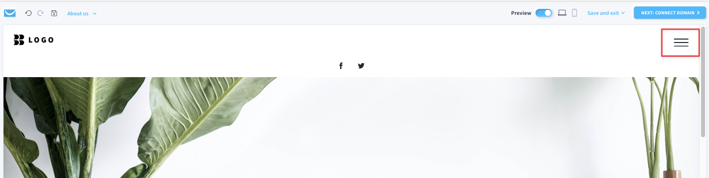
The side menu in the mobile view can only be displayed as a hamburger icon.
How can I edit the site menu?
You can customize any site menu on your website. To do that, click on the site menu you want to edit to open the toolbar.
Text settings
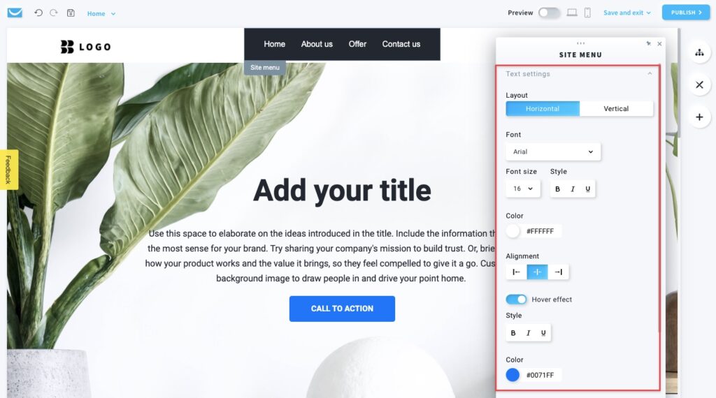
- Layout
Select between horizontal or vertical layout of the menu. - Font
Select the font from the predefined ones or add your custom one.
Note: we support Google Fonts only. - Font size and Style
Choose the size and style of your site menu. - Color
Select the colors of the font in the menu. - Alignment
Select the position of the writing inside the menu.
Note: this will only align the text inside the menu, not the menu itself. - Hover effect
Enable this option to add a text hover effect.
You can select the style and color of the hover font effect below.
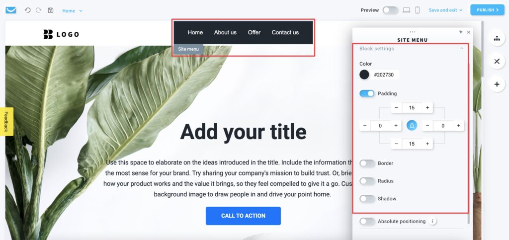
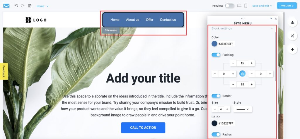
Block settings
The site menu block is a framed workspace around your menu with a Site menu label on the left. You can only see the frame after clicking on the object. It won’t be visible on your website.
You can customize its background color, padding, border, radius, and shadow.
Absolute positioning
Enable this option to move the site menu to any place on your website.
Note: we only recommend using this option if you have some unusual design that can’t be created in any other way. Using objects with absolute positioning can make your page less responsive on mobile devices.
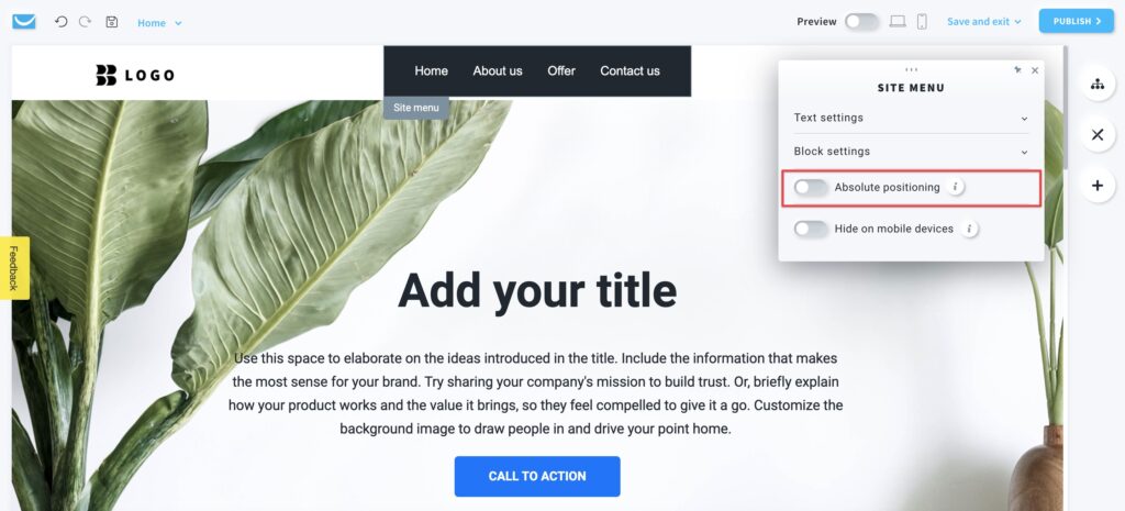
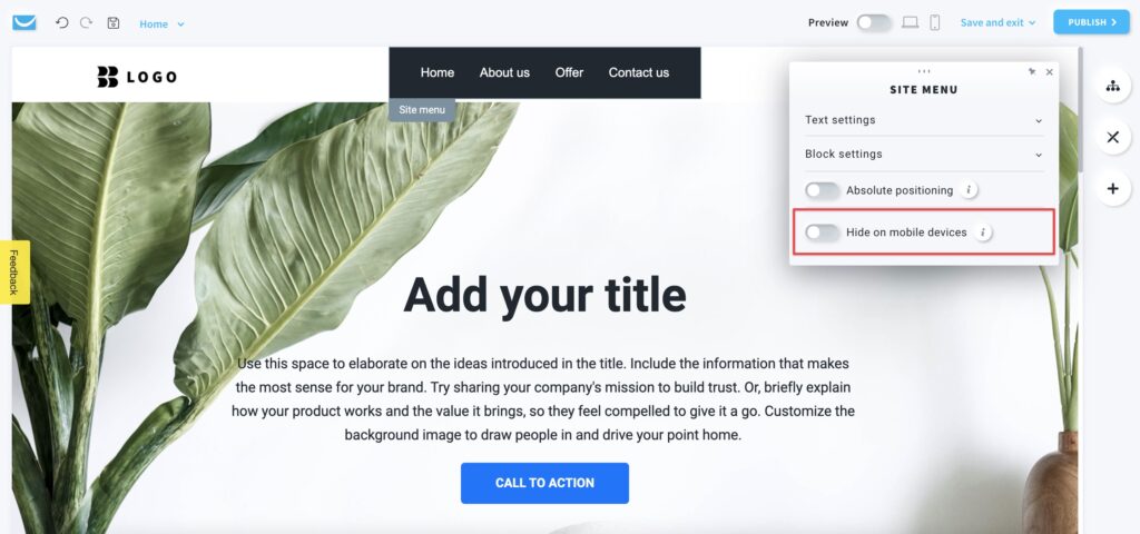
Hide on mobile devices
Enable this option to hide your site menu when your page is opened on a mobile device to make it simpler and faster.