How to optimize my landing page for mobile devices?
The GetResponse landing page builder automatically generates a mobile-friendly view for you. This ensures your landing page is responsive across various screen sizes in both vertical and horizontal layouts.
You can customize the mobile view using the following options:
Hide on mobile devices
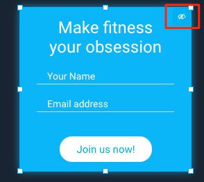
This feature is available for every element on your landing page. Use it to hide specific objects when your page is viewed on a mobile device, ensuring a simpler and faster experience.
You’ll find this option at the bottom of the object settings toolbar.
It’s particularly helpful for hiding dividers and spacers in the mobile view.
Note: Vertical dividers have this option enabled by default.
Scale to full-screen width on mobile
When enabled, this option makes your image or video span the full width of mobile screens. It helps maximize the use of limited mobile screen space while allowing an alternative arrangement for the desktop version.
Note: This option is available only for images and videos.
Mobile view optimizer
You can define the font sizes and paddings of your site for mobile devices. The desktop view won’t be affected by the changes.
To open the optimizer, click on the mobile icon on the right in the top toolbar and adjust the values on sliders.
Click on the Reset to default to set each section back to default.
Steps for legacy landing pages
Our mobile workspace in the legacy landing page creator lets you preview and modify the mobile version of your landing page. It gives you the ability to customize the mobile version by:
- scaling and resizing text and images
- hiding and restoring elements
- repositioning elements
- replacing background images
You can use the mobile workspace for modifying:
- blank templates you use to build your page from scratch,
- ready-made page templates you can customize to fit your marketing needs,
- your existing landing pages you’d like to update.
Click Preview to open a separate tab where you can check how the changes you’ve made will appear on your customers’ devices.
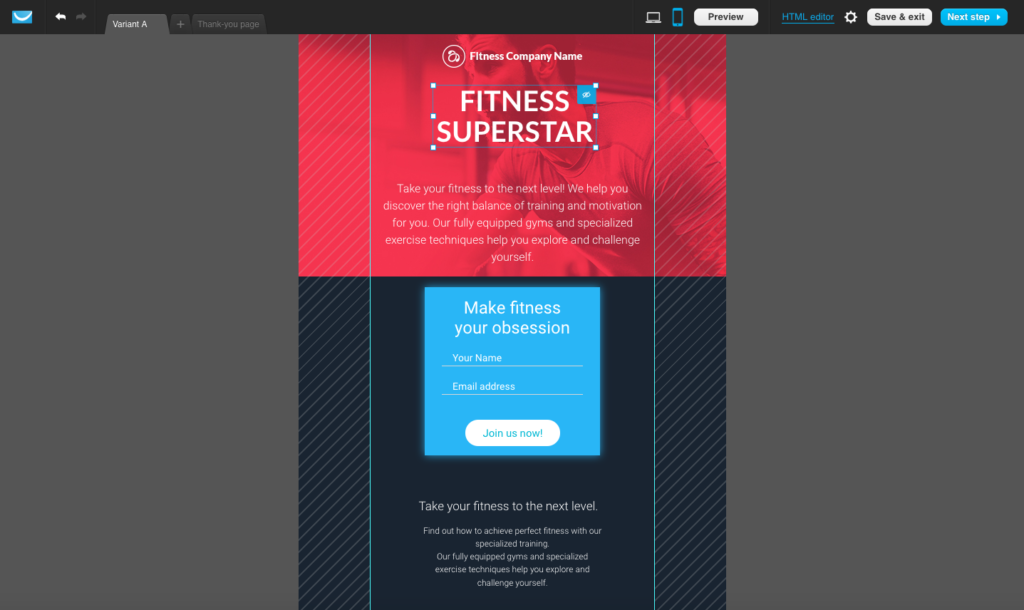
How do I access the landing page mobile workspace?
If you’re creating a new landing page, simply click the mobile workspace icon to open the workspace.

For your existing landing pages, click the mobile workspace icon in the landing page creator. A pop-up module will open asking you to confirm that you’d like us to convert the page. Once you do, the mobile workspace will open.
Once the landing page is converted, its mobile version can be viewed on mobile devices. The break point for mobile versions in GetResponse is 600 px. So, if your landing page appears in a viewport 600 px or smaller, we’ll serve its mobile version.
Note: If you don’t go to the mobile workspace for all the variants of your landing page and thank-you page before saving it, we’ll ask you to confirm whether you’d like us to convert them to mobile versions.
How can I arrange my landing page for mobile devices automatically?
Because our desktop workspace and mobile workspace are different versions of the same layout, one cannot be manually edited without affecting the other. Instead, we provide the option to arrange your landing page for mobile devices automatically. To complete this process:
1. Click the mobile workspace icon.
2. Click anywhere in the mobile workspace.
3. If using Windows, select Control + O on your keyboard. If using Mac, select Command + O on your keyboard.
4. A new window will appear, asking if you’d like to optimize the mobile layout. Click Yes, do it to proceed.
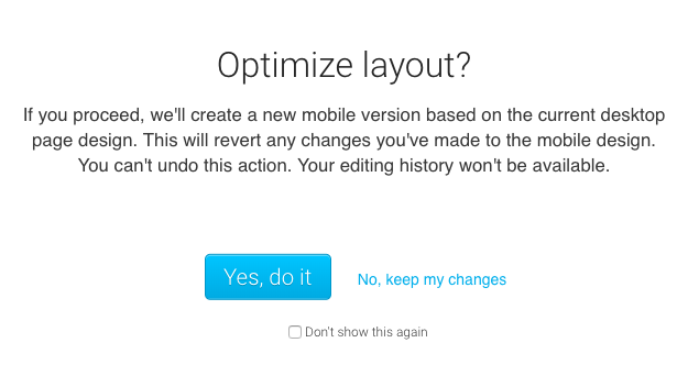
Your landing page will be arranged for mobile devices automatically.
Note: This will revert any changes you’ve made to the mobile design. You can’t undo this action. Your editing history won’t be available.
How can I reposition elements in the mobile workspace?
Drag and drop elements to move objects in the mobile workspace. Please note that some changes in the mobile workspace can affect the desktop version:
- Moving elements to a different section, or removing an object from a box, affects the desktop version of the landing page as well.
- Moving elements within a section applies to the mobile version only. Nothing changes in the desktop version.
We’ll notify you each time this happens by showing you a number next to the mobile workspace icon.

The number indicates how many of your changes affect the desktop version. (The same works for changes you make in the desktop version that affect the mobile version.)
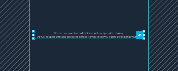
You can only move elements within a specific workspace area. It’s not possible to place any elements on the far sides of the workspace (they’re covered by diagonal stripes). It’s because they may not be visible right away in the viewport of mobile devices. Your customers would need to scroll to see objects placed there. We want to make sure your landing page displays correctly on small screens, so we let you know where it’s best not to place objects.
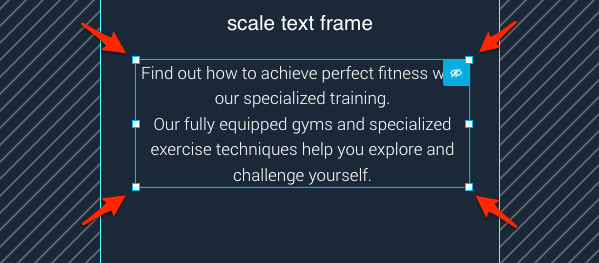
How to scale and resize elements in the mobile workspace?
You can also resize it to change the width of the text frame. Then, you can scale an object to increase or decrease text size in the mobile workspace.
Resizing and scaling allow you to modify text fields in the mobile workspace so that they appear in the viewport just the way you want them to. Here’s how to do it:
1. Click on the object to display the sizing handles.
2.To resize, click and drag the sizing handles on the sides to change the width of the text frame.

3. To scale, click and drag the sizing handles in the corners to make the text smaller or bigger.
Scaling and resizing objects in the mobile workspace won’t cause any changes in the desktop workspace.
Can I remove elements in the mobile workspace?
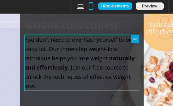
You can hide elements in the mobile workspace. To do this, click on the visibility icon that appears after you’ve selected an element.
To view the hidden elements, click the Show hidden button in the top toolbar. The workspace area is grayed out and the hidden object becomes visible. You can now:
- Restore the element. To do this, simply click on the visibility icon again.
- Keep the element hidden. To do this, click on the Hide elements button now visible next to the mobile workspace icon.
Note: It’s not possible to add or delete elements in the mobile workspace. You need to switch to the desktop workspace to do this.
Can I edit text fields and replace background images in the mobile workspace?
You can edit text fields and replace background images in the mobile workspace. Here’s how to do it:
- For text elements, double-click an element to open the toolbar with the editing options. You can change text size, color, and alignment.
- For background images, Double-click the image to open the toolbar with editing options. Click the background image icon to replace the current image, or the x icon to remove it.


