Getting your business emails opened is like threading a needle.
You fail more times than you succeed.
Inboxes are jammed as brands jostle for people’s attention on the most profitable channel of all— email. In such a highly competitive environment you have to go an extra mile to succeed with your email marketing campaigns.
Success starts with subscribers opening your emails; otherwise your campaign’s dead in the water.
But how do you get your nose in front in the tight race for the inbox?
Stretch every element of your campaign, by, among other things, optimizing the preheader. Sidestepping common preheader text mistakes will put you ahead of the pack and hike your open rates.
First, let’s get the basics out of the way.
Related:
1. How to increase your email open rates – 12 tips
2. Guide to email marketing KPIs and metrics
3. Email marketing best practices and tips
What is email preheader text?
The preheader is the bit of text that appears under the subject line when an email is viewed in the inbox.
Here’s an example from my inbox.

In the above screenshot, the line ‘Everybody’s doing something. We’ll do nothing!’ is the preheader.
Sometimes it’s called the Johnson Box. This refers to a snippet of copy found at the top of direct mail letters, containing the key message of the letter. Other terms used to describe it are:
- Preview Text.
- Second Subject Line.
- Snippet Text.
Why bother with a preheader in the first place?
5 reasons why you need a preheader
1. The design of the preview pane demands it
The preview pane is structured in a way that affords subscribers a chance to get a foretaste of what a message is about.
It seeks to quickly address three crucial questions your audience might have about an email:
- Who is this message from? ( Sender) Is it from a trusted sender?
- What is it about? (Subject) Is the subject catchy enough?
- Why are they writing? (Preheader) Is the message worthwhile?
If you are like most small business owners, your main focus is the subject line. You probably know that research shows up to 50% subscribers decide to open an email based on the subject line alone.
But what happens to the other 50%?
They linger and then look at the next component that falls within the eyeline of their reading path—the preheader. This gives you a second chance to tease users to open your email.
2. The mobile-first world reality requires it
These days most people read emails on mobile devices.
Not only do mobile users read on the move, but they also check their email 3x more than desktop users according to research conducted by Google.
Preheaders are more pronounced on mobile devices.
That’s good news.
A longish snippet text line gives you a great opportunity to expand your subject line and boost your open rates.
3. The number of preheader characters warrants it
Depending on the email client you are using, your preheader can be anything from 40-100 characters long.
That’s between 8-20 more words to support your subject line or say more about your business.
In fact, preheader text dominates your inbox.
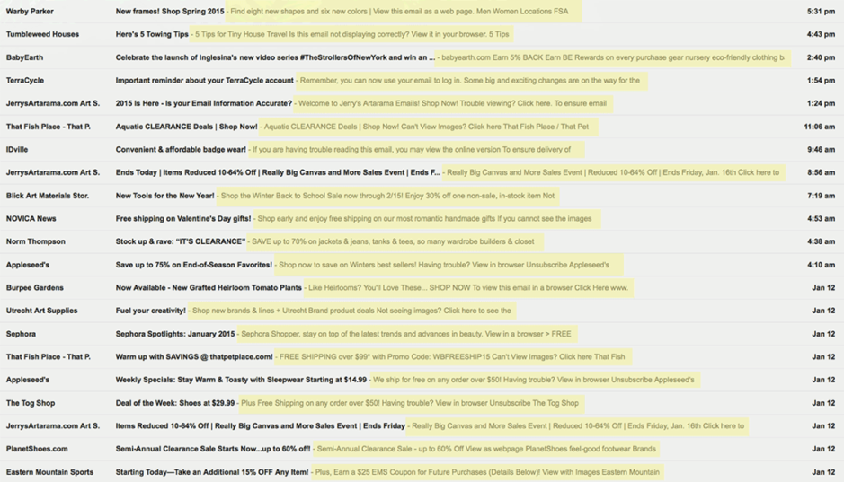
As you can see, the preheader uses up to twice as much space than the subject line in some cases.
Surprising, hey!
Don’t let all this precious space go to waste. Use it to bolster your subject line and market better.
4. The position it occupies encourages it
Mobile users tend to do a lot of scrolling.
The preview text is visible without having to scroll.
Its strategic above-the-fold position makes it a powerful tool for engaging subscribers right off the bat before they are tempted to leave.
5. The role it plays in avoiding the spam folder
If users mark your email as spam, your emails won’t see the light of day.
Good preview text reduces spam alerts.
How?
It sums up what the newsletter is about. Once recipients appreciate the content, they won’t mark your email as spam. You’ll avoid the dreaded spam folder and increase deliverability rates.
Now that you’ve got a good handle on preheader fundamentals, let’s move on to blunders SMB marketers typically make with them.
Mistake #1: Omitting the preheader
What’s the biggest mistake can you make with the preheader?
Underestimating its power and totally excluding it.
By doing so, you miss an awesome opportunity to get more people clicking on your email campaigns. Research shows including a well-crafted preheader can boost opens by almost 7%.
Imagine the difference such a margin can make to your bottom line.
If your email doesn’t have a specially composed preheader:
- Your email’s first few words may be displayed in the designated preheader space.
- A default phrases like “This email was sent in HTML only, to view it please copy it into your browser” may appear.
- An image’s alt-text may appear if your message contains an image.
- Your code might be dragged into the preview text place.
- The preheader space will showcase placeholder gibberish text like ‘Lorem ipsum dolor sit amet consectetuer’.
Talk about blowing a great chance to craft a well thought out preview text and entice more newsletter subscribers to click on your email.
Still think having a preheader isn’t a big deal?
Well, think again.
Marketing Experiments did a test to see the impact of having a preheader in an email. One email had no preheader. It simply displayed the URL of the first image in the email. Meanwhile, the treatment displayed a specific type of text.
The results were impressive: the treatment saw a huge 104% increase in clicks.
Mistake #2: Duplicating the subject line
Repeating your subject line verbatim in the preheader is a bad idea.
First, it’s just being a lazy marketer. Second, it demonstrates a lack of creativity—not a good attribute for a marketer. Importantly, readers might think you are a spammer and ban you from their inboxes forever.
Your preheader should complement the subject line, not copy it.
It should add more valuable info not contained in the subject line. Combined, your subject line and preheader should tell one complete story. Below are some quick tips on how to nail it:
- Use figures to concretize the subject line.
- Inject a sense of urgency by adding a deadline to your offer.
- Ask a loaded question that piques your audience’s interest.
- Highlight your offer’s second benefit.
- Personalize the preheader if you haven’t personalized the subject.
- Captivate through visually appealing emoji.
- Weave fear of missing out (FOMO) into your copy.
In essence, treat your preheader like your second subject line.
Here are a couple of examples of some of the above strategies in use.
Philips Chrysler used personalization to good effect.

Using the recipient’s name makes her warm up to the message.
Wayfair wooed their newsletter subscribers by using the clapping hands emoji.

The emoji adds a touch of color, emulates a certain feeling, and lights up the dull text.
In short, be creative not repetitive.
Mistake #3: Including unsubscribe option
Yes, you must make it easy for people to unsubscribe from your list.
And, yes, the opt-out option should be in a prominent area so people see you’ve got nothing to hide.
But the preheader might not be the best place for it.
In the example below from my inbox, the word ‘stop’ is capitalized, drawing more attention to unsubscribing than to the offer.

One moment you’re excited about saving, then in the next instant you are hit with a message telling you to pull out of the list.
Ugh.
Not inspiring for the reader if you ask me.
It kills the momentum generated by the subject line.
Why not let readers see your offer first and then give them the chance to remove themselves from your list later on inside the email?
Besides, newsletter readers expect the unsubscribe link in your footer. Seeing it much earlier can be unsettling for them.
Editor’s note:
While adding the unsubscribe link in the preheader isn’t providing the optimum experience for your email subscribers, there are times when it pays off to move this link further up in your newsletters.
For example, if you’re having deliverability problems and your emails are often marked as spam – for no good reason – then it’s worth giving your email recipients the option to opt out, instead of reporting your message as spam.
High spam complaint rate may for example be related to the local customer habits. In some markets, for example in Russia, you’ll notice that email campaigns get reported as spam more often, as the users there don’t usually trust the unsubscribe links and have become used to opting out this way.
To make sure your email deliverability is intact, follow the email marketing best practices and make your subscription process as transparent as possible.
Mistake #4: Making a whitelist request
Surely, using the preheader to ask subscribers to whitelist your brand so they never miss an email from you is a great idea, right?
Wrong.
Here’s why.
To begin with, it’s wasted effort. When was the last time you manually added companies you want to hear from to your personal address book?
Rarely, if at all.
And yet you still receive business newsletters. Here’s the thing. Inboxes have become complicated enough to detect the emails you want to receive without you whitelisting the sender.
So whitelisting isn’t the best use of the preheader.
You are better off focusing your energies on crafting an irresistible welcome email. Once subscribers engage with your first email, future emails won’t get stuck in the spam folder. Your deliverability rates will go higher.
A good welcome email:
- Urges subscribers to open it ASAP.
- Appreciates the subscriber for joining your list.
- Sets the tone for the user’s relationship with you.
- Quickly establishes rapport with subscribers.
- Spells out what to expect in the coming days.
- Gives instructions on how to whitelist you.
- Describes who you are and what you do.
- Delivers the promised information.
Since welcome emails have insanely high open rates, once you get your foot in the door you are guaranteed your audience will see forthcoming emails.
Mistake #5: Too many links
Most people read emails on mobile devices, remember?
Have you ever tried clicking a link on your phone?
It can be quite a challenge, to put it mildly. According to an MIT study, the average width of an index finger is 1.6 to 2 cm for most adults so tapping on a 12pt font can be frustrating.
It gets worse.
In a pioneering study on how users hold their mobile devices, UX Matters revealed that 75% of phone users touch their screen only with the thumb, the fattest finger.
Chances of inaccurate touches become multiplied.
As if clicking on a link isn’t bad enough in and of itself, too many links are worse because:
- Readers may end up clicking on the wrong link because links are cramped. This is another reason why putting an unsubscribe link in the preheader is a bad idea.
- Readers will be overwhelmed by too many choices and end up not clicking on any of the links, a classic case of analysis paralysis.
- Readers might miss the link they’re interested in because it’s been cut off.
- Readers may be frustrated by the bad user experience and abandon your email.
Keep things simple.
Trim the copy in your links to the barest minimum. Or, better still, avoid text-heavy links in some campaigns.
And, instead of cramping links into the preheader, try a button CTAs in the copy.
Buttons are bigger, brighter, and nicer, hence they’re more likely to be clicked.
But don’t take my word for it. Test to see which works best for your audience.
Mistake #6: No call to action
Why do you send newsletters in the first place?
To get people to act on your offers, isn’t it?
Whether you want them to try your product, enlist your services or attend your event, one thing is clear – tell them exactly what you want them to do.
Failure to include a convincing CTA is a big blunder that might reduce the success of your campaign.
Like any good result-getting CTA your CTA should be;
- Clear, not clever.
- Short, not lengthy.
- Active, not passive.
- Specific, not general.
- Simple, not complex.
Cut to the chase by leading with a convincing CTA in the preheader.
Mistake #7: Making it too long
Crafting a lengthy preheader is a big mistake, and here’s why.
Your words get chopped off before you get your message across. This drastically reduces your chances of users checking out your emails. And, with most people reading emails on space-starved mobile devices, this is a real problem.
Litmus released useful research that reveals how many preheader characters popular email clients usually show on mobile devices.

To quickly get your message across on most devices before it gets truncated, aim for around 50 characters or 11 words. Since you have very little wiggle room, for best results:
- Put the most important part of your message at the beginning.
- Lead with an active verb that instantly grabs attention.
- Turn the whole header into a CTA and take people straight to your landing page.
- Get rid of filler words that take up space without saying much.
Bear in mind also that your preheader length is connected to the size of the subject line. A long subject line means a short preheader and vice versa. Play around with both until you hit the sweet spot.
Still having trouble getting the length right?
Don’t despair.
Take the guesswork out of the equation by using email header preview tools like Zurb to see how exactly your preheader and subject line will look on different devices.
Mistake #8: Preheader and subject line mismatch
If your preheader doesn’t fit your subject, you’re erring.
No matter how nice sounding your preheader is if it doesn’t expand on the subject line, it’ll fail.
A disconnect between the two is jarring for users.
Combined, the subject line and the preview text make up 58% of the first thing people look at when deciding whether to open an email.
By marrying the two so they complement each other and communicate one full story, you raise your chances of getting your email opened.
Here’s an example:
Subject: 50% off our new collection
Preheader: Save big on all latest denim jackets, jeans, and dresses for 3 days only!
The subject line introduces a massive discount. And then the preheader adds finer details about the offer by telling subscribers which items are on sale and how long the special is running for.
These specifics make the offer clearer and add a bit of urgency into the scenario.
Mistake #9: Forgetting to split test
Relying on your gut won’t get you far.
In an age of countless analytics and testing tools and toys, it’s surprising how businesses still depend on what they think will work.
Test, don’t assume.
Carry out A/B tests of your preheaders.
Try out various angles and variants of subject lines and preheaders. Keep testing and tweaking until you see a substantial uptick in opens.
How to add the preheader text in GetResponse
Adding the preheader text is simple if you’re using the GetResponse Email Creator.
All you have to do is either double-click on the preheader element available from the right menu, or drag it and then drop on top of your message.
The preheader element comes with a default line of copy, which you can then edit, style, and adjust to your liking.
And here’s an image that shows you where to find this element in the GetResponse Email Creator.

Conclusion
Treating preheaders as an afterthought is a costly mistake.
Take time to carefully optimize yours.
Adding the preheader text is simple if you use tools like the GetResponse Email Creator.
For inspiration, check out this article which provides some great preheader text copywriting ideas.
If you get it right, you’ll lure more recipients into opening your messages. More opens lead to more click-throughs. More click-throughs lead to more conversions. And, more conversions ultimately lead to more money for your business.
