Editor’s note: Check our new resource to learn all about email design best practices for 2023 and beyond.
Introduction

Today’s email users have many choices of devices, software platforms and operational systems, each with its own rules for HTML interpretation. As a result, a single message can be processed and displayed in several different ways, depending on the hardware and software used.
In this document, we’ve collected some best practices for HTML email design — practices that will help you maintain full control over how your messages look inside inboxes.
We have verified the rules in this document, so your email template should display properly in all the popular email clients. Nevertheless, we recommend that you always test your messages before sending them to subscribers.
We will update this document regularly and provide supplemental information as email services change their standards and rules.
HTML Email Coding Rules
Below are some basic rules for creating the HTML newsletters that you send using GetResponse. These rules will help you design responsive messages that look great in every email client.
- Build your template using tables — not
<div>, basic HTML, and the abbreviations that are common in website design. - Use inline CSS2 to control style, since most email clients remove the
<head>section from HTML code. Avoid abbreviations. - Use tag attributes, to make sure your HTML code is interpreted the same way in different email clients.
- Don’t use colspan or rowspan attributes.
- Use padding rather than margins to control the position of design elements, to avoid the rendering problems often caused by older email programs.
- Use absolute paths for images, not relative-path URLs such as
"/images/image.gif". - Give each image a unique name (a name that relates to the message) to prevent problems when copying a template from one campaign to another.
- Define each graphic element as a block-level element, to avoid unwanted spaces under images.
- Don’t use
<thead>and<tfoot>tags in your HTML templates. These are reserved for the GetResponse WYSIWYG editor. - Define text alignment (left/center/right) using the
alignattribute, not usingstyle="text-align: center | right | left". - Always check your email design using GetResponse Inbox Preview, to make sure it will display properly in all types of email programs, browsers, and devices.
Best Practices

The following best practices will help you optimize your templates and control their appearance.
- Set the width to 600 px, to make the full width of the template visible in email clients.
- Choose popular fonts such as Arial, Verdana, Georgia or Times New Roman, to maximize the chances that your content will render correctly. If you need to use fonts that are not commonly supported by all operating systems, you should save the text block as a graphic element.
- Do not use images to create the structure of your message.
- Set the margin and padding value in each cell to 0, to avoid shifting content from side to side.
- Adjust images and text using
align="left"oralign="right", instead of allowing them to float. - Always close
<img>and<td>tags in one line, to prevent older email clients (such as Outlook) from displaying unwanted empty spaces under images. - Define the alt, width and height values of your images, so your template will look correct, even when the email client blocks the images.
- Start the naming sequence of images in your creative with 0, e.g. 01.jpg, 02.jpg, etc.
- Save images using the format with the smallest possible size for the defined colors. Use the “Save for Web” function and optimize the image size and quality. The preferred formats are .gif and .jpg.
- Save colors in HEX format.
- Use lower case letters for HTML, and remember to indent according to this structure: 1 tab = 4 spaces.
- Use animated GIFs, which are supported in most email clients, instead of Flash animations, which often are not supported.
- Do not use JavaScript, since it is blocked in by most email clients.
- Do not use forms
<form>in your templates, because they are not supported by most email clients. Even if the email client displays the form, the user will receive an alert, warning them not to send data.
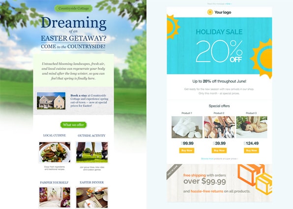
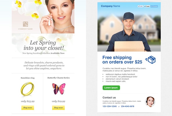
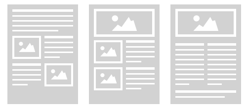
Newsletter Layout Design
Email messages are usually created in one-column or multi-column format. Choose your template based on the type of message and your goal (such as, to promote your e-store offer, or to invite subscribers to an event).
Below are skeleton templates to use when planning your campaigns. In them, you will find the following comments:
<!—Module –> – This is where you should place one of the modules (such as preheader or text block) which are described in the next section.
<!—Basic table always with 100% width –> – A basic table is a frame for the message and should always have the same width value. The basic table contains other tables with the actual content.
<!—Table describing the width of your message –> – This table determines the width of your message (the recommended width is 600px) and contains the columns and modules.
<!—definition of the first column and its width –> – This is the first column in the message. In the example, it is 300px wide.
Any of these templates can be copied into GetResponse Email Creator, where you can fill the modules with any content you wish. The comments will not be displayed to your subscribers.
One-column layout

<table  width="100%"  align="center" bgcolor="#ffffff" cellpadding="0" cellspacing="0" border="0">
  <!-- Basic table always with 100% width -->
  <tr>
      <td  align="center" valign="top" style="margin: 0; padding: 0;">
          <table  width="600"  align="center" bgcolor="#ffffff" border="0" cellspacing="0" cellpadding="0">
          <!-- Table describing the width of your message -->
              <tr>
                  <td  align="center" valign="top" style="margin: 0; padding: 0;">
                      <!-- Module -->
                  </td>
              </tr>
              <tr>
                  <td  align="center" valign="top" style="margin: 0; padding: 0;">
                      <!-- Module -->
                  </td>
              </tr>
              <tr>
                  <td  align="center" valign="top" style="margin: 0; padding: 0;">
                      <!-- Module -->
                  </td>
              </tr>
              <tr>
                  <td  align="center" valign="top" style="margin: 0; padding: 0;">
                      <!-- Module -->
                  </td>
              </tr>
              <tr>
                  <td  align="center" valign="top" style="margin: 0; padding: 0;">
                      <!-- Module -->
                  </td>
              </tr>
              <tr>
                  <td  align="center" valign="top" style="margin: 0; padding: 0;">
                      <!-- Module -->
                  </td>
              </tr>
              <tr>
                  <td  align="center" valign="top" style="margin: 0; padding: 0;">
                      <!-- Module -->
                  </td>
              </tr>
              <tr>
                  <td  align="center" valign="top" style="margin: 0; padding: 0;">
                      <!-- Module -->
                  </td>
              </tr>
              <tr>
                  <td  align="center" valign="top" style="margin: 0; padding: 0;">
                      <!-- Module -->
                  </td>
              </tr>
          </table>
      </td>
  </tr>
</table>
Multi-column layout
The total width of columns cannot be more than the width of the template (600 px in this example). This type of message, sent with GetResponse, will be responsive, meaning that on mobile devices, the columns will be placed in one line, from left to right.
<table  width="100%"  align="center" bgcolor="#ffffff" cellpadding="0" cellspacing="0" border="0">
  <!-- Basic table always with 100% width -->
   <tr>
       <td  align="center" valign="top" style="margin: 0; padding: 0;">
           <table  width="600"  align="center" bgcolor="#ffffff" border="0" cellspacing="0" cellpadding="0">
           <!-- Table describing the width of your message -->
               <tr>
                   <td  align="center" valign="top" style="margin:0; padding:0;">
                       <table  width="100%"  align="left" border="0" cellpadding="0" cellspacing="0">
                           <tr>
                               <td  width="300"  align="left" valign="top" style="padding: 0; margin: 0;">
                               <!-- definition of the first column and its width -->
                                   <table  width="100%"  align="left" border="0" cellpadding="0" cellspacing="0">
                                       <tr>
                                           <td  align="left" valign="top" style="padding: 0; margin: 0;">
                                               <!-- Module -->
                                           </td>
                                       </tr>
                                   </table>
                               </td>
                               <td  width="300"  align="left" valign="top" style="padding: 0; margin: 0;">
                               <!-- definition of the second column and its width -->
                                   <table  width="100%"  align="left" border="0" cellpadding="0" cellspacing="0">
                                       <tr>
                                           <td  align="left" valign="top" style="padding: 0; margin: 0;">
                                               <!-- Module -->
                                           </td>
                                       </tr>
                                       <tr>
                                           <td  align="left" valign="top" style="padding: 0; margin: 0;">
                                               <!-- Module -->
                                           </td>
                                       </tr>
                                       <tr>
                                           <td  align="left" valign="top" style="padding: 0; margin: 0;">
                                               <!-- Module -->
                                           </td>
                                       </tr>
                                   </table>
                               </td>
                           </tr>
                       </table>
                   </td>
               </tr>
           </table>
       </td>
   </tr>
  </table>
Newsletter Structure Blocks
The templates in the GetResponse Email Creator are built using modules (such as preheader, image, and text). These modules can be copied and placed anywhere in your template design. Follow these helpful rules:
- Use the Email Creator editing tools that are associated with each module.
- Choose the modules you wish to include, and then place them anywhere they fit in your template design.
- Save the module ID at the end. Edit the padding and border only in the table cells of the module.
- All tables that form modules (and that are formatted width=100%) should have the alignment set at align=”center”.
Preheader module
- The preheader module displays the first sentence in your newsletter. In the email client, the preheader is visible next to the subject line, and usually contains a link to the online version of the message. Use the tag to format the text of the preheader.
<table width="100%" align="center" border="0" cellpadding="0" cellspacing="0" data-editable="preheader">
    <tr>
        <td align="center" valign="top" style="margin: 0; padding: 0;">
            <span style="font-family: Helvetica, Arial, sans-serif; color: #000000; font-size: 12px">
                View this email <a href="[[view_this_message]]">online</a>
            </span>
        </td>
    </tr>
  </table>
Text module
- This module contains the text of your newsletter. You can place a text module anywhere in your message. Any text module can include links to websites, blogs, or an unsubscribe page (e.g. <a href=”[[remove]]”>Unsubscribe</a>)
<table width="100%" align="center" border="0" cellpadding="0" cellspacing="0" data-editable="text">
   <tr>
       <td align="left" valign="top" style="margin: 0; padding: 10px;">
           <span style="font-family: Arial, Helvetica, sans-serif; color: #000000; font-size: 14px">
               Scelerisque facilisis a rhoncus sed! Non in duis dictumst natoque <a href="#">nec mus diam</a>
           </span>
       </td>
   </tr>
  </table>
Image module
- This module can contain any image, such as your company logo or a picture of your product.
- Do not set width=”100%” in the main table that forms the module. The width of the image is defined by the data-mobile-width parameter, which can take either of these two values:
- 1 → stretch the image to the width of the screen that is being used.
- 0 → keep the original image width when viewing on a mobile device.
<table align="center" border="0" cellpadding="0" cellspacing="0" data-mobile-width="1" data-editable="image">
   <tr>
       <td valign="top" align="center" style="padding: 10px; margin: 0;">
           <img src="http://path/to/img.jpg" alt="Lorem" width="20" height="20" border="0" style="display:block;">
       </td>
   </tr>
</table>
Image-Text module
- This module contains an image and text. You can use it, for example, when presenting your product with a description. To format the text, use only the <span> tag. Do not set width=”100%” in the main image table that is nested in the text module.
<table width="100%" align="center" border="0" cellpadding="0" cellspacing="0" data-editable="text">
       <tr>
           <td valign="top" align="left" style="padding: 10px; margin: 0;">
               <table border="0" cellpadding="0" cellspacing="0" align="left" width="190" style="margin: 0; padding: 0;" data-mobile-width="1" data-editable="image">
                   <tr>
                       <td valign="top" align="left" style="margin: 0px; padding: 10px;">
                           <img src="http://path/to/img.jpg" width="180" height="242" alt="Lorem Ipsum" style="display:block;">
                       </td>
                   </tr>
               </table>
               <span style="font-family: Arial, Helvetica, sans-serif; color: #262626; font-size: 14px;">
                   Scelerisque facilisis a rhoncus sed! Non in duis dictumst natoque adipiscing, odio nec mus diam?
               </span>
           </td>
      </tr>
</table>
Button module
- This module displays a call-to-action button. To format the text, use only the <a> tag.
- Do not use width=”100%” in the main module table. To set the width of the button, define the width in the first <td> cell.
<table border="0" cellpadding="0" cellspacing="0" align="center" data-editable="button">
    <tr>
        <td valign="top" align="center" style="padding: 10px;" bgcolor="#ff0000" width="200">
            <a href="" style="font-family: Arial, Helvetica, sans-serif; color: #ffffff; font-size: 18px; text-decoration:none; font-weight: bold;">
                Lorem ipsum ›
            </a>
        </td>
    </tr>
</table>
Line module
- This module displays a horizontal line. Set the value of the upper and lower padding to at least 10px, to display the editor control.
<table border="0" cellpadding="0" cellspacing="0" align="center" width="100%" data-editable="line">
   <tr>
       <td valign="top" align="center" style="padding: 10px 0px; margin: 0;">
           <div style="height: 1px; line-height: 1px; border-top-width: 5px; border-top-style: solid; border-top-color:#dedede;">
               <img src="data:image/gif;base64,R0lGODlhAQABAIAAAP///wAAACH5BAEAAAAALAAAAAABAAEAAAICRAEAOw==" alt="" width="1" height="1" style="display: block;">
           </div>
       </td>
   </tr>
</table>