When it comes to design, online marketers used to leave that “mumbo jumbo” to graphic designers. However, there is a growing number of marketers who like to think of themselves as brave souls who don’t need any graphic designers because their knowledge and keen sense for the “design mumbo jumbo” is enough. Now, there is nothing wrong with being a brave soul! But it’s good to know your basics to make sure you improve your brand instead of hurting it.Are you a marketer who likes to focus just on content placement, colors, and logos? Well, I have news for you – it is time you take on typography too!
Typography is frequently underestimated by people, as they do not realize how important the texts’ actual look and placement is when it comes to understanding the content it portrays. It is pretty obvious that our reading comprehension is better when our eyes don’t have to focus on insanely romantic, artistic, and hard to decipher lettering. In fact, there is a whole science behind what kind of typefaces work better under different conditions – but first, the basics in order to understand the science.
The basics of basics
Typeface vs. Font
You might be used to telling everyone that “this Comic Sans font is not as cool as Helvetica”, but you’re actually wrong. No, not because Comic Sans is cool (let me underline that – it is not cool, don’t use Comic Sans.. ever!) but because what you’re describing is a typeface.
Essentially, a typeface is the actual creative works or font family, if you will. Garamond of Helvetica are typefaces as they define the respective creative works. However, if you were to say “Times New Roman, bold, 17pt” – you would be describing a font.
Nowadays the two are pretty much interchangeable, however this used to matter when a lettering press was still in use since you had to pick an entire family (typeface) and than define each specific letter (font) in that family and how it is to look within the printed text.
Serif vs. Sans Serif
These two beautiful words define the more artistic, archaic lettering with strokes (serif), and the more simple lettering with the french sans (without) in front of serif.

Serif typefaces include those like Times New Roman or Garamond, and these are used in print. This is because serifs (the little strokes) help the brain distinguish between letters with ease. If you are going to read a long text, you want your eyes to be able to focus on the context and you want them to move through the words as fast as possible. Once the brain eliminates obstacles, such as distinguishing between letters, you can saccade away with ease!
According to a great infographic, which closes in on the battle between serif and sans serif, printed works have a resolution of about 1000 dpi (dots per inch), whereas computers are at about 100 dpi (Even Apple’s retina has a resolution of only 300 dpi). This means that as far as the web goes – sans serif typefaces like Arial or Helvetica are much easier to read.
The basics of text layout
My dear marketer, now that you know that it serves you best to use sans serif in your online marketing, and that fonts refer to specific letter conditions, it is time that you learn the spacing lingo. Whether you are creating headlines for your new blog post, getting text together for a banner, landing page, or even a newsletter, you have to make sure your kerning, tracking, and leading is down right perfect.
Kerning sounds like a scary monster but it is actually your best friend! This specific word refers to the actual spacing between letters. It doesn’t look good when some fonts are too close together, while others are spaced far apart:
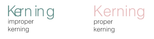
You want to make sure that the kerning is right in all your words. Sometimes a typeface makes strange things happen and the space between an uppercase and lowercase font is bigger than between two alike sizes. In this case you simply have to change the kerning between the two to make your word simply look better.
Tracking comes in handy when you want to think about how longer sentences or more complicated words will look. Why? Because tracking is the horizontal length between letters (..but isn’t that kerning? nope!)
When thinking about tracking, you think of readability. Words that are too close together (or just letters alone in one word) might make it harder for your readers to understand your message. As we are using sans-serif, it could even make it hard to distinguish between some of the fonts!
Leading which refers to the space between baselines (paths). When you’re thinking of how you want a whole paragraph to look, you have to think of leading. If your sentences are spaced too far apart, they will be hard to read, if they are too close together, they too will be difficult to read. Where is the golden middle?

This is because you don’t want the descender line (the very bottom line where for instance ‘g’ is in golden) or baseline (font path) to be too close to your ascender line (the very top line). In layman’s terms – your leading should always be around 120% – 145% of the point size.
Remember – elements of good design are made up of:
- Consistency – Keeping your chosen font families fairly close, don’t use Novecento Neue in your headline and Papyrus in your text!
- Hierarchy – Headlines or more important parts in your text layout should be underlined. Be it bold, italics, uppercase, or simply a more defined typeface.
- Alignment – Don’t let your text flow in a rivery shape. Keep your rulers, guides, and baselines consistent.
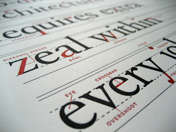
Believe it or not, there are numerous parts to a single font and characteristic parts to a whole typeface. To see the full anatomical diagram of typography, click here.
The emotions behind a typeface
According to Jost Hochuli the reception of everything written – including typography – takes place in two ways: firstly, in the act of reading itself, that is the conversion in the brain of the perceived succession of the letters, and secondly as a (most unconscious) visual perception, that triggers associations with what has previously been seen and arouses feelings.
For instance, in a study done by Errol Morris in which the same text was presented to people, where the text itself was shown in different font families. Once the text was read, those people were asked whether they agreed with the statement in the text or not. What was interesting, but not at all surprising, was that readers that were given a sample in Comic Sans were more likely to disagree. That shows us that once we have some sort of a mindset in our head about a certain typeface, it’s hard to get it out and it provokes us emotionally (in the case of Comic Sans – negatively).
Which it is worth our time to peek at various websites and how they look in order to see just what we feel, think, and notice looking at their typography. Take an hour of your day and devote it to looking at what brands similar to you are doing when it comes to design. Research what is popular, what works, what doesn’t, and don’t be afraid to change something.
What do I choose?
Well, that depends on the tone that you’re going for (more formal, more hipster, more simple), but no matter what you choose, try to go with sans-serif, online readers will appreciate that you’ve taken their eyes into account 😉
Here is a list of font families that will make any text look great:
1. The familiar:
- Arial
- Verdana
- Trebuchet
- Verdana
- Helvetica
2. The free:
- Novecento (A personal favorite, but don’t use it in long texts!)
- Roboto
- Lato
- Open Sans (Might be too condensed, but all that takes is changing the tracking, right?)
- Campton
3. The premium:
4. The decorative (best for headlines):
Of course the list could go on and on, but these are just a few to get you started and with which you could never go wrong. Also, don’t be afraid to try something different! For even more inspiration, check out the various typefaces that Awwwards listed (100 free fonts for 2014), a great site for free inspiration! A/B testing will come in handy too.
Google Fonts is also a popular place to start, in fact, some of our very own Landing Page Creator 2.0 fonts came from that very market. Typography is a beautiful art to master because any text that welcomes and indulges our eyes and makes us want what’s behind the content.
Take what you knew, what you now have learned, and go on look over your very own content, headlines, and even newsletters. You might just be surprised how different you will now see everything. We also love to know what you think! Let us know what your favorite typeface is and why.